
Tuesday, 7:00am
15 January 2013
Ladies’ unmentionables
Shelley Gruendler is fascinated by the graphic language of feminine hygiene disposal bags
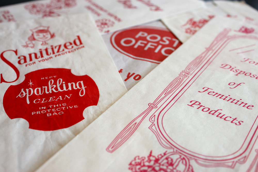
Twenty years ago, while in my second year at design school, I pilfered my first ‘feminine hygiene sanitary disposal’ bag from a doctor’s office in Raleigh, North Carolina, writes Shelley Gruendler.
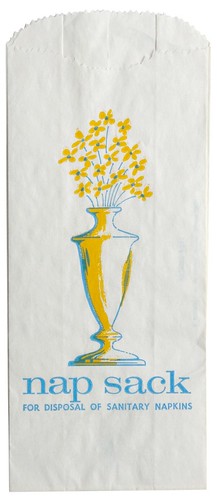
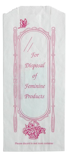
I thought this ‘nap sack’ was beautiful then, and still do, even as it yellows from age. I remember being smitten with the humble aesthetic, the cheerful colours, the whimsical flowers and, especially, the extended lowercase letterforms (below, left).
These disposal bags are fascinating, both as communication ephemera and as a symbol of unnecessary advertising to an already captive audience. But most of all because the design of the bags appears to be oblivious of their purpose: to contain used menstrual items as they are disposed of in a public toilet waste bin.
Both bags are from the United States and are printed, unsurprisingly, in reds and pinks.
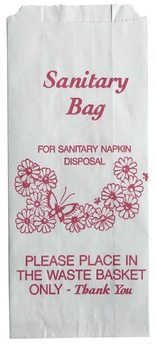
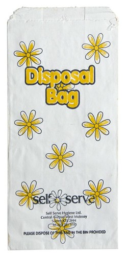
 As I have moved around the world, and people send me more examples, my collection has grown exponentially. I have bags from the Czech Republic, France, Switzerland, Italy, Germany and Canada in addition to my originals from the United States and England. The imagery varies from (often tacky) floral illustrations to radioactive warnings, and includes numerous examples of the ‘feminine’ graphic.
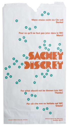
Pink is a popular colour, regardless of the material it is printed on, though I have seen some unpleasant alternative colour schemes. Aesthetic styles also vary dramatically, with equally varied success rates. Differing versions show that redesigns are not always an improvement, and demonstrate how a change in typeface, alignment and ink quantity can dramatically change tone.
The design for Sachet Discret uses flowers in a more stylised and less child-like manner, demonstrating how good design can make a mundane object interesting.
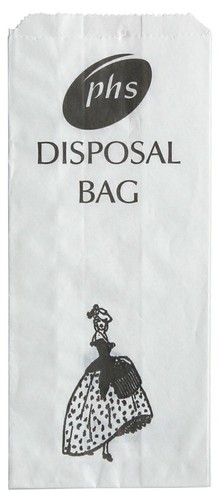
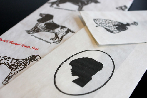
Design considerations aside, the representation of women and the inherent taboo topic of menstruation can be both amusing and beguiling. Ridiculous ‘feminine’ imagery appears often – a cameo head; a dressing mirror with a butterfly wafting by; a woman in an early nineteenth-century floral dress (above, right). Was this really the best the designers could do?
My collection has also expanded to contain ‘instructional’ signs from toilet cubicles. Some are condescending – one uses a photograph of a woman to demonstrate how to dispose of a bag; some politely explain the reason to use bags, and spell out what should not be put in the bin with them.
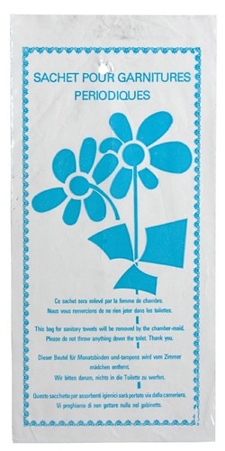
Health warnings and icons are equally abundant and unnecessary, as with bag Sachet pour garnitures periodiques, which combines a clumsy flower and an even clumsier radioactive symbol – that simulates leaves – to create a bizarre mixed message.

Now that most public toilets provide disposal units in each cubicle, disposal bags are beginning to disappear. While the new arrangement makes things easier for the user, I do miss seeing such quirky ephemera perched on the backs of toilets.
Dr Shelley Gruendler is a typographer, designer and educator, based in the Canadian typographic archipelago. She is the founder of Type Camp International.
Eye is the world’s most beautiful and collectable graphic design journal, published quarterly for professional designers, students and anyone interested in critical, informed writing about graphic design and visual culture. It is available from all good design bookshops and online at the Eye shop, where you can buy subscriptions, back issues and single copies of the latest issue. You can see what Eye 84 looks like at Eye before You Buy on Vimeo.