Thursday, 11:32am
30 September 2010
Life-saving graphics?

Tough, durable and informative: posters in the age of HIV / AIDS

Twenty-five years ago the HIV / AIDS virus began killing thousands and infecting hundreds of thousands more, writes Steven Heller, in his essay for a new show at Boston’s MassArt. Although the western world was hit unaware, the disease had been coursing through the Third World's bloodstream for years before.
When Europe and the Americas were directly affected, however, curative and preventative measures were gradually instituted, yet prejudice abounded.
After all, this was a ‘gay’ disease. With death tolls on the rise, mainstream and alternative media eventually rallied to dispel demonising half-truths and myths. As more victims in the creative industries were struck down, international celebrities took to their soapboxes. Amid their heartfelt clamour, and in addition to a surge of kinetic mass media, the most prodigious barrage of information was nonetheless disseminated through more static media – the printed poster.
Top: ‘Get tested before you get married’, Parisa Tashakori (2007, Iran).
Below: ‘AIDS Ribbon Hands’, Palla Koblinger & Partner (2000, Austria).
Posters were (and are) the great equaliser in countries where paper is a high-tech medium. Although verbal and visual languages and dialects may be different, a poster can make the difference between ignorance and understanding. Yet how many different ways are there to say HIV / AIDS? Understanding what the public will accept at any given time or venue (what the industrial designer Raymond Loewy called ‘most advanced yet acceptable’) is not an exact science but demands good instincts. Designing in particular vernaculars, across different borders and for varied constituencies is what makes the posters in this collection so compelling. No single design language fits all problems. The level of intensity of a message must be weighed against the kind of response or action that is wanted and expected. With AIDS it is not enough to advertise to fund a cure or advocate prevention, degrees of emotional investment must be considered. Is that done through design, image or text? Do the standards of ‘good’ design or ‘modern’ design matter? Is a message best served by simplicity or complexity? And what, if any, are the taboos – the lines that artists and designers cannot cross?
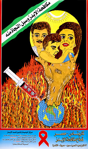
Above: ‘Fighting AIDS’, anon. (date unknown, Egypt).
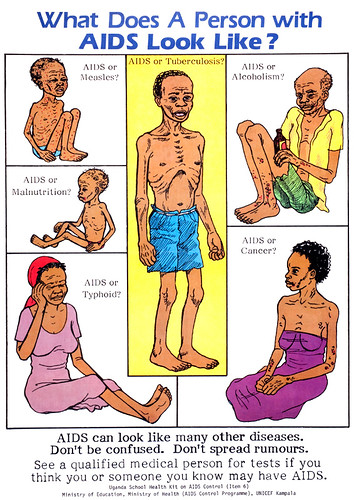
Below: ‘What does a person with AIDS look like’, anon. (1993, Uganda).
In the West many AIDS posters polemically attack the issue, yet in India for instance, they more touchingly convey stories designed as warnings to alter common behaviour. Using vernacular imagery rendered in popular styles, one such poster written in Hindi states: ‘My husband has gone to the city to make more money, I hope he does not contract AIDS while he is there. But if he resists temptations then he can never bring AIDS back home.’
Another from India shows an even more compassionate side: ‘People suffering from AIDS need love. Not disgust, not abandonment, but just love.’ In Uganda, heavily hit by AIDS in the early 1990s, posters are designed to encourage detection and treatment, like this: ‘What does a person with AIDS look like? AIDS can look like many other diseases. Don't be confused. Don't spread rumours. See a qualified medical person for tests if you think you or someone you know may have AIDS.’
Above: ‘Don’t Share Needles’, Lanny Sommese (1989, USA).
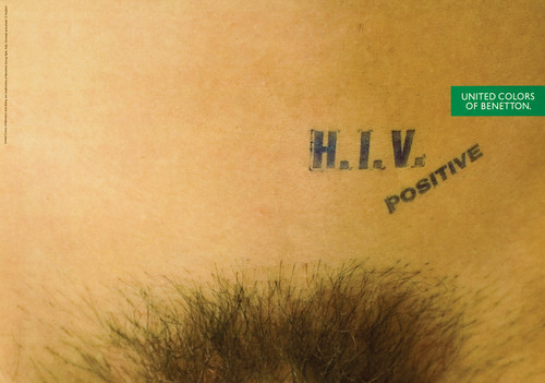
Below: ‘Benetton: Vagina’, Oliviero Toscani (1993, Italy). See Eye 29.
Twenty-five years have passed since the first of these posters was created. Many more than the 153 presented here have been produced. They reveal the ability to use graphics as an information tool and intervention weapon, and show that a balance must be struck between aesthetics and communication. Can posters stop a disease? Obviously not! But depending on where they are made and who they affect, they can make a huge difference. They may only be paper, but they are tough and durable.
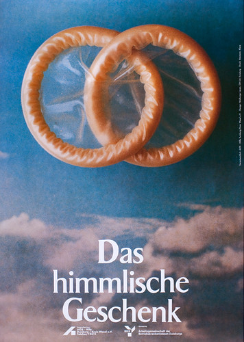
Above: ‘The gift from heaven’, Walburga Lieven (1995, Germany).
Below: ‘Ignorance Equals Fear’, Keith Haring (1989, USA).
This is an edited extract from Steven Heller’s essay on www.graphicintervention.org.
See also: ‘Fighting AIDS with pictures and words’ in Eye 52 and ‘Sex, death and grinning condoms’ in Eye 49. Also ‘Graphic Responses to AIDS’ in Eye 22 and articles in Eye 6 (out of print).
Now > 4 December 2010
Graphic Intervention: 25 Years of International AIDS Awareness Posters 1985–2010
Stephen D. Paine Gallery
Massachusetts College of Art and Design
621 Huntington Avenue, Boston 02115 USA
www.graphicintervention.org
Opening Reception
Thursday 7 October, 6:00–8:00 PM
‘Visualizing Solutions: Designers and the HIV/AIDS Crisis’
Thursday 4 November, 6:30 PM, Tower Auditorium
Panel discussion with Chaz Maviyane-Davies, Lanny Sommese, Joe Scorsone, Alice Drueding
Eye magazine is available from all good design bookshops and at the online Eye shop, where you can order subscriptions, single issues and back issues.
The summer issue, 76, out now, is a music special – full contents here, and you can see a selection of visual details on Eye Before You Buy on Issuu.


