
Wednesday, 9:00am
20 December 2017
Lincoln in the limelight
Greg Heinimann
Luke Bird
Jon Gray
Richard Bravery
Oliver Munday
Rafaela Romayo
Tom Duxbury
Awards madness
Book design
Graphic design
Robert Hanks takes a final look at the cover designs for The Man Booker 2017 shortlist and the winner – George Saunders’ Lincoln in the Bardo
Book design can be an unlovely process – a set of negotiations to find something that satisfies the requirements of design, editorial and sales, with the last inevitably taking precedence. Along the way, art can get sidelined and the results can be garish or banal, writes Robert Hanks.
The Man Booker Prize, Britain’s most prestigious award for literary fiction, offers an annual chance to take a view of the state of the art. It’s sometimes argued that ‘literary fiction’ is a genre, just as surely as crime or science fiction are; but it would be more accurate to say that the label should be applied to books that aspire to originality, that try (even if they fail) to invent their own genres. That is reflected in the cover for this year’s longlist of thirteen: they include joyously skittish, exuberant typography (Gray318’s cover for Zadie Smith’s Swing Time), smart trompe l’oeil illusion (Richard Bravery’s cover for Mohsin Hamid’s Exit West), a David Hockney landscape (Bravery again – Ali Smith’s Autumn), cleverly selected and subtly altered stock photograph (Luke Bird, Paul Auster’s 4321), a playful diagram of the novel’s theme (Oliver Munday, Colson Whitehead’s The Underground Railroad) and an abstract swirl of colour (Rafaela Romayo, Mike McCormack’s Solar Bones). Though one or two ideas are repeated – the Hockney, for example, rhymes with Vanessa Lubach linocut of woodlands on Fiona Mozley’s Elmet – what stands out is the variety of the designs, and the difficulty of imposing themes on them.
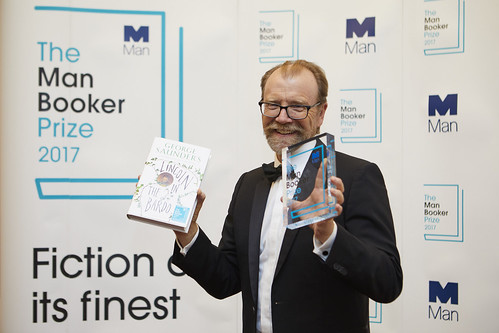
US author George Saunders with his award for the Man Booker Prize-winning title Lincoln in the Bardo.
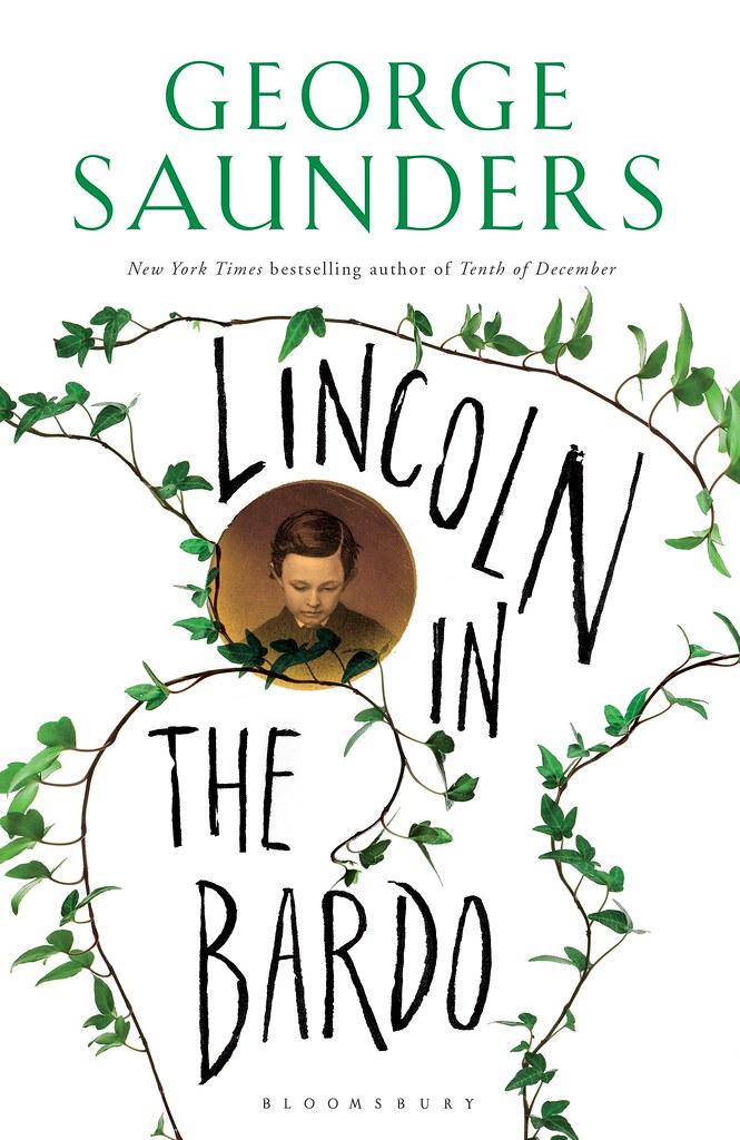
Top: Greg Heinimann’s cover design for Lincoln in the Bardo.
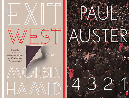
For Luke Bird, Paul Auster’s heavyweight reputation made the job of designing the cover for 4321 particularly daunting: ‘Faber’s always been so proud to publish him … And there were rumours in-house that it was a masterpiece.’ The novel’s four sections offer four possible versions of the same life: the temptation was to mimic that structure with a cover split into quarters, using pictures that resonated with 1940s and 50s Americana. He tried several ideas before somebody (‘Can’t remember whether it was the author, or it was the editor’s brief’) suggested VE Day as a reference. The chosen image, an archive picture of VE Day in New York suggests not a splitting but an amalgamation of experience, a sense of the mass and crowding of life. For the lettering Bird chose Drescher, a light sans serif face, because ‘I didn’t want it to fight.’
Cover designs for Exit West, designed by Richard Bravery; and 4321, designed by Luke Bird.
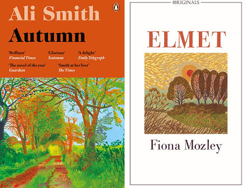
At the other end of the scale, the fact that Fiona Mozley’s Elmet was a debut novel being published in paperback with a small print run meant that Tom Duxbury had pretty much a free hand. It became a very personal project for him: the novel – about an upbringing in a copse in the countryside, with a violent father – is set in the part of Yorkshire where Duxbury grew up; and he had had Vanessa Lubach’s art in mind for a while (‘On Instagram I follow all these British printmakers, so I’m always trying to get the images on the covers’). The picture he chose is called Farewell to a Norfolk Summer, but the landscape chimed with the flatness of the Vale of York, and he was struck by ‘the colour, the lighting, the sunset – the violence possibly’.
One thing that images of the covers cannot convey is the texture – which in some cases was a vital part of the experience. The hardback of Ali Smith’s Autumn, for example, had the Hockney image printed on a half jacket. It is the first of a series of books using the seasons as titles, each of which will use a Hockney painting from a series depicting the same stretch of east Yorkshire road throughout a year (the second novel, Winter, came out in November). The idea of using the Hockney came from Jo Prior, Penguin’s managing director – though the idea wasn’t entirely new: one of his iPad paintings had been the cover image for Smith’s 2011 novel There but for the. Richard Bravery wanted to use cloth as the binding material – ‘something natural (well, as natural as it could be) to run alongside the seasonal titles.’ He thought it felt ‘almost sacrilegious’ to cover the cloth, but the half jacket ‘seemed to give space to both Hockney’s artwork and to the binding’. The result was – as another publisher enviously put it to me – a ‘wonderful package’. Distressingly, I only own the paperback: no half jacket, but some compensation in the shape of handsome French flaps.
Cover designs for Autumn, by Richard Bravery, and Elmet, by Tom Duxbury.
Others did subtler things. On 4321 Luke Bird added supermatt lamination, which he thinks works particularly well with archival photography, lending it ‘almost a kind of haze’. It also gives it a very gentle rubberized feel. But Greg Heinimann’s work on George Saunders’s Lincoln in the Bardo – the first novel by a much praised and widely loved writer of short stories – is even more impressive. The story revolves around Abraham Lincoln’s mourning for his eleven-year-old son Willie, who died in 1862, at the height of the American Civil War; a photograph of Willie is shown in a copper coloured disc medallion, embossed to enhance the impression of a medallion or a coin; and the vines that cradle this picture are embossed too, so that you can trace the tendrils with your finger as they coil around the cover. ‘It was a real headache getting that sorted,’ Heinimann admits – he had to cut around each leaf to create the effect.
The corporate, commercially driven process that produces book covers can be tiresome. But sometimes, too, out of the grind of argument and compromise, up fly unexpected sparks of beauty and meaning – covers that are gorgeous to look at and touch; and more than that, that throw new light on to the text, bringing complexities and ironies into view. Sometimes it is art that emerges.
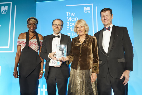
Jury chair Baroness Lola Young with Man Booker Prize 2017 winner George Saunders being presented the award by the Duchess of Cornwall Camilla Parker Bowles alongside Man Group CEO Luke Ellis.
Robert Hanks, journalist, critic, broadcaster, London
Eye is the world’s most beautiful and collectable graphic design journal, published quarterly for professional designers, students and anyone interested in critical, informed writing about graphic design and visual culture. It is available from all good design bookshops and online at the Eye shop, where you can buy subscriptions and single issues.