
Friday, 12:00pm
29 May 2015
London’s American poster king
Edward McKnight Kauffer
Hannah Höch
Henri de Toulouse-Lautrec
Design history
Graphic design
Posters
Typography
Visual culture
McKnight Kauffer’s Modernist posters for London Underground go under the hammer next week. By Graham Twemlow
In the design canon, from a contemporary perspective, the American-born poster artist Edward McKnight Kauffer (1890-1954) remains an enigmatic figure. Yet in the 1920s and 1930s he was the most celebrated graphic designer in the UK, writes Graham Twemlow.
He was admired by his clients (he became London Underground’s most prolific poster artist); loved by the public (one of his client’s had banners placed on empty poster sites stating: ‘A New McKnight Kauffer poster will appear here shortly’); revered by critics (Wyndham Lewis referred to him as ‘the Underground poster king’ and a 1927 Commercial Art described him as ‘something of an alchemist who changes ideas into pure gold’); and lauded by newspaper columnists (one 1926 newspaper headlined a photograph of McKnight Kauffer at work with ‘Too Good For Films’, stating in a caption below: ‘Mr E. McKnight Kauffer, the poster artist, who had two of his posters rejected by a film firm on the ground that they are too good’).
McKnight Kauffer was at the peak of his profession when the outbreak of the Second World War left him no option but to return to the US: he had remained a United States citizen throughout the 35 years he spent in England. Although in the postwar years he established a new career as a graphic designer in New York, his Anglocentric style of hand-drawn work appeared outmoded when placed against the hyperbolic trend set by the burgeoning Madison Avenue advertising agencies.
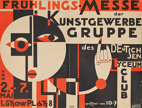
With the scarcity of graphic design monographs and histories in recent years, vintage and Modernist poster auctions, both in New York and London, act as a frequent reminder of the high points of twentieth century graphic design. In many of these auctions, Modernist works are placed side-by-side with artistic posters from fin de siècle Paris. At a forthcoming Christie’s South Kensington sale (4 June 2015), posters by Pierre Bonnard and Henri de Toulouse-Lautrec can be viewed among a number of decorative works by the French artists Paul Colin, Charles Loupot and Jean Carlu and some rare works by Modernist designers such as Herbert Matter and the Berlin Dada artist Hannah Höch, known primarily for her pioneering photomontage works.
Hannah Höch (1889 – 1978), Frühlings-Messe Der Kunstgewerbe Gruppe, c.1925, 14 x 18.5 in (36 x 47 cm), est. £8000-12,000.
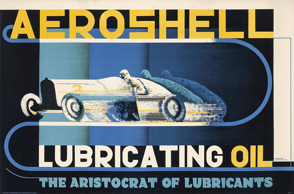
Top: E. McKnight Kauffer, Aeroshell Lubricating Oil,
1932, (30 x 45 in (76 x 114 cm), est. £5000-7000.
Some of McKnight Kauffer’s finest Modernist posters are also on view. The brooding, almost threatening design for Power, The Nerve Centre of London’s Underground is in stark contrast to the majority of work he had produced previously for London Underground. A muscular airbrushed arm projects from an outline rendering of the Underground roundel surrounded by a disc-like tunnel. Although he had been using an airbrush for some time on smaller promotional items, press advertisements and book illustrations, this was the first time he had used it extensively on a poster design. The clenched fist releases electric current supplied by the Cubist representation of the poster’s power station.
E. McKnight Kauffer, Power, The Nerve Centre of London’s Underground, 1931, 40 x 20 in (101 x 63 cm), estimate £15,000-20,000.
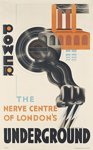
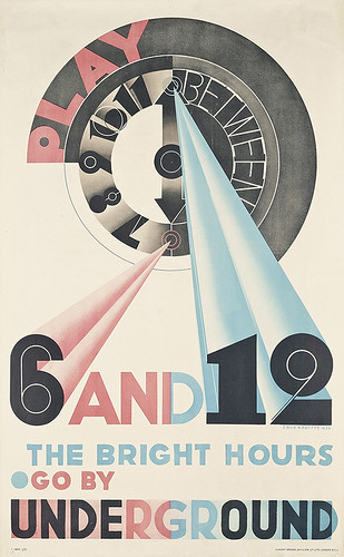
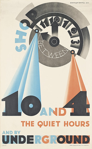
Another interesting factor in this design is McKnight Kauffer’s use of a ruling pen evidenced in the concentric circles and vertical lines through the word ‘Power’. In the late 1920s he had acquired a quantity of specialist drawing instruments on his visits to Berlin on behalf of the W. S. Crawford advertising firm (he worked part-time at Crawford’s for a time) including an architect’s adjustable drawing desk. He used an airbrush, too, to create three-dimensional effects on the Play Between 6 And 12 and Shop Between 10 And 4 posters.
E. McKnight Kauffer, Play Between 6 And 12, The Bright Hours, 1931, est. £8000-12,000. McKnight Kauffer uses a complex clock motif to differentiate between the recommended time periods.
E. McKnight Kauffer, Shop Between 10 And 4, The Quiet Hours, 1931, est. £8000-12,000.
Jack Beddington, the publicity manager of Shell-Mex was another keen supporter and patron of McKnight Kauffer. The posters (or lorry-bills, as they were known) Kauffer produced for Shell-Mex varied between a soft pastoral style, representing country scenes and a more Modernist and symbolic approach. His 1932 Shell poster, Aeroshell Lubricating Oil, also included in this sale, fits into the latter category. Whereas the majority of Shell posters feature a centralised illustration, with text top and bottom, McKnight Kauffer insisted on designing posters as an entirety – incorporating the text into the design. In this instance, instead of using an airbrush to represent the mechanical and speed aspect of the racing car, he has used a sponging technique to create a blurred slipstream effect. Ruled lines have been added to increase the illusion of speed, and further areas of sponging, achieved with the aid of a cut mask, enhance the perceived movement of the racing car.
In 1924 McKnight Kauffer edited and ‘arranged’ a book devoted to the history of posters. In the introduction he acknowledged the influence of Henri de Toulouse-Lautrec on his work (he owned a number of Lautrec posters which were used to illustrate the book) stating that Toulouse-Lautrec’s radical poster designs had ‘passed like a comet over the Western hemisphere’. His 1924 poster Winter Sales Are Best Reached By Underground is one of the clearest manifestations of Toulouse- Lautrec’s influence.
E. McKnight Kauffer, Winter Sales Are Best Reached By Underground, 1924, 40in x 25in, est. £3000-5000.
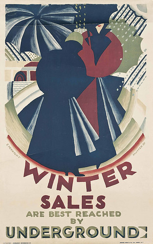
The notion of the cropped and close-up composition of figures placed in a flattened perspective in McKnight Kauffer’s poster is reminiscent of the way in which Lautrec dealt with characters depicted in his works.
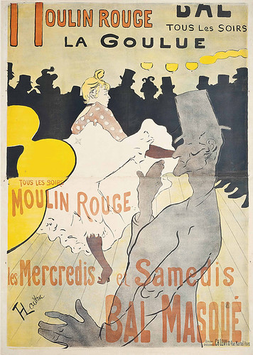
In Henri de Toulouse-Lautrec’s Moulin Rouge – La Goulue (1891) it is remarkable to consider that it was not only the first poster he had designed but also his first lithograph. The two key figures depict Louise Weber, known as ‘La Goulue’ (the glutton), and her partner Jacques Renaudin, known as Valentin le Désossé (the boneless), dancing the quadrille. What makes this poster such a seminal work is its simplicity and a stark contrast to the more illustrative and decorative posters of the time. The viewpoint taken by Lautrec is exaggerated and emphasised by the cropping of Valentin’s body and the simplified drawing of the dance-hall lights on the left, making the profile of La Goulue the main focus. The flattening of perspective owes much to his fascination for the spatial illusion to be found in Japanese woodcuts. The figures have been drawn with an assured mastery demonstrating what can be achieved by using the medium of lithography.
The lettering (only the top portion by Lautrec) may be crude and ill considered, yet it does not detract from the overall appeal. It was not unusual for posters of this period to be printed on a number of sheets due to their scale but, unusually, Moulin Rouge, La Goulue was printed on two sheets of equal size with an added narrow strip at the top completing the headline lettering. This is the two-sheet version (a rare three-sheet version sold at Christie’s for over £300,000 in 2014).
One of the attractions of the Christie’s South Kensington saleroom is that works can be viewed in a spacious exhibition environment. Posters, such as Moulin Rouge – La Goulue and Power, The Nerve Centre of London’s Underground need to be seen in reality to appreciate their size, scale and dynamic power.
Henri de Toulouse-Lautrec, Moulin Rouge – La Goulue, 1891
67in x 48in, est. £50,000-70,000.
Viewings at Christie’s South Kensington run from 30 May to 3 June 2015. The sale takes place on Thursday 4 June 2015, at 1pm.
Graham Twemlow, design historian and lecturer, London and Cahors, France
Eye is the world’s most beautiful and collectable graphic design journal, published quarterly for professional designers, students and anyone interested in critical, informed writing about graphic design and visual culture. It is available from all good design bookshops and online at the Eye shop, where you can buy subscriptions and single issues.