Tuesday, 8:00pm
3 March 2015
Mission America
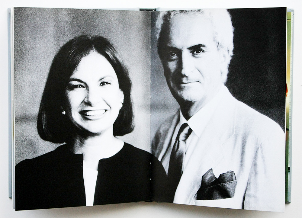
New York was Lella and Massimo Vignelli’s kind of town. They were New York’s kind of designers. A profile from the 1980s by Rick Poynor

Entering the New York offices of Massimo and Lella Vignelli is like crossing the threshold of a church, writes Rick Poynor.
A reverential hush seems to descend as the reception area, a broad, minimally appointed corridor, opens up in front of you. Your long walk to the four Rotonda chairs at the far end, where you will wait, properly awed, for Mr and Mrs Vignelli to appear, is like a neophyte’s passage to the altar. It takes you past four fat columns and a circular table bearing a single glass vase. Like an electrostatic burst of creative inspiration, branches shoot up from the vase into the serene air.
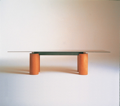
Innovation and tradition come together in the Serenissimo table for Acerbis International.
Top: Photographs from Lella and Massimo Vignelli: Design is One, Images Publishing Group, 2004.
Waiting, you muse on the elegance and audacity of this gesture. Imagine you were a client: if the Vignellis can stage-manage such effects for themselves, what could they do for you? At length you are led into Massimo Vignelli’s office. It, too, is exquisitely empty. Lead panels line one of the walls from floor to ceiling and a steel cube, standing alone at one end of the room, carries a cargo of awards. On the wall there is a citation for design excellence signed by Ronald Reagan. You sit at a steel-topped table. Through the blinds you can see the skyline and the Empire State Building.
Even before you meet the Vignellis, you know that New York is their kind of town. They’ve been here since 1965 when they came over from Milan to co-found Unimark International, specialists in corporate identity. This 14th-floor penthouse on the West Side, home of Vignelli Associates and Vignelli Designs – both founded in 1971 – is one of many rewards for their dedication to New York and their self-appointed mission to bring design to America. Outside, the city bears their stamp. Shoppers head for the subway, with its signage by the Vignellis, carrying the bags they did for Bloomingdale’s full of their tableware for Heller or Sasaki. On the way they pass St Peter’s Church, between the legs of Citicorp Center, for which the Vignellis, in 1976, designed the interior.
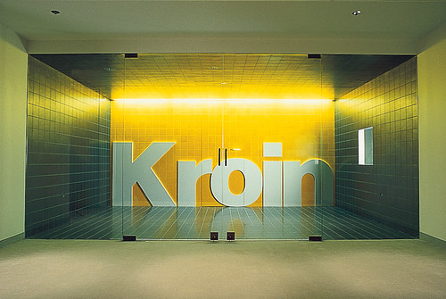
Less means more: stark, dramatic tiling for Kroin’s showroom in Cambridge, Massachusetts.
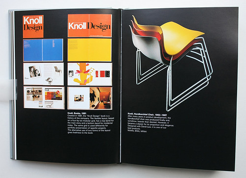
Knoll Design, 1981, a history of the company. Spread from Lella and Massimo Vignelli: Design is One.
At home or back at the office, relaxing on one of Vignelli’s chairs for Poltronova, Sunar or Knoll, they might leaf through a copy of American Ceramics or Architectural Record – designed, of course, by Massimo Vignelli. Books, magazines, calendars, packaging, posters, signage, corporate identities, furniture, jewellery, glassware, exhibitions and interiors – the Vignellis, prodigiously versatile, seemingly without effort, design it all.
Massimo Vignelli makes his entrance. He is a wearing a grey ouvrier’s jacket. Its big floppy collars combine with his silver hair and steel-framed glasses to give him the look of a worldly prelate. Like his glamorous wife Lella, who arrives a few minutes later, radiant in a red dress, you can see he is interested in clothes. Later, while she goes to fetch a new coat which she wants you to see, he elaborates on the absurdity of the modern suit.
‘Why the pants? Why the hell we have the pants?’ he demands. ‘It’s the most uncomfortable kind of the thing.’ Fashion is one branch of design the Vignellis have yet to try.
Lella Vignelli returns, modelling the coat like a professional. ‘Isn’t that minimal-iste!’ she exclaims with the delight, indicating the lack of buttons. ‘After I found this designer I said I don’t need any more to design fashion.’ She beams her broad, Sophia Loren smile and Massimo smiles too. The office might be a temple but the priests are having a ball.
Colorstone tableware for Sasaki Crystal.
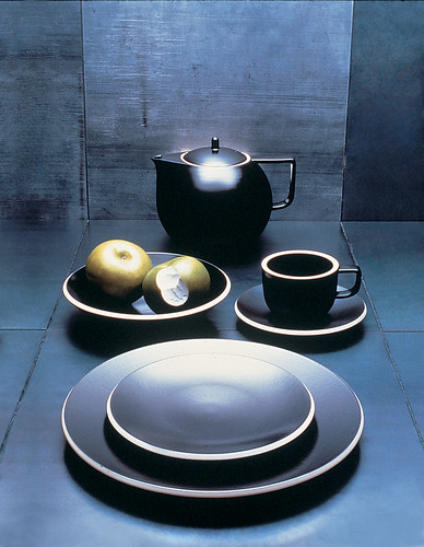
The Vignellis have been married for more than 30 years and the two sides of their lives, the public work and the personal relationship, are inseparable. ‘As a matter of fact,’ confides Massimo, ‘I find it difficult to understand how two people could be working together without being married. To me it’s the other way round. It’s so natural. It’s really one thing. There are two different personalities but it’s one body in a sense.’
In this symbiotic partnership he is the idealist and visionary; she is the voice of practicality and reason. ‘Really for Massimo, design in his mission,’ says Lella Vignelli. ‘It was always that way to a fanatical point. It would be difficult if I was not involved in what he was doing because there would not be much to communicate about.’
‘Lella is much more practical,’ says Massimo. ‘She has a tremendous sense of practicality which I don’t have. Things that are ethereal or idealistic have to have a basis in practicality – which Lella brings forward. However, if she goes too far, then I will come back and “Hey, wait a moment, you are killing the idea.”’
Detail of the invitation for ‘The Work of Lella and Massimo Vignelli’ exhibition at Parsons School of Design, New York.
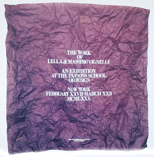
Born in Milan in 1931, Massimo Vignelli studied art at the Brera Academy of Art and architecture at the University of Venice before turning, in the 50s, to graphic design. Lella was born in Udine – her biography politely omits the year – and studied architecture at the University of Venice and Massachusetts Institute of Technology.
In 1960, after further spells in the US, they established the Lella and Massimo Vignelli Office of Design and Architecture in Milan. She specialised in three-dimensional design – interiors, furniture, products and exhibitions; he concentrated on two-dimensional design – graphic programmes and corporate identity. But the problem in Milan was that there were just too many designers already. ‘After a while,’ says Massimo, ‘you were banging your head against the ceiling.’
In New York, though, the ceiling was much higher. In fact, there wasn’t one. Clients had money and they badly needed design. Not that the Vignellis had an easy ride. ‘It took a lot of strength to stick with our approach,’ recalls Lella. ‘When we were with Unimark our partners would say, “You don’t understand the American way.”’ The idea of a husband and wife team was radically new in mid-60s America. Businessmen expected the little lady to be at home doing the dishes. US companies were also conditioned to expect specialists. The Vignellis’ Milanese readiness to take on anything caught them unawares. ‘The whole notion of a designer being in a position to design everything is foreign to Americans,’ says Massimo.
It is foreign to the British, too. On a visit to London in 1987 to deliver a lecture at the RIBA, the Vignellis sensed a ‘territorial’ resistance to their total design message. To Massimo Vignelli this is a ‘bleak view’ of what it means to be a designer. But is it really possible for an individual to master the skills and techniques of several different types of design? Massimo believes that it is.
‘I think designers should be able to design anything from graphics to interiors, from two-dimensional to three-dimensional things. The expertise that each particular project requires is very limited compared to the amount of interdisciplinary know-how. If you have a certain kind of attitude to design and a methodology, you can jump from two-dimensional things, like a book or a magazine, to three-dimensional things. It’s the same kind of discipline. The reason you put type in a certain position is the same reason that makes you approach a curve or a material in a certain way.’
Meticulous symmetry: what waiting visitors see as they look down towards the reception area.
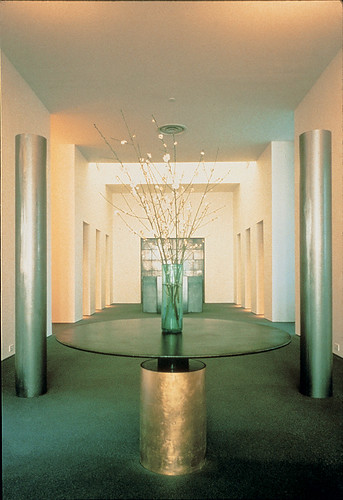
The Vignellis express the philosophy that allows them to make these jumps in three words: discipline, appropriateness and ambiguity. For them discipline is the structural principle by which one element relates consistently to another, whether it is columns of type and pictures on a page, or the table and chairs in Massimo Vignelli’s office. To this end, the Vignellis are dedicated exponents of the grid and a systems approach to design programmes.
Appropriateness, as they define it, is the search for the specific quality of a project, the expression of which will give it its final form – another way of saying, you might think, that form should follow function. Hardly a surprising conviction, perhaps, in two designers for whom the Modern Movement, the International Style, Swiss graphics and the notion that the designer bears a heavy social responsibility are still the key influences. (True to form, Massimo’s favorite building in New York is the Seagram.)
More surprising – and more interesting – is the way in which, in the late-70s, the perfect world of Vignelli-design began to crack at the seams. This was nothing so crude as an attack of the Post-Modernisms. Enter ambiguity.
Writing for an exhibition in 1980, their friend Emilio Ambasz perceived ‘flashes of randomness’ and even ‘existential turmoil’ in the work of this outwardly immaculate duo. Tissue paper invitations to a New York show, decorated with the usual elegant typography, had been brutally crumpled before they were sent off and thereby endowed, in the Vignellis’ words, with a new ‘plurality of meaning’.
Poster for Knoll International, 1966. Spread from Lella and Massimo Vignelli: Design is One.
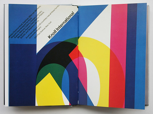
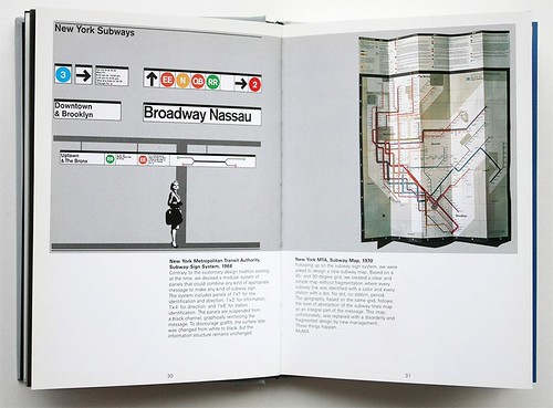
Subway sign system for the New York Metropolitan Transit Authority, 1966 (left) and the subway map for New York MTA, 1970 (right).
‘Rather than presenting answers in careful doses,’ reflected Ambasz, ‘it is slowly becoming evident that, in the last period, the designers have been posing questions.’
The Vignellis’ famous coffee table for Casigliani in 1979 introduced the same ambiguity into their furniture, which once, like the monumental lacquered Saratoga range, had looked so smug, so sure of itself. The table’s ingenious ‘legs’, the four basic shapes of Euclidean geometry – cube, sphere, cylinder and pyramid – have been the standard props of metaphysical doubt since the work of Giorgio de Chirico and Carlo Carrà. Allowing a degree of user involvement, the marble pieces can be moved around beneath the glass top.
A tour around their offices reveals just how carefully the Vignellis’ credo is enshrined in their surroundings. It really is, as one critic commented, ‘a self portrait’. Touch that corrugated steel screen which forms such a striking backdrop to the studio and it will swing open to disclose ancillary areas. Discipline. Chaos isn’t banished, as you at first imagined, it’s contained by the grid. Appropriateness. That might look like a solid wall but those lead panels are hinged doors. Ambiguity.
Control is important to the Vignellis. By 1986 the number of designers working for their two companies had risen to 35. Now they are back to 25, the level at which they feel they can remain personally involved in all their projects, if only as principals. Vignelli Designs handles the furniture and product design. Vignelli Associates specialises in vast graphics projects, such as their programme for the National Park Service Publications, now 10 years old, which demand rigorous implementation. Young designers joining the company must learn to work the Vignelli way. ‘This is the kind of design that interests me,’ says Massimo. ‘Setting up a system that other people can use creatively.’
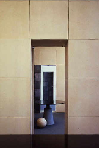
Doors open to reveal carefully composed views.
Their business-like insistence on informed, rational decision-making is no doubt one reason for the Vignellis’ continuing success in the US. More important still, perhaps, is the very European emphasis they place on the process of refinement in a culture that celebrates constant diversity and continual change.
Consider the Serenissimo table that they designed for Acerbis: in ID magazine’s annual design review for 1987 it was singled out as the best piece in its category. Its four massive legs looked back to an earlier table of 1971 in which the glass rested on stainless steel cylinders. But the tension between the cantilevered glass top of the Serenissimo and its sturdy, architectonic base was new, and so was the use of an encaustic technique called Venetian stucco to treat it. As ID’s jurors remarked, it was a stunning union of the old and the new, of tradition and innovation.
‘You must always try to go deeper,’ says Lella Vignelli, still smiling. ‘We are discovering that some of the language was already there in our very early work. At that point it was unconscious but now it’s conscious. And because of that we feel it’s stronger, more mature and more successful.’
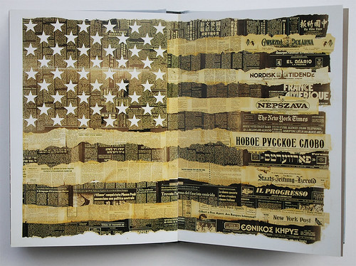
Bicentennial poster, 1976, designed to celebrate the ‘interaction of the different ethnic groups that make the United States’ (from Lella and Massimo Vignelli: Design is One).
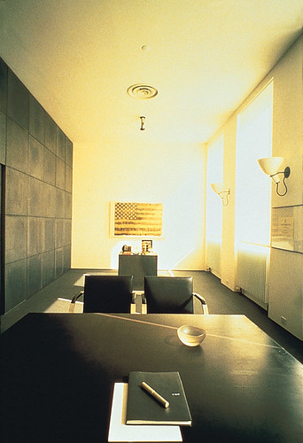
Massimo Vignelli’s New York office, 1985, had a black steel desk and Brno chairs, with the Bicentennial poster affixed to the back wall.
Rick Poynor, writer, Eye founder, London
First published in Designers’ Journal, January 1988
Eye is the world’s most beautiful and collectable graphic design journal, published quarterly for professional designers, students and anyone interested in critical, informed writing about graphic design and visual culture. It is available from all good design bookshops and online at the Eye shop, where you can buy subscriptions and single issues.
