Tuesday, 11:52am
27 July 2010
Musical paintbrush
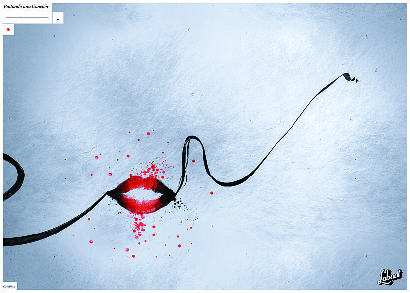
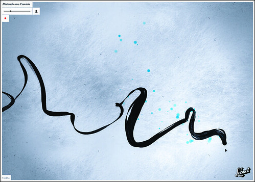
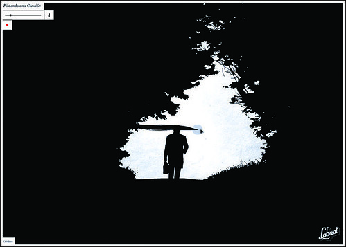
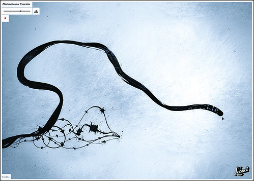
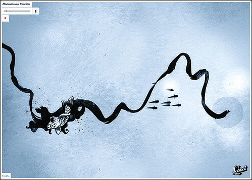
The interactive, calligraphic visualisation for Labuat’s ‘Soy tu aire’

In his essay ‘Sound and vision’ in Eye 76, John L. Walters discusses the challenges of online graphic visualisations of music: ‘Visualisation programs can provide some acts with low-budget spectacle, but these work better in short form. One of the most lauded recent examples is the interactive calligraphic microsite (soytuaire.labuat.com) for Labuat’s “Soy Tu Aire”.
‘“We imagined a conductor moving the baton with her hands,” says Rafa Soto of Herraiz Soto & Co, who devised the site with fellow art director Roman Rodriguez and programmer Jordi Ministral of Badabing! “We wanted to create a tool that allowed us to represent the different intensities of the song,” adds Soto.”
‘Intimate experiences like this, which can be enjoyed on a laptop or iPad using headphones, are perhaps the natural successor to the involvement fans used to feel with twelve-inch sleeves, as something to dote on.’
We spoke to Soto about his award-winning site (it won FWA’s People’s Choice Award 2009, and was nominated for a Music Webby earlier this year):
Eye: How did the idea originate? Was it a commission for a visualisation?
Rafa Soto: The request was quite open: ‘Feel free to do what you do want, guys. And as a gesture of thanks, we’ll pay you peanuts. You know how fucked-up the music industry is today!’ So we started with a blank piece of paper and evaluated all types of ideas and not necessarily any particular type of visualization exercise.
The idea was born out of the need and urge to move your body. And so we thought: what if we create a platform that allows people to express themselves and dance with the mouse whilst listening to music? The song has important orchestral movements and we imagined a musical conductor moving the baton intensely with her hands. A baton traces pictures in the air, and a mouse does the same, but on a screen.
We carried out a test on the streets of Barcelona, replacing the baton with Wii remote control (see below).
Eye: Who was in the team and who did what?
RS: At Herraiz Soto & Co, I worked with Roman Rodriguez, one of our art directors. Together with him we developed the concept, interaction, usability, as well as the storyboard for the whole song. In Badabing we worked together with Jordi Ministral, one of the best Action Script programmers I know. Jordi helped us give form to the concept we had in mind with extraordinary fluidity.
Eye: What was the process that led to choosing the elements: the calligraphic line, the illustrative and abstract images?
RS: We were inspired by the brushstrokes in Chinese calligraphy, that can be extremely precise if painted softly, but at other times very intense. We wanted to create a tool that allowed us to represent the different intensities of the song like a Chinese paintbrush.
The ‘paint-a-song’ concept works in two ways. On the one hand, you are painting music, and on the other you are painting letters, the semantic content of the song. When we were thinking of the paintbrush, we visualized one capable of painting both the music and the content. That is why all the illustrations that you paint with the brush are related and are in sync with the lyrics. The paintbrush not only listens to the music and beats to the rhythm of the song but also interprets the words.
Eye: Are you working on any new projects that use a similar approach?
RS: Nope - we’d love to though!
Eye: Our current issue, Eye 76, is a music design special. Do you think that projects such as ‘Soy tu aire’ might take the place of gig posters and album covers in the hearts of music fans?
Music and technology always have gone hand in hand. A Stradivarius is a product of technology, just as an oboe or a Stratocaster or a Roland. The difference is that technology is today not only responsible for changing the way we distribute music, but also for the way we experiment with it.
I am convinced that technology has so much more to offer us in terms of grand ideas. And these ideas will, in the future, become great promotional campaigns and strategies. If you offer an emotional experience capable of moving people, then I’m sure people will talk about it.
Eye: What is your own experience of music design? Do you have favourite covers, videos or posters that have influenced you and your colleagues?
I do not have a fixed opinion about music design. Sure I could say that Gondry or Spike Jonze influenced our work. But in reality they have had an impact on the audiovisual sector as a whole, and that’s nothing new.
What I do find interesting is how musical design is so much more free and anarchic than graphic design in advertising. Brands take good care of their messages so that people can understand them. That’s why commercial design is perhaps a little too democratic, and, well, predictable.
Eye: On your site, you say: ‘We love the future because we can invent it. We love music because it says things that words could never say.’ What is the future of music design?
Baroque musicians hated classical musicians, classical musicians didn’t like jazz. Jazz musicians couldn’t stand rock. Rock musicians loathed pop. And pop musicians abhorred electronic music. And so on and so forth. I have no idea what the future of music is going to be; however I am sure that we won’t like it, but our children will.
Eye magazine is available from all good design bookshops and at the online Eye shop, where you can order subscriptions, single issues and back issues. The summer issue, Eye 76, out now, is a music special – full contents here. You can read a selection of pages on Eye Before You Buy on Issuu.
Student subscriptions are half price, see bit.ly/EyeStudentOffer.

