Tuesday, 9:41am
30 March 2010
No wasted space
Charles Burns
Dave Eggers
the form of the book
Book design
Graphic design
Illustration
Magazines
Typography
McSweeney’s celebrates its vision of independent publishing

We’ve always had a soft spot for Timothy McSweeney’s quarterly, which wormed its way into our consciousness around the century’s end, and has kept us entertained and stimulated ever since.
Dave Eggers’ little journal has now grown into some kind of publishing empire (35+ books, The Believer magazine, a website, DVD journal Wholphin and the remarkable newsprint San Francisco Panorama) which has attracted contributions from some of the most interesting and innovative authors, artists and designers of the past decade.
A new book, Art of McSweeney’s – to be published in June 2010 by Tate (Europe) and Chronicle (US) – celebrates the journal’s design and visual content.
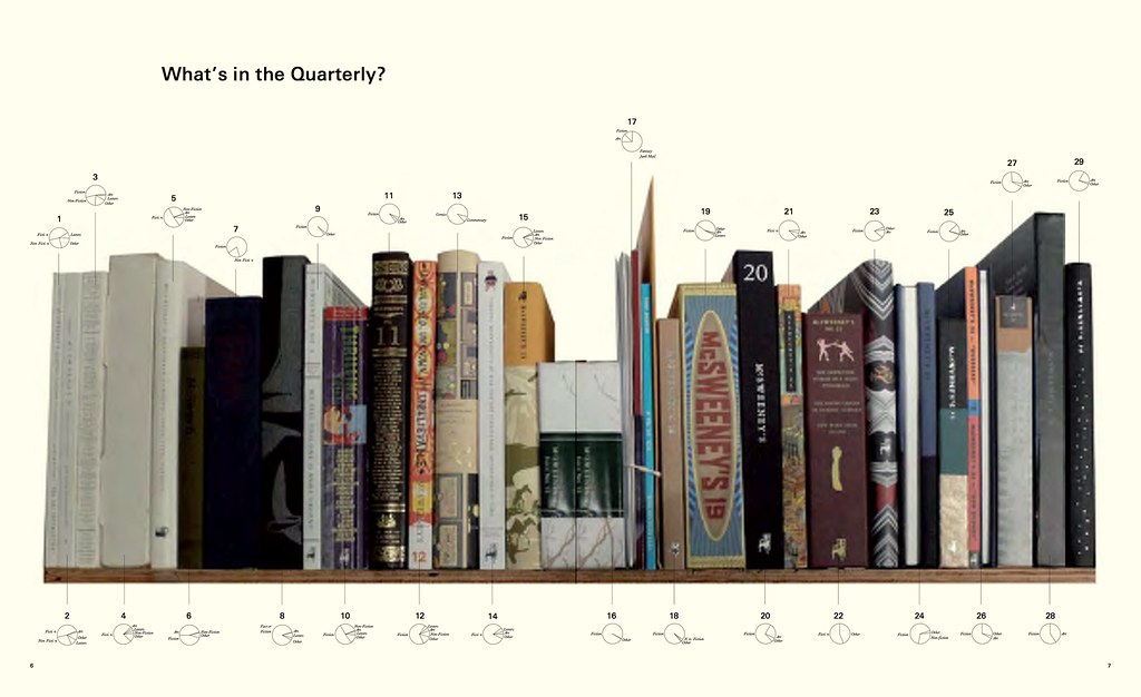
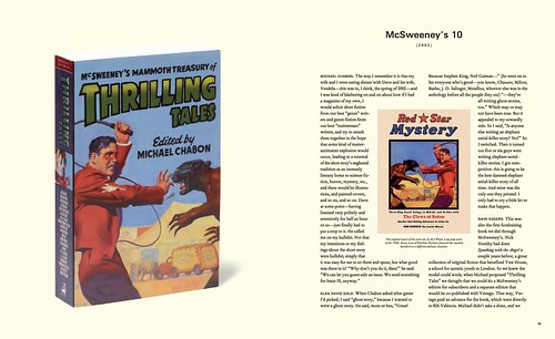
Here’s a glimpse of the book (courtesy of a low-res pdf from publisher Tate), of some of the book’s spreads.
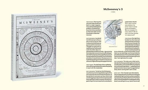

In 2000, Andrew Blauvelt’s ‘Towards a complex simplicity’ in Eye 35 examined the design of McSweeney’s earliest issues: ‘The diagrammatic and the eccentric converge in Timothy McSweeney’s, a literary journal in which words reign supreme,’ wrote Blauvelt.
‘This is confirmed by the admonishment on the cover of issue two: “If words are to be used as design elements then let designers write them.” Prone to confabulation, this small, book-like journal is set in only one typeface, Garamond, about which is provided a five-page pseudo-colophon. McSweeney’s is typically bereft of imagery, especially photography, preferring small line illustrations and the occasional diagram or dingbat … McSweeney’s relies on verbal explication and finds a visual corollary in the diagram.
‘The contents of issue two, for example, are represented by the number of words per article and approximate reading time, and by a pie chart that categorises the offerings by percentage, for example, “Stories that want you to be happy: 19%.” Carefully ordered, but abhorrent of white space … for McSweeney’s the Modernist principle of “activated” white space seems empty, both wasteful and useless, because every place is a seen as a potential space to hold meaning.’
The self-described ‘scrappy internet arm’ McSweeneys.net (aka ‘McSweeney’s Internet Tendency’) continues the droll typography of those early journals, but the actual printed McSweeney’s has expanded and diversified to champion illustration, photography and comic book art alongside fine writing.
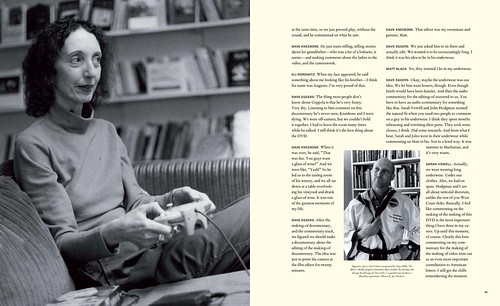
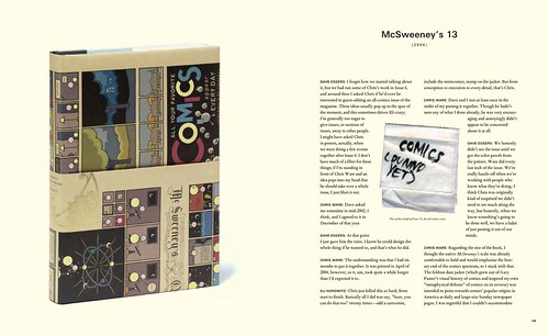
And The Believer has taken on a robust life of its own. Art of McSweeney’s examines Charles Burns’ cover art for the 2007 music issue (below) in detail.

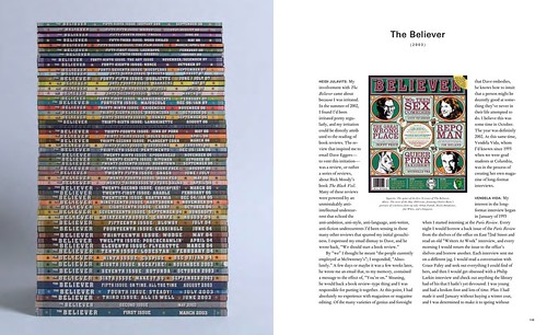
Eggers once outed himself in front of 2000 graphic designers as a former ‘Mac hack’. Quizzed by John Hockenberry at the AIGA Voice conference (2002), he said that: ‘Books now are aloof – they take themselves too seriously.’ There’s an admirable lightness of touch to nearly everything Eggers does, but Art of McSweeney’s shows that he takes his own books very seriously.
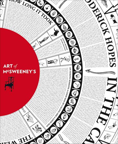
Art of McSweeney’s will be published by Tate in June 2010.
Eye, the international review of graphic design, is a journal you can read like a magazine and collect like a book. It’s available from all good design bookshops and at the online Eye shop, where you can order subscriptions, single issues and classic collections of themed back issues.
