Tuesday, 11:00am
24 March 2015
Noted #66
various designers
David Lane
Tony Seddon
Shelley Gruendler
Gunnar Vilhjálmsson
Gustav Almestål
Oliver Long
We Made This
Richard Linton
Dave West
Gourmand Grotesque 777 & 888, 10x10, Type Team, PLINC and A Typographic Bestiary

Here are a few #TypeTuesday books, catalogues and specimens that caught our attention in recent weeks.
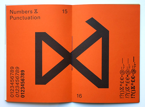
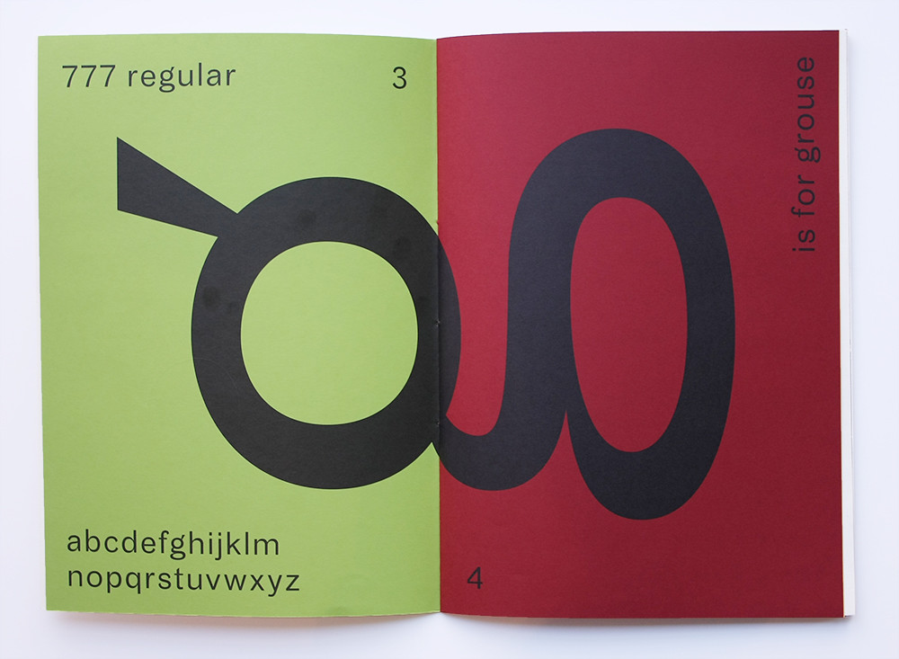
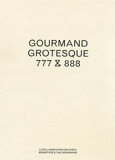
Gourmand Grotesque 777 & 888 is a type specimen for two new bespoke typefaces designed exclusively for The Gourmand, the food and culture journal (see ‘At first bite’ on the Eye blog and ‘Raw like sushi’ in Eye 87). Type designer Gunnar Vilhjálmsson and Gourmand creative director David Lane based the typefaces on seven Grotesque faces from the Monotype archive; they can be seen in Gourmand 5, 2015.
In keeping with the magazine’s content, the specimen includes several recipes – for grouse, bread sauce and pickled mulberries; blue cocktails; flummery; smoked eel salad; stuffed aubergine; and Jeff Koons’s apple dumplings – and a fold-out poster showing a black and white photograph by Gustav Almestål from the series ‘The Hungry Sinner’ (Gourmand 0).
Right and top: Spreads from the type specimen for Gourmand Grotesque 777 & 888 made in collaboration with Monotype.
Editor: Marina Tweed. Design: David Lane and Oliver Long.
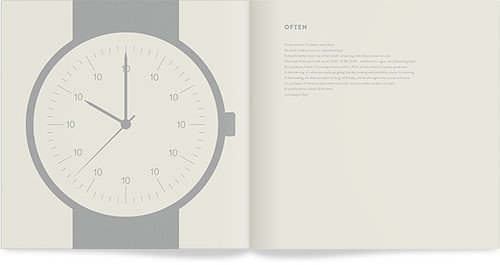
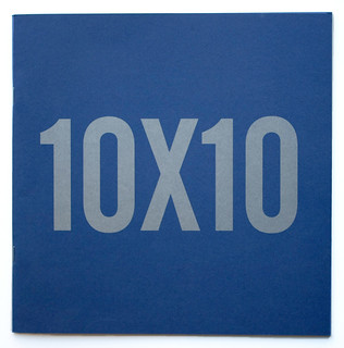
For its tenth anniversary, Alistair Hall’s graphic design studio We Made This published a limited edition book entitled 10x10, with ten different coloured covers that contain ten, ten-line short stories about the number ten – ‘Bitten’, ‘Enlighten’, ‘Heighten’.
Spread from 10x10 designed by We Made This, showing the short story ‘Often’.
The cover of the blue edition of 10x10, a collection of short stories celebrating ten years of London studio We Made This.
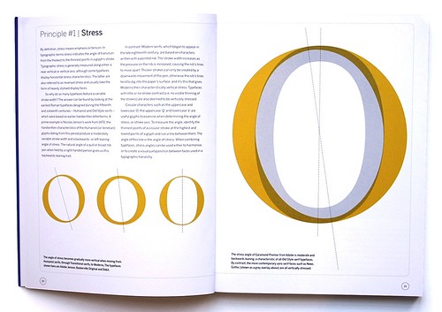
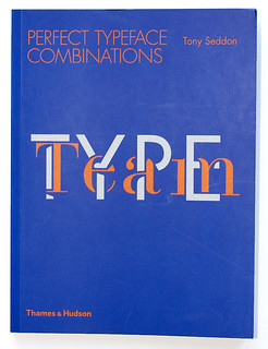
Type Team, written and designed by Tony Seddon, suggests 149 different typeface combinations to inform and inspire, shown alongside commercial examples of similar combinations in use. These are interspersed with ‘principles’ – stress; ascenders and descenders; and serif shapes and bracketing, among others – and ‘tricks’ such as ‘Heirarchy is important’, ‘Weight problems?’ and Don’t go overboard’. In his introduction, Seddon compares choosing ‘type teams’ to making a playlist: ‘It’s important to think about how they relate to one another. Even if you’re a fan of both Motörhead and Mozart, the examples are no more harmonious than if Fette Fraktur were paired with SangBleu.’ Type Team explores both the subjective and objective nature of what makes a combination a success or failure.
A spread from Tony Seddon’s Type Team, highlighting the typographic ‘Principle #1: Stress’.
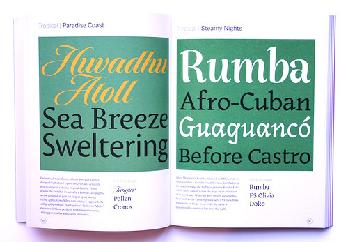
Spread showing Tangier designed by Richard Linton, 2010, paired with TypeTogether’s Pollen and Adobe’s Cronos. Their calligraphic roots, ‘blend perfectly with Tangier’s curves, adding personality and charm to the mix’, writes Seddon.
Tony Seddon, Type Team, Thames & Hudson, £14.95.
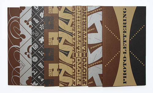
While we were spring cleaning, a bundle of House Industries’ Photo-Lettering Inc. catalogues tumbled on to our desks. All of the typefaces featured within are digital reconstructions of lettering originally designed by Photo-Lettering Inc (or PLINC) who went out of business in the late 1980s. Their type library was bought by type foundry House Industries in 2003 and the display faces available on the online headline generator (up to 40 characters in length) remain available for purchase individually or by subscription. (See ‘Type Tuesday’ about swashes and cookbooks on the Eye blog.)
Covers from type foundry House Industries’ Photo-Lettering Inc (PLINC) catalogues. In its day, PLINC commissioned type from Herb Lubalin, Milton Glaser and Seymour Chwast, among many others.
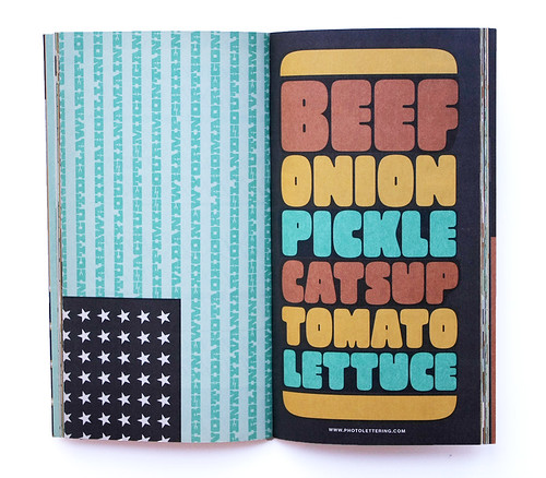
‘Beef onion pickle catsup tomato lettuce’ is set in West Thud, designed by Dave West and digitised by Kris Sowersby. The PLINC collection is available as an online typesetting service at photolettering.com.
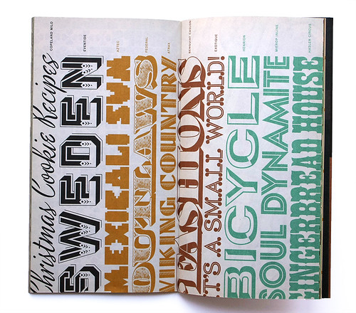
Left to right: Copeland Milo, Eventide, Aztec, Federal, Atrax, Benguiat Caslon, Exotique, Henrion, Mierop Inline and Hasler Circus.
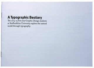
First-year graphic design students at Staffordshire University were given the brief to represent attributes and observations of nature using solely type. The resulting A Typographic Bestiary pamphlet sees students manipulating placement, size and alignment. Their images emphasise typography’s vital role in design and its ability to communicate visual messages.
Spread from A Typographic Bestiary showing work by students Rhys Jones and Clarissa Ecob.
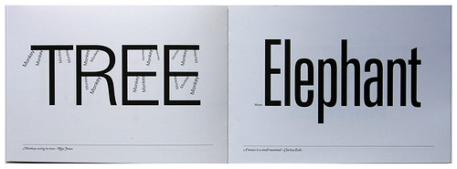
A Typographic Bestiary by the first year graphic design students at Staffordshire University. The project was inspired by Ivan Chermayeff and Tom Geismar’s book Watching Words Move.
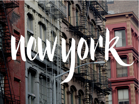
There are also plenty of type events to enjoy this week: ‘Designing Obsidian with Andy Clymer’, tonight at Cooper Union, 24 March 2015, ‘StereoType: New directions in typography’ exhibition at Boston Society of Architects until 25 May 2015 and the ‘NYC: Brush Script’ type camp 27-28 March 2015.
Type Camp ‘NYC: Brush Script’ run by Shelley Gruendler and Laura Worthington.
Eye is the world’s most beautiful and collectable graphic design journal, published quarterly for professional designers, students and anyone interested in critical, informed writing about graphic design and visual culture. It is available from all good design bookshops and online at the Eye shop, where you can buy subscriptions and single issues.

