Monday, 10:00am
7 April 2014
Offset 2014: day two
Bjørn Rune Lie
Sarah Illenberger
Neville Brody
Milton Glaser
Tom Hingston Studio
Maser
Graphic design
Illustration
Music design
Typography
Visual culture
Bjørn Rune Lie, Sarah Illenberger, Hingston, Brody, Glaser and Maser. Pam Bowman continues her coverage of the Dublin Offset conference.

Speaker Bjørn Rune Lie began Saturday’s line-up presenting to a surprisingly full theatre, given that the delegates party was the night before, writes Pam Bowman.
Norwegian illustrator Bjørn Rune Lie, who now lives and works in Bristol, is probably best known for his work with Nobrow. Lie’s work is distinctive, employing limited colour pallettes and a technique he described as ‘drawing with a scalpel’ – he cuts stencils and then works with charcoal. He referenced the book Art Forms in Nature: The Prints of Ernst Haeckel and this influence can be seen in the notebook covers for Nobrow. Echoing many other speakers, he spoke about the importance of personal work, ‘Take time out to experiment and try new things’, said Lie. Bjørn Rune Lie’s personal work is done away from the computer at a separate desk he has for drawing and mark-making.
Bjørn Rune Lie.
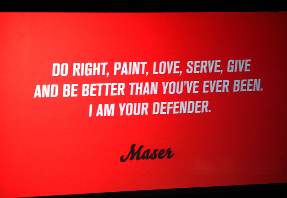
Top: slide by Dublin-based artist Maser.

Sarah Illenberger is a German multi-disciplinary artist and illustrator who works from a studio in Berlin. Illenberger studied graphic design at Central Saint Martins and London appears to be a big influence.
Illenberger stressed the importance of having good content to work with and the joy of being given carte blanche. She values her personal work, which includes experimentation with new materials (including fruit and veg).
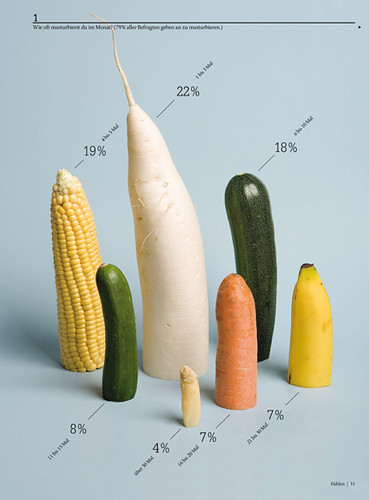
Sarah Illenberger, The Truth about Sex.
Tom Hingston’s talk was titled ‘Heroes, influences and other stuff’. Under the principle ‘Be uncompromising in your approach’, Hingston referenced practitioners whose tools and processes are as interesting as their outcomes – painter Gerhard Richter, photographer Miroslav Tichy, Catalan artist Antoni Tàpies and graffiti artist Dondi.
With his second principle, ‘Explore your identity through your work’, Hingston referenced the work of Martin Scorsese, John-Paul Goude and photographer Samuel Fosso. For the third, ‘Be playful with the language of colour’, he referenced Japanese artist and designer Keiichi Tanami, fashion designer Paul Smith, architect Luis Barragán and film director Harmony Korine, whose Spring Breakers, he said, used colour ‘as a storytelling device’.
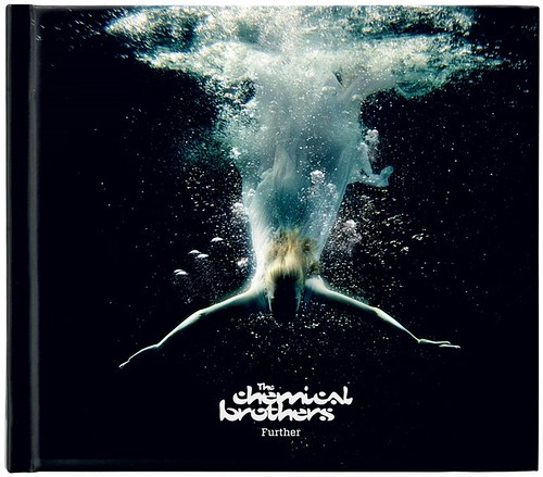
Cover of The Chemical Brothers’ Further (Parlophone, 2010), limited-edition CD. Creative Direction: Flat Nose George. See Eye 76. Design: Tom Hingston Studio. Stills photography: Jez Tozer.
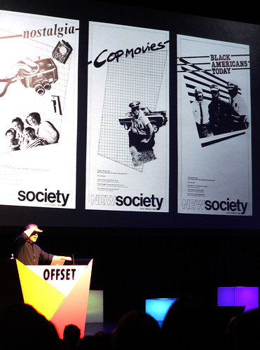
After lunch, Neville Brody began with projects from his student days at London College of Printing (now London College of Communication). He stated, ‘They said I had no commercial potential, and they were probably right.’
Brody talked about recent projects and ended on Fuse 1-20 (see ‘Postmodern jam session’ in Eye 83), with a focus on education and working with students. He said: ‘Take more risks and think about play and failure … we are stuck in a place of fear.’
Brody also talked about his work at the Royal College of Art, including his ‘rebranding’ of the college using the Calvert Brody, a reworking of Margaret Calvert’s typeface Calvert designed with Calvert herself and type designer Henrik Kubel of A2.
Brody is concerned with the current state of funding for Higher Education: ‘I don’t see why the nation should be asking for their students to be investing in the nation’s future.’ (This was in reference to the level of student fees in the UK, which is not an issue in The Republic of Ireland.)
Neville Brody.
Following his appearance on the main stage, Neville Brody was interviewed by Adrian Shaughnessy, who quickly disclosed that for two days a week, Brody is his boss at the RCA.
Shaughnessy asked Brody about education and its purpose: ‘Design education should start earlier in schooling and I think testing should come later.'
'Modern students are lazy, self-satisfied trend-followers. Modern students are energetic, talented and inspiring. Which is it?’, asked Shaughnessy.
Brody responded, ‘All of the above … both, can I say both?’
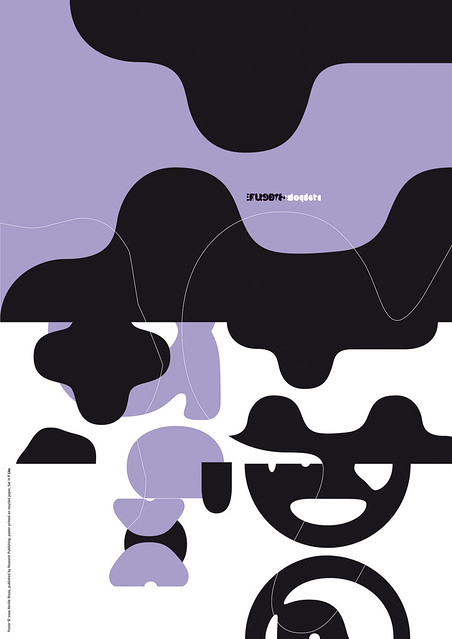
Poster from Fuse no. 18, 2000, set in FF Lies by Neville Brody.
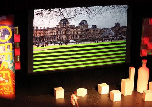
Milton Glaser appeared on screen on the main stage, in a recorded interview with Steven Heller that proved to be extremely popular: the auditorium was full. The discussion revolved around the relationship between graphic design, advertising, communication and money as well as the position of art and process. Heller used Paul Rand as an example of someone ‘planting his flag as an advertiser’ and Glaser talked about him as someone who thought that ‘beauty could be an effective way to reach people and get them to take notice of something.’ The film finished with enormous applause, which was recorded and sent to Mr Glaser.
Milton Glaser in conversation with Steven Heller.
To end day two, Dublin-based artist Maser started his talk by saying that his career began eighteen years ago when he was caught spraying walls with grafitti. He now works in galleries and on public art projects with graphic and lettering work. His talk was full of great examples of collaborative and charitable projects with a strong visual identity, and as a wise head on young shoulders, was one of the highlights of the day.
Maser.
Pam Bowman, typographer, lecturer in typography and joint course leader for graphic design, Sheffield Hallam University
Eye is the world’s most beautiful and collectable graphic design journal, published quarterly for professional designers, students and anyone interested in critical, informed writing about graphic design and visual culture. It is available from all good design bookshops and online at the Eye shop, where you can buy subscriptions and single issues.
