Friday, 8:50am
20 March 2015
Offset 2015: day two
various designers
Chrissie Macdonald
Graphic design
Illustration
Magazines
Visual culture
Aisha Zeijpveld, Declan Shalvey, Steve Doogan, Tomi Ungerer, Veronica Ditting, Anders Eklind and Björn Engström, Chrissie Macdonald and Snask. Anna Kealey continues her coverage of the Dublin conference

Saturday’s illustration-heavy line-up at Offset welcomed artist, author and designer Tomi Ungerer, illustrator Chrissie Macdonald and creative agency Snask, among many others, to the stage, writes Anna Kealey.
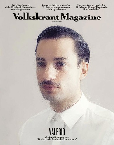
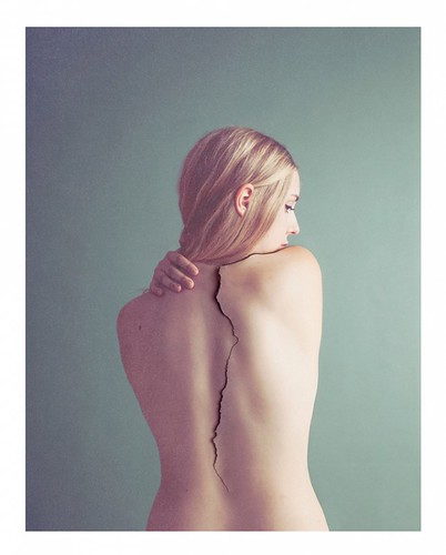
The day began awash with the soft pastels and delicate surrealist imagery of Amsterdam-based photographer Aisha Zeijpveld. She gave a behind-the-scenes look at her conceptual portraits and revealed her analogue production methods that use materials such as cut-out cardboard and frosted glass rather than Photoshop effects.
Aisha Zeijpveld’s portrait of Valerio Zeno for the cover Volkskrant Magazine. Photography assistant: Maurits Weebers.
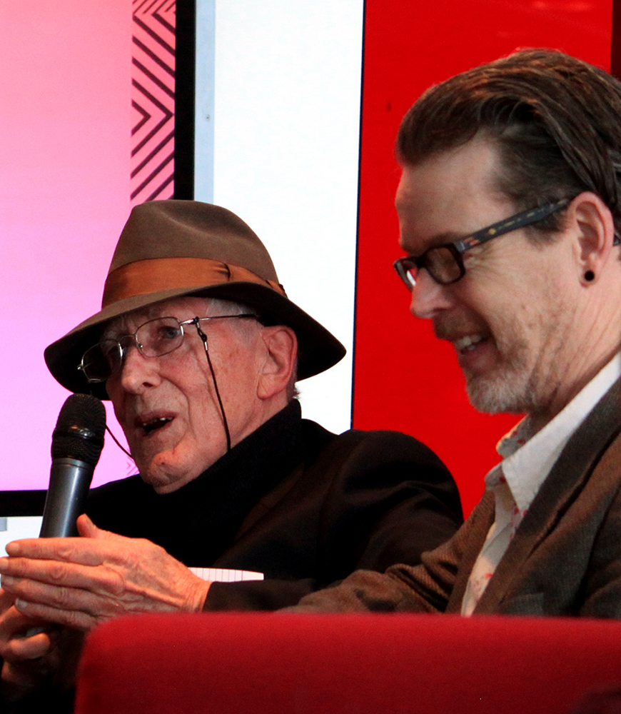
Top: Tomi Ungerer and Steve Simpson photographed by Pam Bowman.
Aisha Zeijpveld’s cover image for Dutch magazine Sir Edmund. Photography assistant and model: Naomi Rothengatter.
Saturday maintained a strong Irish contingent with comic book artist Declan Shalvey and illustrator Steve Doogan both appearing on the main stage. Doogan encouraged the audience to step out of their comfort zone by telling candid stories about his reaction to a bad break-up. He concluded his talk with a video of his sketches from his trip around Asia which silenced the audience and brought some people to tears.
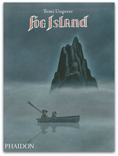
Page from Tomi Ungerer’s Fog Island.
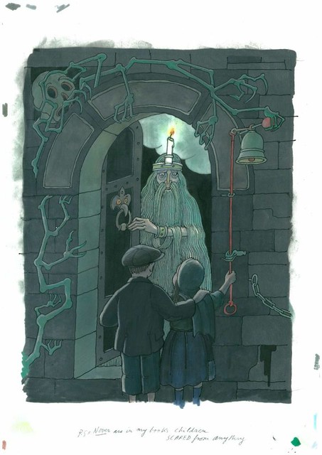
Tomi Ungerer got the first standing ovation of the conference for his conversation with Irish illustrator Steve Simpson. Ungerer urged the audience to be ‘endlessly curious’ with his touching personal journey through life and work. As he spoke, his diverse illustrations whirled by on the screen behind him: ‘If you only illustrate in one style you’re limiting your potential. I was always seeking out new ways to express myself’.
His upbringing in Nazi-occupied Alsace, France meant he ‘couldn’t stand violence or injustice’ and used drawing as a coping mechanism. Throughout his career Ungerer has always had ‘too many ideas’ and recounted that during full moons he would design the majority of his posters in one day and print them himself at Milton Glaser’s Push Pin studio. Ungerer concluded by reading an excerpt from Fog Island, his atmospheric new book which he has dedicated to Ireland.
Tomi Ungerer, Fog Island, Phaidon, £10.95.
On the second stage, the panel discussion ‘Where’s the Unlike Button?’ kicked off by questioning if there is still a place for critical discourse in the design and advertising industries. Panelists Mary-Ann Bolger, Ken Early, Breandan O’Broin, Gavin O’Sullivan and Adrian Shaughnessy responded with a resounding ‘yes’.
Shaughnessy recalled how he was met with massive ‘abuse through the comment section’ after publishing what he considered to be a ‘fairly mild and considered’ criticism of the 2012 Olympic logo on Design Observer. ‘If you criticise anything you’re accused of betraying the profession … there is zero appetite for looking at the social implications of the design, except on the peripheries’, said Shaughnessy. Design historian Mary-Ann Bolger called for a productive critical discourse as opposed to simply ‘liking’ or ‘not liking’.
The panel also discussed the difficulty of being a critic in a creative industry as close-knit as Ireland. One hopeful sign for the future of Irish design criticism is that ICAD’s Campaign: the journal of the Institute of Creative Advertising & Design will be published in October 2015 after a fifty-two year hiatus.
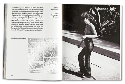
Spread from The Gentlewoman no. 11, 2015.
The Gentlewoman no. 11, Spring / Summer 2015, featuring Björk. It is the first time the magazine has used a colour photograph for its cover.
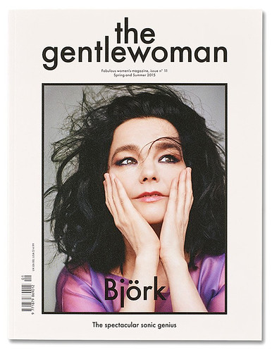
Back on the main stage, Veronica Ditting discussed her elegant editorial design for The Gentlewoman magazine and said ‘Each issue has its own visual vocabulary’. The level of design and editorial consideration is outstanding – Ditting said that the team has been known to discuss a five-word cover line for up to two days.
Forsman & Bodenfors’ campaign banner for United Nations World Food Programme / 805 Million Names.
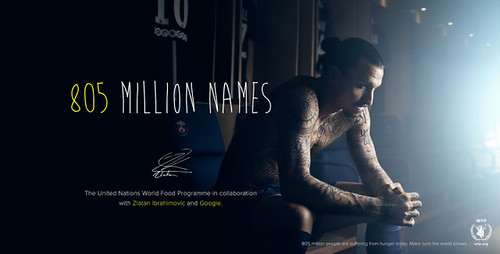
Anders Eklind and Björn Engström from 130-employee strong advertising agency Forsman & Bodenfors engaged a packed audience with the strategies behind their infamous campaigns. ‘People often ask me, if there’s no creative director who decides what is the best idea? Simple: the team’ said Eklind. The agency’s unorthodox structure has been effective – their multi award-winning portfolio includes Jean Claude Van Damme’s Epic Split for Volvo which has received over 100 million views online. The pair concluded their presentation with a powerful campaign created for the United Nations World Food Programme featuring footballer Zlatan Ibrahimović.
Chrissie Macdonald for London’s Pick Me Up graphic arts festival.
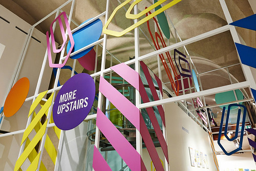
Chrissie Macdonald’s interpretation of London for the illustrated group series I HEART NY-LON is inspired by forgotten objects from Transport for London’s Lost Property Office. Photography by John Short.
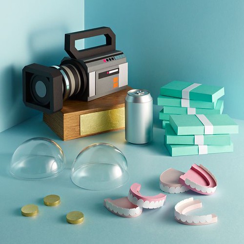
Chrissie Macdonald began her ‘seriousness of being silly’ talk with the seminal project that launched her career – a post-apocalyptic supermarket – and ended with recent her collaboration with Eley Kishimoto. The colossal amount of work Macdonald has achieved in between includes editorial, spatial and advertising campaigns that show how much she has diversified within the seemingly narrow field between illustration and set design.
Macdonald takes her inspiration from physical ephemeral objects and showed images from her collections – everything from cinema tickets to her Keanu Reeves folder, which she keeps in her ‘room of shame’.
Aerial view of the Malmö Festival poster installation designed by Swedish ad agency Snask.
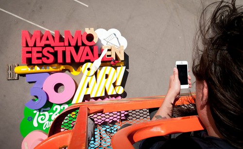
Final speakers from Swedish advertising agency Snask gave a lively and loud presentation with support from musical guests VÄG. Their flashy showmanship was anchored with excellent work, particularly their work for Malmö festival, Scandinavia’s largest city festival.
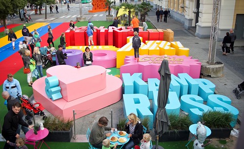
The ambitious 2014 festival poster was an enormous wooden typographic structure comprised of gigantic letters which doubled as an installation at the event. Creative director Fredrik Öst recounted standing on a crane and instructing those laying out the installation to push their entire bodies into the huge 3D letters as a form of ‘physical kerning’.
Snask’s poster installation at ground level. Snask’s creative director Fredrik Öst asked: ‘How often do kids get stuck in typography nowadays?’.
Read ‘Offset 2015: day one’ and ‘Ready, Offset, go!’ on the Eye blog.
Anna Kealey, design educator at University of the Arts London and the University of Gastronomic Sciences, Italy
Eye is the world’s most beautiful and collectable graphic design journal, published quarterly for professional designers, students and anyone interested in critical, informed writing about graphic design and visual culture. It is available from all good design bookshops and online at the Eye shop, where you can buy subscriptions and single issues.
