Sunday, 11:30pm
6 November 2016
Offset Sheffield 2016: day one
Alexandra Greasby
Leanne Berry
Joseph Alec Broadhead
Lucy Doherty
Laura Haddrell
Amy Hart
Cory Metcalfe
Seren Moon
Hannah Page
Takara Start
Stephanie Warren
Jasmine Welsh
Sarah White
Steve Simpson
Pentagram
Ian Anderson
Studio Laucke Siebein
Moving Brands
Moving Picture Company
The Creativity Hub
Marta Veludo
Aaron Duffy
Pip Jamieson
Why Not Associates
Graphic Thought Facility (GTF)
Book design
Brand madness
Design education
Graphic design
Illustration
Reviews
Visual culture
Offset’s first Sheffield conference bought together artists and designers for two days of engaging presentations and lively panel discussions

Last month, a host of speakers from across the design industry came to present their work for Offset Sheffield 2016. Here we publish the first of two reports … written by final-year students at Sheffield Institute of Art’s Graphic Design and Illustration course.
Day One of this first iteration of the conference in Sheffield saw a diverse roster with Main Stage presentations from Studio Laucke Siebein, Steve Simpson, Moving Brands, The Creativity Hub, Pentagram, Marta Veludo, Ian Anderson and Aaron Duffy.
Poster by Studio Laucke Siebein for the 2015 RijksakademieOPEN.
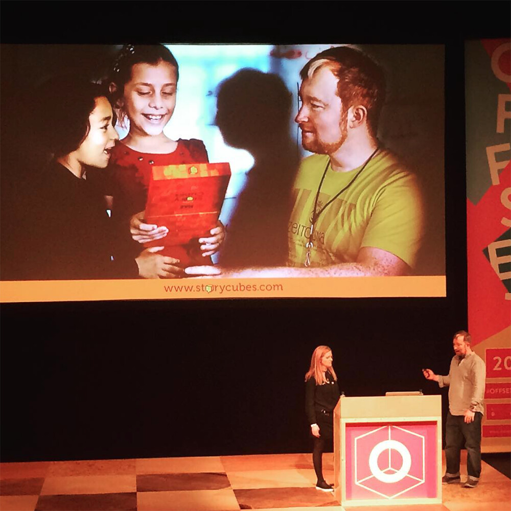
Top: The Creativity Hub on the main stage. Photograph: Joseph Broadhead.
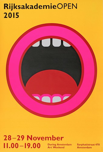
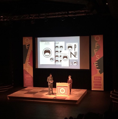
Studio Laucke Siebein launched the day with an A-Z playfully representing their large archive of work. With the acknowledgement ‘we’re cheating a little as we have more than one item per letter’ they kicked off with ‘A’ for Amsterdam and Architecture, before heading into ‘B’ for Berlin and Books, (the studio is based in both Amsterdam and Berlin), ‘C’ for Colour, and ‘D’ for Dynamic and Dutch design. ‘G’ meanwhile allowed them to point out the value of a Good story when presenting or pitching to a client. Later ‘W’ represented Working together, with ‘Z’ evidencing Zig-Zag, or the bumpy creative path where ‘the end is never clear’. For Laucke and Siebein, ‘Making books is the most complex thing within our discipline,’ and they offered the insight that visual identity is never given, but is always hard earned. Their slides explained key approaches and allowed the audience to re-learn the designers’ alphabet.
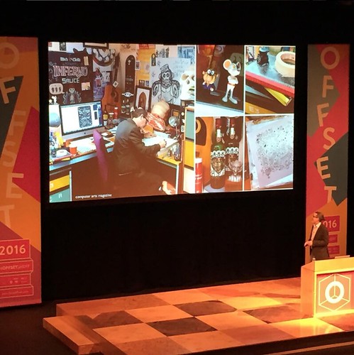
Illustrator and Offset veteran Steve Simpson was on next, with an honest, witty and engaging journey through the ups and downs of his creative life. Speaking about the difficult early years of his career and his efforts trying to establish his style really connected with students in the audience. Simpson shared the source materials that feed his practice – 1950s hand-lettering and the travel advertising of David Klein among others – and he revealed how ideas were developed in his sketchbooks, whose pages he photographs and sends to clients as a way of showing how a project will look. His illustrations for packaging show his attention to every aspect – including little touches such as reworking the often-overlooked bar code into the design itself.
Steve Simpson showing images of his studio. Photograph: John Dowling.
Darren Bowles presents for Moving Brands. Photograph: Charlotte Andrew.

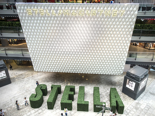
For Darren Bowles, creative director at Moving Brands, current design has become ‘too squeaky pants’ – with projects that are too clean and refined. His maxim ‘embrace collaboration, let clients get messy’ was demonstrated through the process of working alongside clients in rough-and-ready creative sprints to develop ideas, and he called for designers to be ‘unapologetically experimental’ in the work they did. The talk showcased the company’s re-brand of Ireland’s largest telecoms business, Eircom, the new layout and branding for BBC Newsbeat, and finished with the ‘Diamond Sky’ installation for the Stella McCartney store in China.
Moving Brands’ ‘Diamond Sky’ installation for Stella McCartney.
MPC introduced their three departments – Film, Advertising and Creative – demonstrating the company’s skills and adaptability through their work for recent movies such as The Martian, The Jungle Book and soon to be released Passengers. This contrasted to their experimental brand campaigns such as the ‘Boss Everyone’ campaign for Adidas, through which they consciously tried to be ‘unpolished’, and work for Reebok Classics which drew out old-school vibes in a contemporary context.
In the afternoon’s inspirational session, Rory O’Connor and Anita Murphy from The Creativity Hub spoke about their ambition to have young people exercise their imagination. Their best-selling game ‘Rory’s Story Cubes’ was made to raise children’s self-esteem and to make stronger connections through families spending more time together, and ‘The Extraordinaires’ teaches design thinking in way intended to engage young people. Every aspect of the development, manufacturing and sales is considered ethically, and the Hub donates games to schools and charities that might not have had the resources to buy them themselves.
Pentagram partners Jody Hudson-Powell and Luke Powell. Photograph: Shandon Carrington.
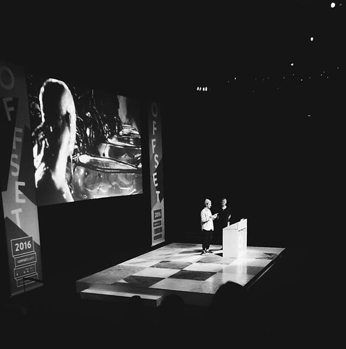
Powell and Powell’s visual identity for the London cafe, shop and workspace Spiritland.
Brothers Jody Hudson-Powell and Luke Powell represented multidisciplinary firm Pentagram. They encouraged the audience to ‘be open to find inspiration even when you least expect it,’ as they explained how projects have been sparked from an item found in a charity shop, or a childhood love for gaming. Technology was a huge component in the presentation, as the brothers gave an insight into a typical day in the Pentagram studio.
Four video intros for Reebok Creative Hub, art directed by Marta & Ricky for agency Soon in Tokyo.
With her Jane Fonda-themed creative workout, Marta Veludo took the Offset audience through a lively warm-up of somersaults, lifting and jogging. Speaking about her work with Reebok she talked about quick responses, actions and reactions. Her quick intro videos revealed a love of handmade, analogue processes and the use of different props, bright colours and textures. With her final ‘stretch up’ Marta offered advice about making time for idleness, boredom and procrastination, since time allows ideas to emerge, something the fast-paced design world often forgets.
Sheffield stalwart Ian Anderson from The Designers Republic (see Eye 71) made clear his love of the city through artefacts from 30 years of making, taking the audience through a portfolio heavily influenced by music – from the faux-future inspired Warp records logo, to collaborations with Sheffield artists Róisín Murphy and Jarvis Cocker.
Aaron Duffy. Photograph: Nikitha Pankhania.
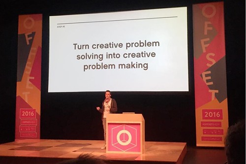
Final speaker of the day Aaron Duffy provided an insightful twelve-step guide to closing the gap between what he describes as ‘doing it for the meal’ and ‘doing it for the reel’. Duffy believes that designers should ‘turn creative problem solving into creative problem making’, applying their skills outside of given briefs by finding solutions to things before they’ve been acknowledged as problems, stressing the importance of perseverance and working together. As for ‘designing for good’, the pro bono work for his project #asktransfolks revealed a need to ‘forget the meal and the reel’ in order to create work that makes a difference.
The more intimate Second Stage at Offset Sheffield provided a mix of presentations and panel discussion. It began with Pip Jamieson, former head of marketing at MTV, who founded the networking and portfolio site The Dots, which seeks to bring new talent to the industry and bridge the gap between senior and junior positions. Recognising that face-to-face contact is important in making make connections she also regularly teams up with internationally known companies, including Google, Facebook and Pentagram to conduct ‘Portfolio Master Classes’. For students and people new to the industry, these events allow them to get in front of these successful figures and receive first hand advice. To a mainly student audience she offered the advice, ‘less is more’, and suggested that it was better to present three projects in depth rather than a series of thinner ones. She considered that setting out the thought process and problem-solving to be as important as a showing a piece of good design. With an eye to the contemporary business arena, she noted how much in demand are UX and digital design skills. As a successful entrepreneur, she was a valuable female role model– given current gender discrimination against women seeking venture capital investment.
Panel discussion at the Squarespace stage at Offset. Photograph: Joshua McWalters.
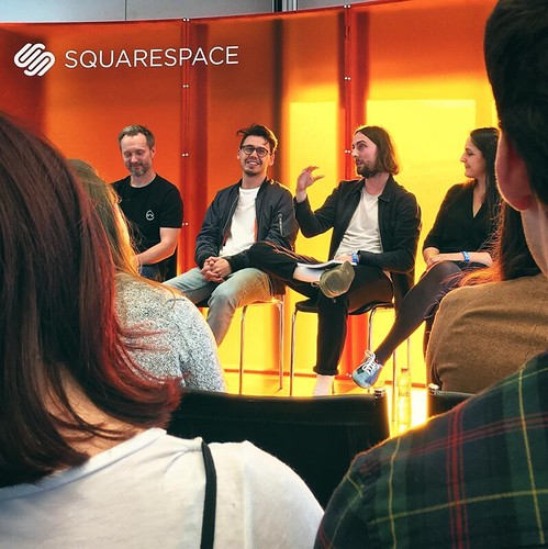
Another opportunity for mutual support was offered in an introduction to the recently launched Squarespace Circle, a community for developers, designers and others using the Squarespace platform. Via Skype from New York, Jeremy Schwartz, the project manager, talked about the features it offered and answered questions. Squarespace then also presented a special screening of their collaboration with actor John Malkovich and director David Lynch, which featured Malkovich playing a surprising range of Lynch’s characters including the Log Lady from Twin Peaks and Henry from Eraserhead.
Eight of 10,000 covers for GF Smith’s promotional pack of digital papers, 2011, designed by SEA Design and Field.
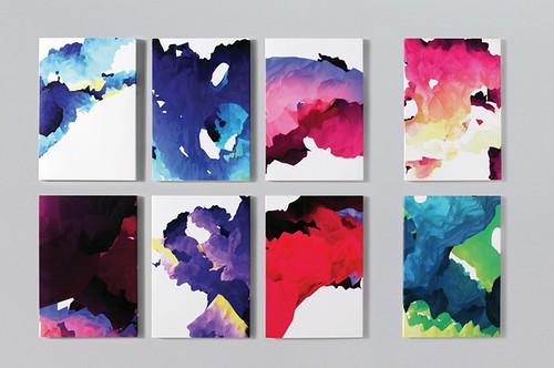
After the break, GF Smith (see Eye 72 and ‘10,000 one offs’ in Eye 80) allowed the audience to indulge their personal paper fetishes, giving a history of the company’s founding and survival through difficult times, including how the Hull office was levelled by the German Luftwaffe and many of the staff called up to fight. They also shared how product development emerged from strange places, as when a warehouse and a thistle field in Scotland inspired the Strathmore Papers.
Andy Altmann (Why Not Associates, see ‘Type as entertainment’ in Eye 7) and Andy Stevens (see ‘Reputations: Graphic Thought Facility’ in Eye 39) shared the wayfinding system they are developing for the new Sheffield Institute of Arts. Intended to allow for the messy realities of the building’s ducts and cabling, and for staff and students to customise at will, it can be repeatedly remade. It draws on the idea of the art school as ‘a place apart’, as a site for experimentation. The project is emerging from research developed by several recent graduates, who are exploring archival material related to the Head Post Office site, and to Sheffield’s Stephenson Blake type foundry (see ‘Sense of place’ in Eye 58).
Studio Laucke Siebein. Photo: Kate Derbyshire.
Student writers from Sheffield Institute of Art: Leanne Berry, Joseph Alec Broadhead, Scott Carroll, Lucy Doherty, Alexandra Greasby, Laura Haddrell, Amy Hart, Cory Metcalfe, Seren Moon, Hannah Page, Takara Start, Stephanie Warren, Jasmine Welsh and Sarah White
Eye is the world’s most beautiful and collectable graphic design journal, published quarterly for professional designers, students and anyone interested in critical, informed writing about graphic design and visual culture. It is available from all good design bookshops and online at the Eye shop, where you can buy subscriptions and single issues.
