Friday, 3:24pm
6 July 2012
Otl Aicher’s interjections

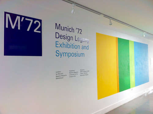
The ‘Munich ’72’ Design Legacy exhibition & symposium in Canterbury

This year marks the 40th anniversary of Otl Aicher’s design work for the 1972 Munich Olympiad, writes Katherine Gillieson. The exhibition and symposium at UCA Canterbury commemorate these in a timely way, as the Olympic torch passes through Canterbury on 19 July and the London games are less than a month away.
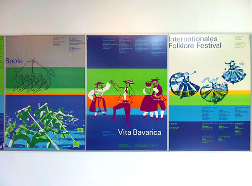
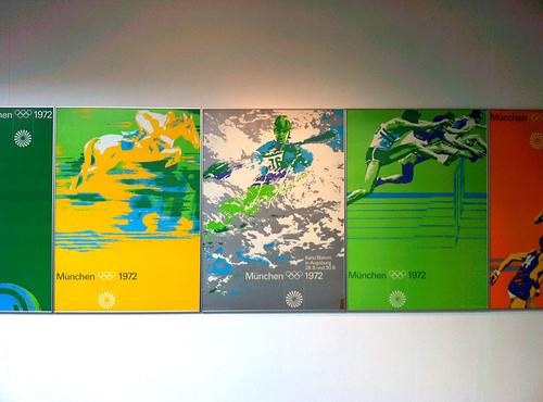
The graphic design of the Munich Olympics is possibly Aicher’s most famous work: the identity system, the iconic posters and the highly influential imagery that set the standard for future Olympic design schemes and more generally, for future 'international' pictogram design.
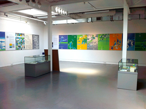
Otl Aicher (1922-1991) was a key figure in German graphic design in the late twentieth century, a co-founder of the Ulm School of Design and a prolific designer and author. The exhibition showcases an impressive series of A0 posters (above and below).
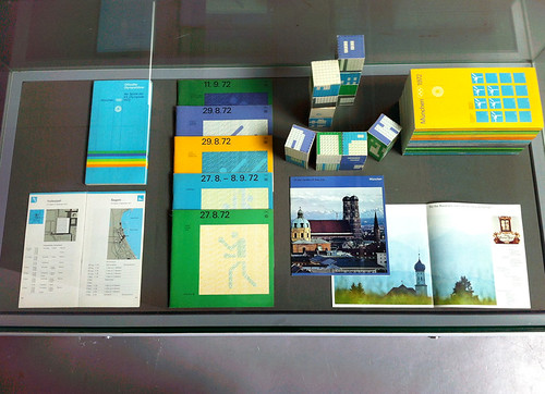
Also on display are a series of posters describing the inner workings and graphic components of the identity system, and a smaller display cases of printed matter including bulletins and guidebooks.
The symposium of 29 June marked the opening of the exhibition, with talks exploring Aicher’s work before, after and during the games, as well as his continuing influence. The day began with a short welcome by British designer Ian McLaren, one of Aicher’s ‘graphic deputies’ during the Munich Olympiad.
The keynote was a videotaped interview between McLaren and David Nelson, head of design at Foster + Partners, with whom Aicher had collaborated on a number of post-Munich transport projects, such as the Bilbao Metro in Spain. A video interview was not the best format for a keynote presentation, but was a lively exchange dotted with Nelson’s recollections of working with Aicher.
Hans Dieter Reichert (Baseline), a co-organiser of the conference, spoke mainly about Aicher’s work as a designer and creator of books. Aicher’s considerable written output touched on a diverse subject matter across design, history and politics. His publications demonstrate his sparse, modular, classically German Modernist style. Reichert reflected on the impact of Aicher's design, both from personal experience and as part of his wider influence from Bauhaus and Ulm.
Another contribution was an interview (via video) with Klaus Jürgen Maack, managing director of the architectural lighting company ERCO and one of Aicher’s longstanding clients. Maack’s reflections on Aicher’s work for his company underscored one of the day’s themes – how Aicher’s design philosophy emphasised a certain type of designer / client relationship; one that was particularly fruitful. For Aicher, the designer is an author and an instigator, working in service of society and fundamentally as part of a team.
Ian McLaren’s presentation that followed Maack considered the graphic design of the Munich Olympics, supported by shots of his extensive collection of printed matter and photographs. He reviewed the overarching design system and how it combined bold colours, typeface (Univers), imagery and icons. His personal reflections on producing various elements (bulletins, guidebooks, posters) included some fascinating insights into the realities of producing printed matter in the early 1970s, as well as some of Aicher’s more memorable interjections.
The audience saw some source photographs for the labour-intensive drawings created for the posters. McLaren also recalled how the Munich games nearly closed down when the terrorists struck – less than 100 metres from his desk.
In the afternoon session, designers such as Lucienne Roberts (Lucienne Roberts+), Tony Brook (Spin) and Mason Wells (Bibliothèque Design , who lent key works to the exhibition), talked about Aicher's current influence.
The exhibition, organised by the University for the Creative Arts and Baseline magazine, is open until 31 July 2012 at the Herbert Read Gallery, UCA Canterbury.
See also ‘How Mexico went for gold’, on the Eye blog and ‘Time after time’, Mason Wells’ article about an Olympic Games schedule from Munich 1972, Eye 63 col. 16 Spring 2007.
Eye is the world’s most beautiful and collectable graphic design journal, published quarterly for professional designers, students and anyone interested in critical, informed writing about graphic design and visual culture. It is available from all good design bookshops and online at the Eye shop, where you can buy subscriptions and single issues. Eye 82 is out now, and you can browse a visual sampler at Eye before You Buy. Eye 83 has just come off press.

