Monday, 11:02am
14 December 2009
Pan Am’s Helvetica dreamtime
How I unearthed a forgotten chapter in corporate design history

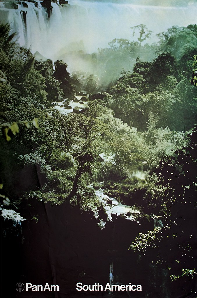
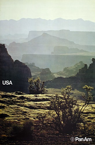
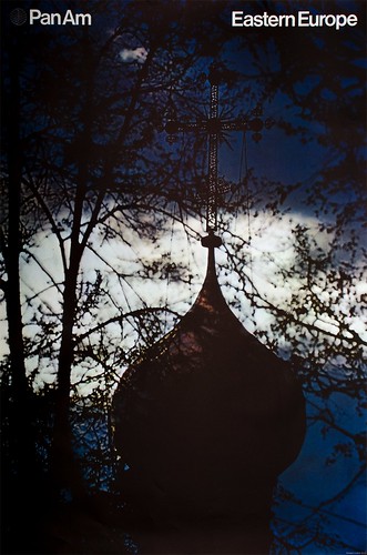
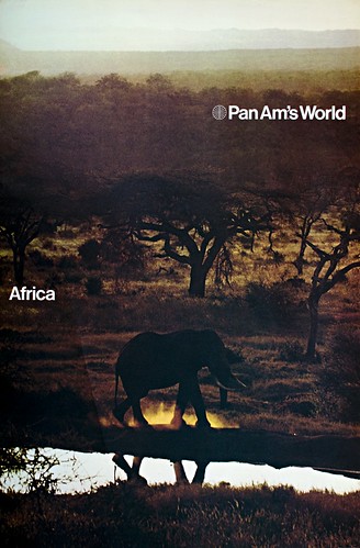
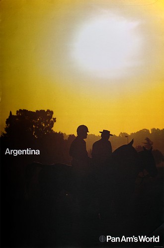
I came across six Pan Am posters while visiting the ‘Here Is Every. Four Decades of Contemporary Art’ exhibition at the Museum of Modern Art in New York, writes Frederico Duarte.
At the time I was looking for a subject for my ‘Design as Protagonist’ project, part of Steven Heller’s Researching Design class at D-Crit (the MFA in Design Criticism at the School of Visual Arts). Also known as the ‘No Google Class’, this course urges students to find more about a designed object without recurring to Internet search engines, in order to build a narrative around its manufacture, design, application and influence.
When asked if he knew these designs, Heller replied: ‘I don't know the posters, but would love to know more. It also goes to the heart of how “modern” Pan Am was in its approach to graphics. Worth a book.’ I knew I was on to something.
At MoMA’s Architecture and Design archive, cataloguer Paul Galloway found ‘a whole lot of nothing’ on the posters apart from the 1972 shipping receipts. At the Chermayeff & Geismar (C&G) collection at SVA’s Milton Glaser Design Study Center and Archives, archivist Beth Kleber showed me other posters and materials from that period, which proved MoMA’s six were part of a larger set, but nothing else. I never got a reply from the Pan Am archives at the University of Miami. I simply had to go to the sources to find my answers.
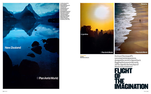
Below: Opening spread from ‘Flight of the imagination’, Frederico Duarte’s article about the Pan Am posters in Eye 73.
What followed could be an experiment on the six-degrees-of-separation theory. On the week I contacted the C&G studio, Michael Bierut told me during his first class he knew the posters and how to reach Bill Sontag, a designer at C&G who worked on them – via Joseph Bottoni, a professor at the University of Cincinatti, Bierut’s alma mater.
I later met with Ivan Chermayeff himself, after speaking on the phone with Bottoni, Sontag and Bruce Blackburn – another designer who worked at C&G and whom MoMA wrongly credited as an author of the Bali poster.
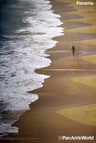
While looking at the posters for the first time in decades (including one which according to him could not have been designed at C&G and was swiftly thrown away), Chermayeff told me a few interesting anecdotes about the redesign, but not the whole story. The same day I met with George Tscherny, who also worked for Pan Am and whose work is also in the SVA archive. He gave me Patrick Friesner’s email and told me to get in touch with him: our correspondence began that evening. Friesner, a Briton now living in northern Dordogne, was at the time – under CEO Najeeb Halaby – Pan Am’s Head of Sales Promotion (not of Sales and Promotion, as I wrongly stated in the article). In his many witty and insightful emails, he revealed to me the fascinating process behind Pan Am’s short-lived Helvetica dream.
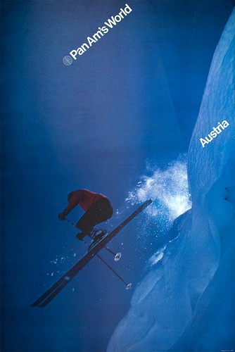
But I still wanted to understand how these posters ended up in MoMA. Chermayeff told me he was not involved in the acquisition process, despite being a trustee and consultant at the time. I then wrote to Christian Larsen, who while at MoMA’s A&D department almost included the Hawaii poster in the 2007 Helvetica exhibition he curated. Larsen got me thinking if Mildred Constantine, MoMA’s Associate Curator of Graphic Design from 1943 to 1971, had acquired the Pan Am posters during her last year at the museum, as part of her many other ‘Swiss school’ acquisitions from the likes of Armin Hofmann, Josef Müller-Brockmann, Manfred Bingler, Tomoko Miho and Massimo Vignelli. That would explain why there are no posters from 1972, only from 1971, in the collection (an easy way to tell the date: Logo + Pan Am = 1971, Logo + Pan Am’s World = 1972).
Connie Butler, MoMA’s current Robert Lehman Foundation chief curator of drawings who included the Chermayeff’s posters in an exhibition dedicated to the past 40 years of the museum’s collection, told me on the phone how surprised she was with their success: she got more feedback from fellow curators and artists about them than about any other of the more than 100 works on show.
Then, on the day we handed our research results (in the form of posters and books) to Steven Heller, Emily King visited our department on West 21st Street. While looking at my poster, she said ‘I think Alan Fletcher did work for Pan Am, too.’ Friesner had never mentioned Fletcher, but I also didn’t ask. By then I could finally Google the words “Pan Am Posters”, so I did. Not only I got immediate proof Fletcher had indeed worked for Pan Am, I later learned from Friesner how he got the job – another six-degree-of-separation-story, worthy of its own blog post: think Mad Men with extra air miles.
Another thing I learned from Google was that none of the people running the many Pan Am memorabilia websites, dedicated as they can be, seems to have even heard of these posters. Few have found any of the materials designed between 1971 and 1972. Judging by these sites (or eBay, for that matter) it was as if this redesign never existed.
Pan Am is no longer. But the story of its redesign, as told by the people behind it, proves personal connections, proximity and chance are all makers of (design) history. How many other great design stories are left untold?
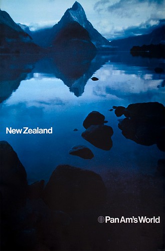
You can read Frederico Duarte’s article ‘Flight of the imagination’ on the Eye website and in Eye 73, a photography special issue.
Eye is the world’s most beautiful and collectable graphic design journal, published for professional designers, students and anyone interested in critical, informed writing about graphic design and visual culture. It is available from all good design bookshops and online at the Eye shop, where you can buy subscriptions and single issues.
