Monday, 11:51am
6 July 2009
Perez Hilton meets Hogarth

Why Mother London chose political cartoons for its Schweppes ads

While writing ‘Drawn into conversation’, his article for Eye 72 about brands and illustration, Steve Hare talked to Mother
London, the agency behind some highly visible advertising campaigns for Stella and Schweppes. In this interview, Mother’s Kyle Harman-Turner and Josh Engmann talk to Steve about the use of David Watkins’ political cartoons for Schweppes’ ‘Experience Matters’ campaign.
Steve Hare: There are several possible reasons for commissioning illustration or particular illustrators – all of which probably play some role in any particular campaign:
- You are a huge champion of illustration and want to keep it in the public consciousness.
- It’s the perfect fit for the brand and the message.
- It’s cheap.
Which of these apply in the case of Schweppes’ ‘Experience Matters’?
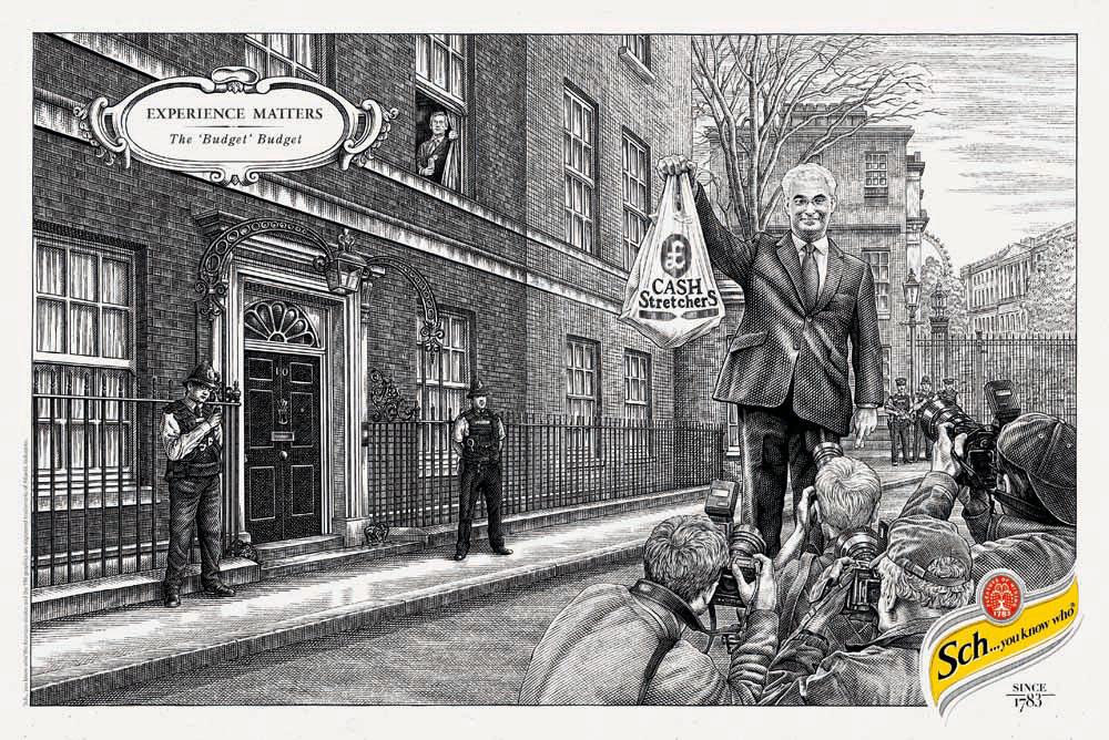
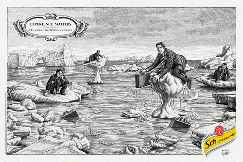
Mother London: Nobody was using political cartoons. This form of illustration is a forgotten medium, often just a small space in daily newspapers that gets overlooked. When you consider their short turnaround, they’re actually amazing. We thought it would be interesting to put that style onto a bigger stage. The intention was to create something that felt less like advertising, and more a piece of entertainment.
As a brand, Schweppes has a history with illustration, and satire in particular, that goes back to its Punch cartoons in the 1940s. We looked to carry that history on, but using a different illustration style.
The price wasn’t really something we considered too much initially, it was more about the ideas being good, and going from there. Being able to react to news and create quick response content is very exciting, and feels like a fresher use of media than say one TV ad.
SH: Is it any part of the role of an art director or ad agency to act as a curator of changing visual culture? How often are you in a position to help set trends, rather than follow them?
Mother: Art-directionally there’s a very simple rule: to make the work stand out. We don’t really look at setting trends, we just do things that we think are interesting, and if we get it right, people often enjoy it. Visually, to have huge billboards sites and newspaper pages that showcase your work all around the country is great opportunity. We wouldn’t want to waste it by doing something unoriginal.
SH: Are clients today more responsive to the use of illustration – and bolder as to how far they'll let you take it?
Mother: The client has been very supportive. Owing to the quick turnaround, we have to run quite a tight ship, but we’re all pulling in the same direction, so it’s going well. We hope that as the project goes on, the momentum will build, and we’ll be able to push more and more work out. Naturally, there are small bits and bobs that the client needs to change, but we like to let the illustrator have a freedom to draw, and then change details after.
SH: Is there a vibrant and sustainable community of illustrators who all benefit from the patronage of brands and ad agencies?
Mother: Absolutely; advertising is a great way to showcase illustration. Our illustrator has his work across all of the daily newspapers, and on billboard sites across the country. We’ve also set up an ‘Experience Matters’ blog, where all of the illustrations are showcased and can be discussed. Towards the end of the campaign we have ambitions to pull all the executions together into a book, and to put on a show of the work in a gallery space.
As an agency we’re very supportive of illustrators, and other creative people in general. Only recently we put on a show with Anthony Burrill in our reception area.
Last Christmas we also set up a ‘Naked Santa Life Drawing’ session in the same space. Everybody was invited to come and illustrate a Santa, sat in nothing more than his hat and boots. The response was overwhelming, and the illustrations formed a show.
SH: How important is new talent – and is the education system keeping this pool fresh?
Mother: We want to work with young, hungry talent. We’re constantly searching blogs and seeing portfolios in the hope of finding someone that has something a bit different. The colleges and universities are a great way for talented people to meet and create work. Students email us on a daily basis asking us to come in with their work. It’s great, and we enjoy scouring the end-of-year shows at the universities to find the best talent.
SH: What influences and inspires you? Graffiti? Album covers? (Are there still album covers?) Books and magazines? Directories?
Mother: I think putting yourself in unusual situations is one of the best ways to find influence. With Mother being positioned in East London, it’s a great place to go and look for inspiration. You can walk down one street and find a modern pop-up clothing shop. Walk down the next and you’ll find an old rag and bone trader.
Blogs are also a great way to see lots of content very quickly, but you can take influence from everything and anything. We always keep a notepad nearby to jot thoughts and observations, as well as a folder on our desktops to drag interesting items.
SH: Is there a trend towards more illustration at present? If so is it simply a trend, which will change – or are there more deep-rooted reasons – which are going to make it a sustainable and growing trend – such as the economic downturn; client budgets; fragmentation etc?
Mother: Certainly illustration is a cheaper option, so we may see more in the future. Though, in general, illustration is just a far more charming way to showcase work. Showing the quirks and imperfections of something has a quality you can’t achieve in lots of other media. Though, that’s not to say it’s necessarily the end for other media – if people have interesting work, they will still be used.
SH: Why was illustration used in this particular campaign?
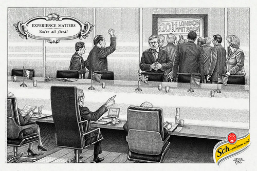
Mother: Schweppes is known for its history with satire, so we looked back to the original satirist himself, William Hogarth. The idea was to recreate Hogarth-style drawings but of contemporary political or celebrity gaffes. It’s kind of ‘Perez Hilton meets the eighteenth century’. In terms of the style of illustration, it was difficult to find someone with such a detailed line stroke as Hogarth, but luckily we found a very talented guy in David Hopkins.
SH: I'm interested in this very tight timescale that you have imposed on it – to come up with a timely news story and respond to that, get it approved and in print in this short period – can you expand on that a little: why, and how?
Mother: It’s a really exciting challenge. It needs a tight client and agency relationship. At times it seems like an impossible workload, but somehow it all comes together. If you think of the satirical cartoonists out there, they have a matter of hours to turn something around, and we certainly have a much greater appreciation of the job they do. Just recently, we managed to react to a news story and get an idea approved in one day. Our illustration was then completed a day later, and we planned to have it in the daily papers within 48 hours or so. Then, at the last minute, the papers refused to run the ad – so there are always hurdles, but it's good fun, and they look great.
One of the best things about the campaign is the topicality. Being able to position a cartoon on the G20 Summit around an article on the same subject is a really good use of media.
For more on how big brands are turning to illustration, read ‘Drawn into conversation’, by Steve Hare, in Eye 72.
Eye is the world’s most beautiful and collectable graphic design journal, published quarterly for professional designers, students and anyone interested in critical, informed writing about graphic design and visual culture. It is available from all good design bookshops and online at the Eye shop, where you can buy subscriptions and single issues.


