Thursday, 7:30am
30 July 2009
Pimp my type
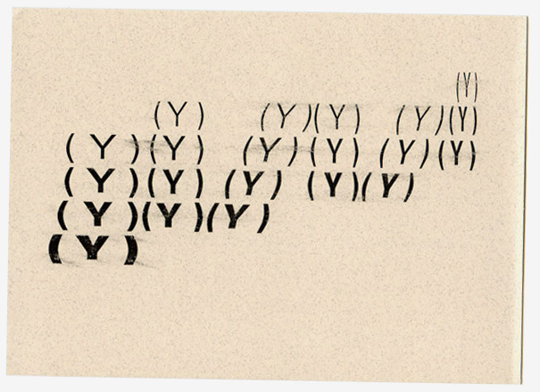
Did ‘Type Tart Cards’ face the grotesque reality of prostitution?

‘SHE’S BACK! RAUNCHY ROCKWELL THE SLAB SERIF … KERN ME SILLY’. Enter the world of ‘tart cards’ seen through the eyes of graphic designers, write Annabel Fraser and Selina Swayne.
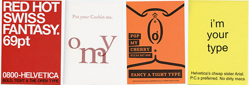
With a brief set by UKType [correction] and later continued in collaboration with Wallpaper*, both professionals and students alike were asked to produce a tart card ‘either for a typeface or a letter of the alphabet.’ Hundreds entered the challenge and their work can be seen in the recent ‘Sex Issue’ of Wallpaper*.
Top: card by ABAKE
Below: a selection of Type Tart Cards from (l to r) Amit Patel, Alasdair Boyce, Sam Grey and Chelsea College.
Many of them use wit (we will never be able to look at Mrs Eaves, Georgia or Cochin in the same way again), some are tasteless, crass or oblique, but only one card questioned the reality behind these aesthetic objects.
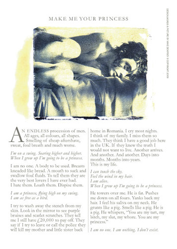
Mike Dempsey’s card (below) and response to Wallpaper*’s request went straight for the jugular: ‘He towers over me. He is fat. Pushes me down on all fours. Yanks back my hair. I feel his saliva on my back. He grunts like a pig. Smells like a pig. He is a pig…’
[See also Mike Dempsey’s blog, ‘Not a trivial subject’.]
Almost all other cards skimmed the surface in what seems a complacent attitude to a graphic design brief. No other cards touched on the grotesque (not Grotesk) reality of life as a prostitute (although we cannot say how many of those asked simply did not undertake the task as a stance in response to the brief).
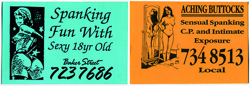
Society’s attitude to prostitution varies considerably, and the old adage that ‘it’s the oldest profession’ allows us to disengage from this highly complex and emotive issue. A look at the history of the tart card (below) underscores this complexity: the reason they were so prevalent in London in the first place was because the law forbid prostitutes to advertise in the yellow pages. Yet a crack down on this means of advertising in 1999 meant that the ability to operate off the street and out of the pimp’s hands was severely restricted, exposing women to further danger.
Whatever your opinion about prostitution, it is surprising that the brief – and most entries – appear to accept this form of selling sex. So while we could discuss, given this premise, whether tart cards succeed in their mission, the project makes us wonder instead at what point a designer’s moral viewpoint meets such a brief.
When architect Arne Quinze designed a brothel in Antwerp, it provoked vehement debate. This project, however, provoked little more than embarrassed amusement among some, and (according to Wallpaper*) little negative feedback. As one viewer at the opening recalled, never had she been to a private view where people were trying so hard not to look at the work. Or did they not want to be seen looking?
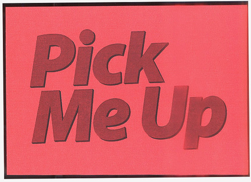
Faced with a project based around such a difficult social question, would it not be better to tackle it with more circumspection? Although MagCulture’s Jeremy Leslie went slightly off-brief, he contributed a set of cards that highlight the similarity between the words used on tart cards and the mastheads of women’s magazines (see magculture.com). This avoided complacency (and naïvety), while cleverly using the tools of the trade to provoke debate (below).
See also: ‘Tart art’ by Tom Phillips, Eye no. 34.

