Sunday, 9:00am
7 December 2014
Plus is more
Type Plus
Edited by Tony Brook and Adrian Shaughnessy<br> Designed by Spin, Unit Editions, £45<br>

The cover of Unit Editions’ Type Plus highlights the book’s arguments, writes Sarah Snaith.
Designers do not always need to prioritise typographic legibility; the designer is also an author of content; and experimentation can push designers to supersede stylistic trends and visual clichés.
Type Plus, edited by Tony Brook and Adrian Shaughnessy, designed by Tony Brook and Claudia Klat.
Top: Atelier d’Alves’s Mãos poster, 2013 (left) and poster for Commedia Buffa [comedy opera] in Porto, 2011 (right).
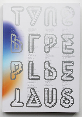
Type Plus is a follow-up to Unit’s Type Only, a large-format book with posters, flyers, prints, book and magazine covers, illustrations, typefaces, album covers, type-driven photography and even wrapping paper. It includes interviews with design studios Non-Format, TwoPoints.Net and designer Erik Brandt. Historical background is provided by familiar works such as Gottlieb Soland’s Grammo-grafik poster (1957), April Greiman’s Pikes Peak Litho guide (1992) and Paula Scher’s Public Theater posters (1994-1995).
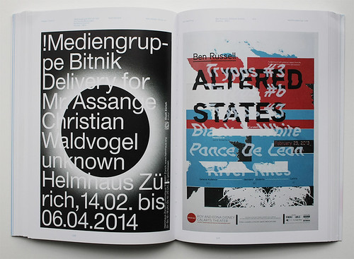
Kasper Florio’s poster for !Mediengruppe Bitnik and Christian Waldvogel, 2014 (left) and Matthew King’s poster for Ben Russell: Altered States, 2013.
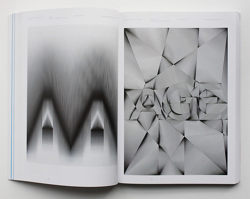
Berger + Stadel + Walsh’s graphic experiment with ‘AA’ and ‘AGE age’, 2013.
An essay by typographer / critic Yves Peters argues that the concept of typography as a ‘crystal goblet’, proposed by Monotype’s Beatrice Warde, is a fallacy, and suggests that supposedly ‘neutral’ typefaces are ‘rife with connotation’. Peters comments on the increase in design-literate viewers, writing: ‘We now live in a visual environment that constantly sends out codified messages just beneath the surface of the written word … We have subconsciously learned to navigate this environment …’
Posters from the D/I/M/E/N/S/I/O/N/S series designed by My Name is Wendy, Carole Gautier and Eugénie Favre, 2013.
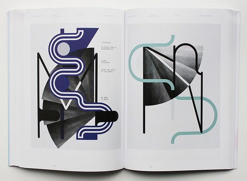
Much of Type Plus shows examples of graphic design that allows letterforms to be manipulated to abstraction for the purpose of advancing meaning. There is work by practitioners such as Matthew King (USA) and Maziyar Pahlevan (Germany), and studios such as My Name is Wendy (France) and Atelier D’Alves (Portugal). King’s film poster for Ben Russell: Altered States, screened at Redcat in Los Angeles in 2013, borrows from the visual language of analogue technology, including maps and the American flag – overlaid letterforms bend and wave like a weak signal on a television screen amid red, white and blue blocks of colour and fragments of a world map.
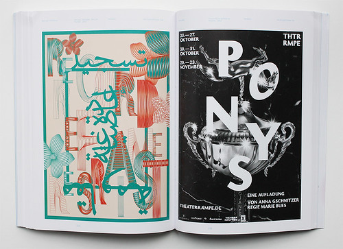
Maziyar Pahlevan’s ‘Record, Reframe, Resist’ poster (2012) was designed for a Friday Late at the Victoria and Albert Museum in London, to coincide with the ‘Light from the Middle East’ photography exhibition, using Arabic script with wireframe Roman characters among oversized flower blossoms.
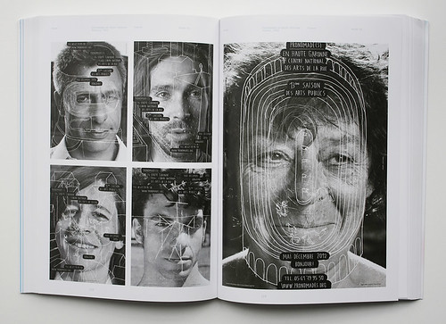
Helmo’s posters for Pronomades en Haute-Garonne, the public art season in Encausse-les-Thermes, France, 2012.
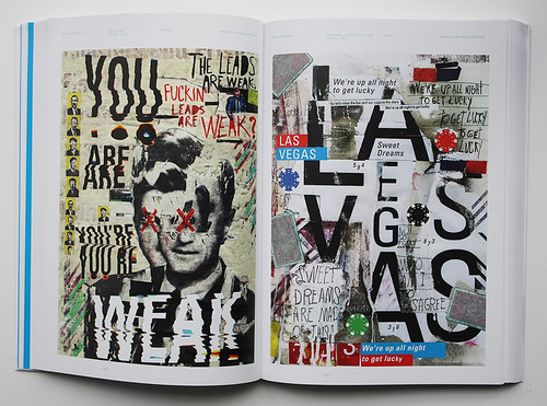
Marcos Faunner’s posters, The Closer, 2013 (left) and Las Vegas, Show Us Your Type, 2014 (right).
Maziyar Pahlevan’s ‘Record, Reframe, Resist’ poster, 2012 (left) and Panorama’s poster for Ponys / Eine Aufladung, 2013 (right).
Sarah Snaith, design writer, London
Eye is the world’s most beautiful and collectable graphic design journal, published quarterly for professional designers, students and anyone interested in critical, informed writing about graphic design and visual culture. It is available from all good design bookshops and online at the Eye shop, where you can buy subscriptions and single issues.
