Wednesday, 6:30am
29 April 2009
Q&A with Daniel Eatock

I used to think ‘canon’ was the same as ‘cannon’, and it could kill you

Online exclusive. For other interviews on the theme of 'Who needs design history?' see Eye 68 on the Eye site.
1. What do you think is meant by ‘the canon’? Do you think about it, and do you read design history books?
I originally thought ‘canon’ was the same word as ‘cannon’, and that the phrase implied that graphic design history would kill if it was fired at you.
I do have design history books, and have been to many design history lectures. It is not a passion. I feel obliged to have an understanding, to be able to move forward covering new ground without repeating the past.
2. Does this kind of design history have relevance to your practice?
Yes, as a design student my work was a direct response to recent GD history (Ray Gun etc.) and a return to clarity, logic and objective rational communication, but with a conceptual twist. It was an attempt to ‘dematerialise’ or remove the graphic element from graphic design.
3. Where did you learn about design history (if at all)?
Started to learn at college, still learning, it is ongoing. I forget things very easily, so often have to relearn. Teaching is a good way of relearning and refreshing.
4. Does history have any relevance to the new technology and techniques you’ve had to master in your work?
So many things are possible with new technologies. Often it’s good to impose restrictions and limitations based on principles from established mediums. For example, Indexhibit.org [created by Daniel Eatock and Jeffrey Vaska] is a website format that consists of an index and an exhibit area. It is a very basic structure that can be navigated intuitively by most users in the same way as pages in a book are turned, or the reverse of a postcard holds the message. The rejection of possibilities and the embracing of restrictions gives the format a simple logic and structure that new explorations with technology often ignore or hinder in their hyper advanced search for the new.
5. If you were in charge of a design education programme, what aspects of design history (if any) would you teach to your students?
Cave painting and hieroglyphics.
6. Does humour belong in graphic design?
Only in timetables, maps, manifestos, academic history books, signage and educational materials. Everything else should be very serious.
Daniel Eatock comes from Bolton in Lancashire, and graduated from the Royal College of Art, London, in 1998.
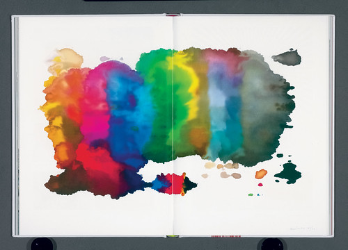
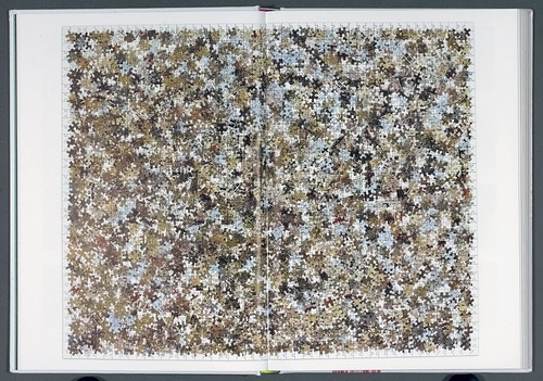
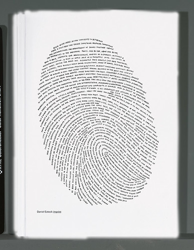
Spreads and cover from Imprint by Daniel Eatock (Princeton Architectural Press, reviewed in Eye no.70 vol. 18). From top: logos for Big Brother 7, 2006; print created by allowing Pantone markers to soak into a stack of paper; Eatock’s contribution to the 2007 Deptford Design Challenge; a ‘self-portrait’ handwritten in the pattern of his thumbprint.
Eye is the world’s most beautiful and collectable graphic design journal, published quarterly for professional designers, students and anyone interested in critical, informed writing about graphic design and visual culture. It is available from all good design bookshops and online at the Eye shop, where you can buy subscriptions and single issues.


