Monday, 11:54am
29 November 2010
Rattle, clatter and forme
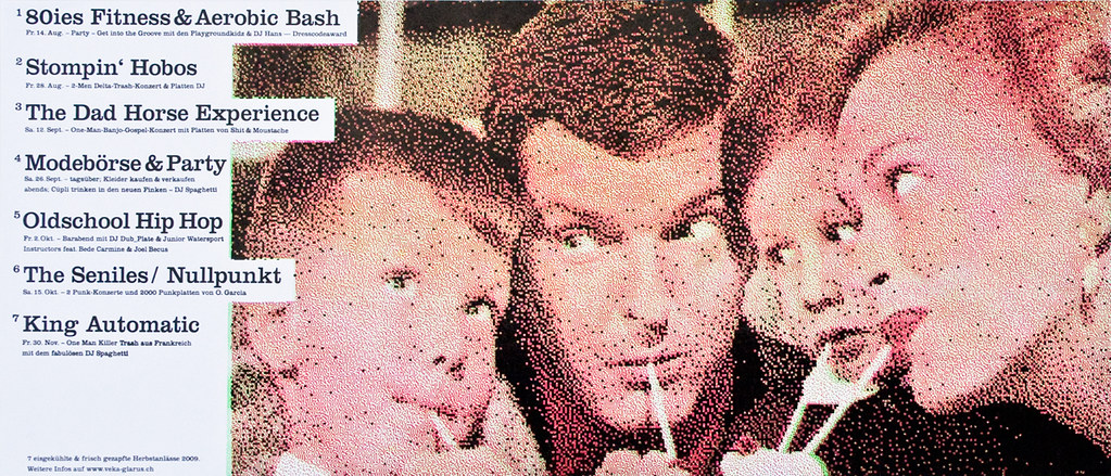
‘Forward Thinking’ told letterpress designer-printers to stay honest

A roomful of handy-looking individuals gathered at St Bride Library for the ‘Forward Thinking’ letterpress conference on 19 November, which had a subtly different air from most typographers’ conclaves, writes Sally Jeffery.
Catch them on another day and they might be doing vector curves, but this was about getting dirt under your nails and where that can take you.
Top: Dafi Kühne subverts a halftone set in Eisgekühlt und frisch gezapft.
What better training for a typographer than the one chosen by Dafi Kühne, a keynote speaker at the conference? Meticulous analysis learned at Zürich University of the Arts, sparking off against the knockabout energy of showbill printing in Nashville, where the young Swiss designer was an intern one summer at Hatch Showprint. Now he takes apart all the contradictory things he has learned and reconstructs them in different ways – for instance a halftone set whose each successive plate has a coarser screen. His thesis on wood type is also a glimpse of ways in which he exploits the properties of printing materials woodtype-now.ch.

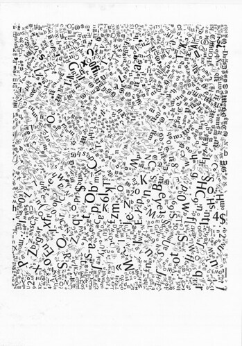
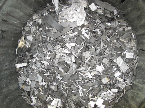
Another experimenter is Edwin Pickstone with his Infinite Ultra Bold, showing what happens to a cap ‘A’ if you take it to extremes (above). And in Type Dump, (below) he makes a sedimentary composition of the contents of a half-ton waste type bin (bottom).
The conference also heard an account by Phil Abel and Nick Gill from Hand & Eye Letterpress of the actual engineering that underpins the metaphors of graphic construction. By ingenuity and sheer persistence their Monotype caster has been made to run from a Macintosh front end; the poetry of it comes with the glorious bundles of plastic piping that blow the divided air that positions the matrix-case.
Twentieth-century air was directed by holes punched in paper tape; now you almost hope to hear, above the old Monotype clatter, great Bach organ blasts coming from the new pipes. Even the old punched paper spool had its epoch-making moments – the technology was invented by an eighteenth-century Lyon silk-weaver to mechanise the raising of warp threads on a loom in patterns. He was, as it happens, the son of an organ-builder.
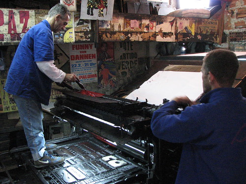
Above: At Gráfica Fidalga, Cláudio adjusts the ink (photo Henrique Nardi).
If Nashville is exuberant, São Paulo is completely wild. Catherine Dixon (who masterminded the event) told the story of Gráfica Fidalga, a small but swashbuckling lambe-lambe [lick-lick] poster-printing business. During her filmed section, we of the micrometer tendency held our breath when the type rattled as the forme slid onto the press, and the printer jumped up and stood on the forme to get at the duct. And then we saw how they got the A1 press out of the building when the shop relocated.
Gráfica Fidalga: Moving Days from Tipocracia / Henrique Nardi on Vimeo.
Below: The posters printed by Gráfica Fidalga work best when done their own way, untrammelled by visiting designers’ homages (photo Catherine Dixon).
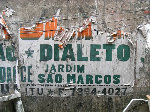
These two old letterpress shops, Hatch and Fidalga, still hanging on, can perhaps serve 21st-century designer-printers best as a reminder to stay honest. The output of re-adopters might be art (and if it’s sold as a print then it pretty much is) but it should not be artful imitation. ‘Forward Thinking’ stacked up a dozen speakers altogether; between them they showed that there’s more to letterpress than just the old inky romance.
Dafi Kühne video and explanations: babyinktwice.ch/index15.php.
See Steve Rigley’s article about letterpress in Eye 57, ‘Thinking in solid air’.
Eye is the world’s most beautiful and collectable graphic design journal, published for professional designers, students and anyone interested in critical, informed writing about graphic design and visual culture. It’s available from all good design bookshops and online at the Eye shop. For a taste of the latest issue, no. 77, see Eye before you buy on Issuu.
