Thursday, 9:57am
18 December 2008
Reasons to be cheerful, part 2
Barney Bubbles
Design history
Graphic design
Illustration
Music design
Technology
Typography
Visual culture
A message from Barney Bubbles in the small print? Or just Ian?

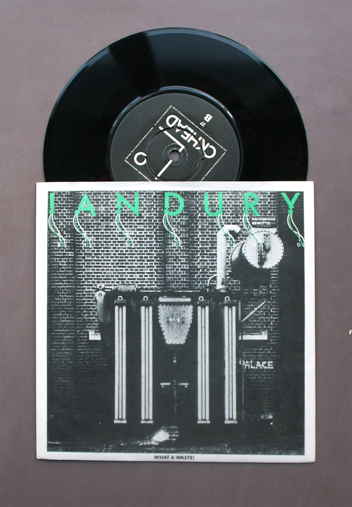
Like Mark Porter, I received an exciting package through the post the other day, writes John L. Walters. Not Reasons To Be Cheerful – I already had the copy I’d reviewed for the latest Eye – but a mint copy of Ian Dury’s ‘What A Waste’, via memorabilia site 911. The single, always a favourite song in my household, was in its original 1978 picture sleeve designed by Barney Bubbles. According to Paul Gorman’s new book about the designer, this is the first official use of Bubbles’ Blockheads ideogram, employed here as the label for the seven-inch vinyl.
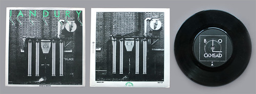
The picture cover, a photograph of a waste plant (with a Louis Hellman-like similarity to a human face) also features Bubbles’ immaculate lettering – each letter of Dury’s name contains a bit of exquisitely executed erosion and some little dangling ‘ribbons’, fringed by the oddly spaced characters for ‘& THE BLOCKHEADS’.
This restlessness and attention to detail mirrors Dury’s own work, and that of his talented band. The lyrics to ‘What A Waste’ comprise a list, whose effectiveness lies in comic contrast and sheer accumulation, as Dury itemises jobs supposedly less wasteful than playing the fool with a six-piece band: ‘I could be a writer with a growing reputation / I could be the ticket man at Fulham Broadway Station.’

Above, trademark currently used by The Blockheads for T-shirts, websites, etc. For Bubbles’ original design, see new image at end of post.
The Blockheads’ music is an elegant distillation of 70s jazz-funk, with a melodic hook that counterpoints Dury’s more functional vocal lines (in much the way that Barney’s decorative ribbons counterpoint the sans caps of Dury’s name). This is a band (still going, and touring the UK right now) who were clearly as good as Bubbles’ logo.
But the label isn’t quite the definitive Blockhead marque, because the square perimeter, normally a rule, is made from the line of small print obligatory for every record release. And in this case, there’s a devilish detail at the end of the line – a message from Barney?
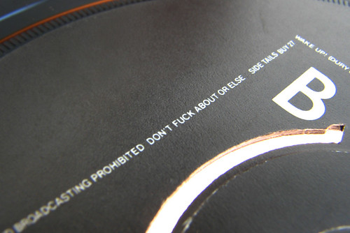
Below: Barney Bubbles’ original Blockhead ideogram, courtesy of Mike & Rebecca.
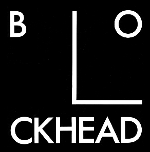
Below: logo for Left Book Club, 1936. See comment no. 9 and website for Working Class Movement Library, wcml.org.uk.

Eye is the world’s most beautiful and collectable graphic design journal, published for professional designers, students and anyone interested in critical, informed writing about graphic design and visual culture. It is available from all good design bookshops and online at the Eye shop, where you can buy subscriptions and single issues.
