Thursday, 12:00pm
16 April 2020
Resorting to type

various designers
Justin Burns
Why Not Associates
Edward McKnight Kauffer
Gordon Young
Andrew Johnson
True North
Hemingway Design
Design education
Design history
Graphic design
Typography
In the first of a new series of Eye blog posts, Justin Burns explores the graphic language of the British seaside

Walk along the promenade and we are met with the sounds, smells and signs that inform our experience of the seaside, writes Justin Burns.
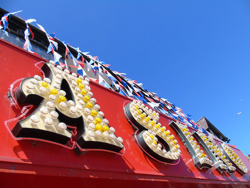
Neon, painted fascias, postcard racks and glowing three-dimensional signs vie for our attention. Many of the visual tropes prompt our sense of nostalgia and our expectations of a typical British resort: elaborate lettering for fairground rides; outlets that promise the best seafood, ice cream and fish and chips; signs, ads and flyers for piers, promenades and theme parks. Signs both branded and vernacular shout through fluorescent typefaces, modifying their promises in local dialects. The visual and typographical landscape of seaside resorts forms the identity and personality of each place.
Scarborough seafront amusements.
Top. Blackpool Promenade. Photographs by Justin Burns.
A recent image of Blackpool Central Pier, photograph by Justin Burns.

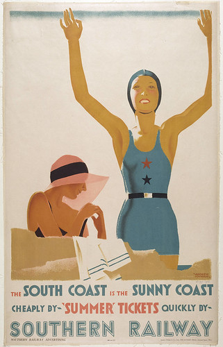
Historically, posters, advertising, and printed travel guides have all promised a coastal utopia, an excursion to warmer, fresher air by sand and sea. Once we arrive, bright lights welcome us to the piers, seafronts and harboursides. This experience of the seaside is informed by the multi-faceted discipline of graphic design, long used by resorts to promote, identity and form the seaside experience for holidaymakers. In addition, the unintentional combinations of words and graphic symbols – including street art, flyposting and graffiti – can also form new messages and meanings. Incidental images, in the form of torn posters, posted flyers, and guerilla advertising, can also contribute to our perception of place.
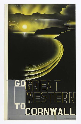
Edward McKnight Kauffer, Go Great Western to Cornwall, 1932.
The beauty of British seaside resorts may have faded in recent decades, but many are seeing a resurgence, with regeneration schemes that invigorate towns and communities. So it is interesting to assess the relationship between graphic design, art, architecture, the urban and natural environment of the seaside and in particular the coexistence of language, visual signs lettering, and typography. Over the coming weeks, this series of Eye blog posts will document the way graphic design has had a significant impact on the emergence, development, identity and regeneration of seaside resorts in the UK.
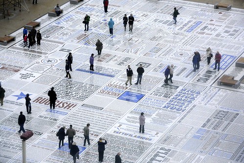
Gordon Young and Why Not Associates, The Comedy Carpet installed at the base of Blackpool tower, 2011.
‘Brand blocks’, designed by True North as part of their identity for Blackpool’s Showtown museum, 2020.
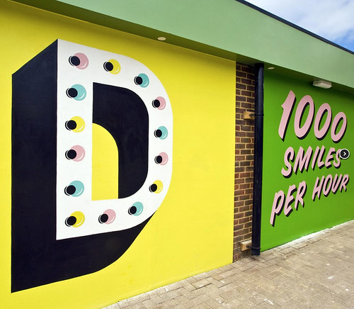
Hemingway Design, Dreamland, Margate, 2015.
Justin Burns, Head of Art & Design, Leeds School of Arts at Leeds Beckett University. Burns is exploring the graphic language of the seaside for a PhD.
Eye is the world’s most beautiful and collectable graphic design journal, published quarterly for professional designers, students and anyone interested in critical, informed writing about graphic design and visual culture. It is available from all good design bookshops and online at the Eye shop, where you can buy subscriptions and single issues.

