Tuesday, 6:00am
23 July 2013
Riddle of the cube
various designers
Jack Llewellyn
Moa Pårup
Design education
Graphic design
Typography
Established graphic designers struggle with the ‘white cube’ of a gallery space. How can emerging designers explain their work in the crowded environs of a graduate show?

Each year, graduating students of the Visual Communication course at the Royal College of Art are faced with the problem of their final graduate show, writes Jessica Morgan.
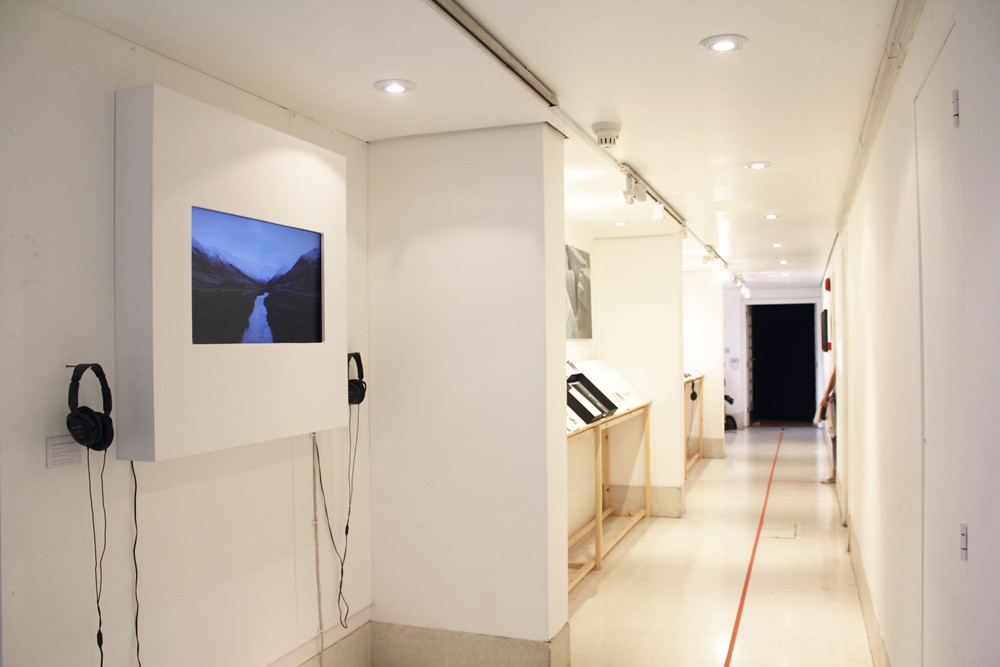
Graphic design is notoriously tricky to exhibit in a ‘white cube’ gallery environment. Witnessing the exhibition from this year confirmed my view that many designers are not comfortable in this setting.
Design is made to fit a purpose, to fulfil a specific brief with a defined context and audience. When simply plucked from that intended context and flung into a series of gallery space the results can be awkward, flat and uninspiring. As a result, some highly capable designers – who may possess finely honed technical and conceptual skills – can lose confidence, some of the criteria that quantifies their work are rendered irrelevant.
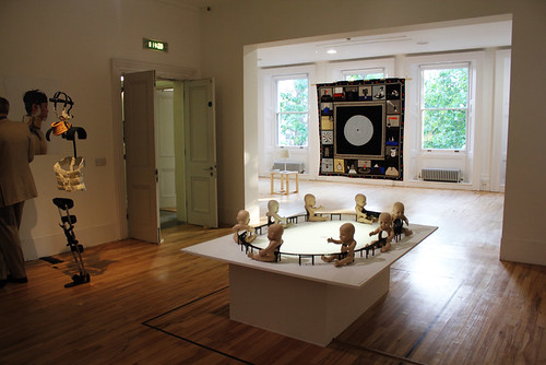
Top and right: ‘white cube’ installations at ‘Show RCA 2013’. Royal College of Art, London.
A poster for a past event is reduced to a piece of visual art; a book designed around a niche subject is seen as an unintelligible object.
One obstacle to the success of a graphic design show is its impossibly varied audience – from the mystical ‘industry people’ wielding wands of potential employment; to the friends and relatives with little idea of what their nearest and dearest do all day.
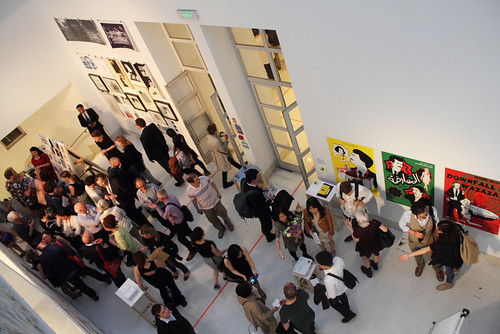
Opening night of ‘Show RCA 2013’, Royal College of Art.
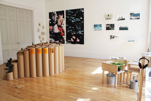
Urban Picnic installation (floor) by Ju Yeun Kim.
To combat this problem, designers often place emphasis on simple, straightforward ideas, which are better suited to a less informed audience. Some students have even found innovative methods to make more arcane areas such as type design exciting to non-design-savvy people.
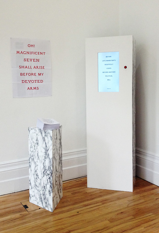
For example, Moa Pårup’s graduate project is a series of typefaces based on gravestone lettering, yet her space in the show features little more than a screen and a button. Each push of the button generates a unique sentence based on the gravestone epitaphs the typefaces were inspired by, visualised in the new typefaces themselves.
Moa Pårup’s The Magnificent Seven.
This simple set-up not only showcases the typefaces in active use, but also offers a layered experience where the viewer can, depending on their knowledge, engage on a purely superficial level and simply enjoy the interactivity and novelty of the exercise, or if more typographically inclined, admire the craftsmanship of the letterforms.
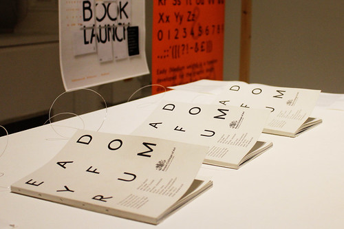
Publication design is another troublesome area. RCA graduate Jack Llewellyn says: ‘The difficulty with exhibiting printed material containing a reasonable amount of content is that it lacks the immediacy and visual impact to draw in an audience at a collaborative show.’ Llewellyn continues: ‘You could liken the medium to that of a mid-to-long format film … [but] graphic design lacks the purpose-built setting of a screening room. The challenge for the designer is to guide the viewer through the story of the content in a sympathetic time frame.’
Eady Forum by Jack Llewellyn, 2013.
The riddle of the final show may never be solved as long as environment and content remain so inherently at odds with one another. My advice to designers is not to panic and resort to something flashy and large scale in order to ‘fill the space’, but to think about the concept behind the work and the way to develop it into a compelling and unique experience.
Show 2013 took place between 20 and 30 June 2013.
Jessica Morgan, graphic designer, RCA graduate, London
Eye is the world’s most beautiful and collectable graphic design journal, published quarterly for professional designers, students and anyone interested in critical, informed writing about graphic design and visual culture. It is available from all good design bookshops and online at the Eye shop, where you can buy subscriptions and single issues.

