Thursday, 11:10pm
25 June 2009
Save the panda, but keep a low profile

‘WWF’s logo was part of the problem, so it had to be part of the solution, too’

Is illustration bringing something new to brand communications? For his Eye 72 feature ‘Drawn into conversation’, Steve Hare talked to Johnny Tan, executive creative director of BBH Shanghai, about Jianfeng Pan’s images for the ‘WWF Saves More Than Pandas’ campaign, and the state of the art in the Asia-Pacific region.
Steve Hare: Do you see illustration as making a comeback – or bringing something entirely new to brand communications? Why is this? Obviously it can be a cheaper solution, but maybe it has something to do with the fact that many brands today do not have an obvious ‘product’ – a concrete thing that you can photograph? A service or concept needs to be presented in a less ‘obvious’ way.
Johnny Tan: I don’t think illustration has ever left. It has always been an effective medium of communication. It has to be used in relation to what’s most effective in bringing the idea to life. I suppose there has been a shift towards the ‘sleek’ and polished photography over the years, possibly to give more stature to brand communication.
SH: Is there a vibrant and sustainable community of illustrators in the Asia-Pacific region who all benefit from the patronage of ad agencies and brands?
JT: Yes and no. Yes, I believe there is an enormously talented pool of illustrators and artists in China. And yes, there is a pool of talent accessible to agencies and such. However, I would venture to say that there must a whole lot more talent we’ve yet to discover. Perhaps they are not properly represented. Art schools and other institutions are fertile areas with fresh thinkers and talent that should and must be tapped into in order to drive fresher expressions. Agencies and brands can provide this ‘stage’ to showcase their skills.
SH: Does it actually matter these days if the illustrator is local – do you look globally for the right style and voice?
JT: No, not at all. We seek to find the best talent that’s most suited to bring the vision of the creative teams to life. Clearly, cost has always been a challenge. All the more so in the current financial climate.
SH: Where do you look for inspiration and ideas when planning a campaign?
JT: It’s the sum of all things. Being a magpie for inspiration stimulates one to broaden one’s horizon and helps see and think differently. Often prompting questions of ‘How about…?’ or ‘What if…?’ Being a student to all disciplines and craft is an infinitely inspiring state to be in.
SH: Can you say why illustration was used in a particular campaign – and what it brought that was unique?
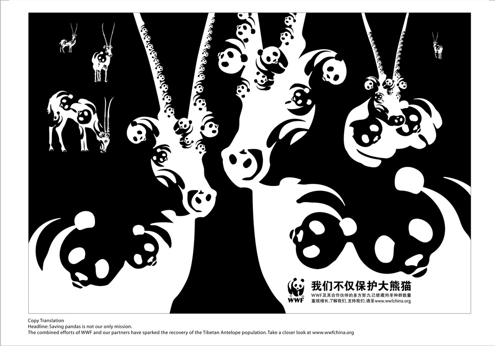
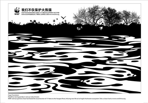
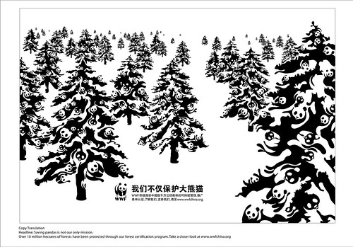
JT: In our WWF campaign, there was a rather unusual brief. As opposed to the usual ads about issues, be it environmental ones or animal conservation etc, where the focus was more in bringing attention to a certain plight, this task was to debunk a misconception, thereby driving more involvement. Based on WWF’s ubiquitous logo of a panda, people’s perception of it has always been about panda protection. Since the graphic was the source of the confusion, that’s where the solution should be too.
Using a graphical illustrated style seemed to be the most effective way to do the job. I suppose the way it was expressed and treated was enormously stark and arresting. In the ocean of ads that hits consumers, something so stark and high in contrast can stand out and capture viewer’s imagination. It takes one to look carefully and see the message, which is often very rewarding when one ‘gets it’.
For more on how big brands are making more of illustration, read ‘Drawn into conversation’ by Steve Hare, in Eye 72.


