Tuesday, 6:30am
28 April 2009
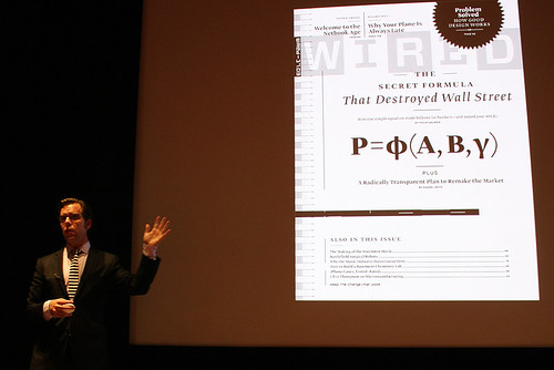
Scott Dadich at the EDO
Star Trek’s sci-fi geekery sugars the science pill of the San Fran mag

Here at Eye Towers we’re all too aware of the joys (and limitations) of making a magazine with a small team, writes Simon Esterson, so it’s always good to be reminded how the big boys do it.
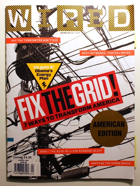
Even so, last Thursday’s lecture to the Editorial Design Organisation by Scott Dadich, creative director of the US edition of Wired magazine (in London courtesy of the D&AD judging) was an evening that left me in awe at the powers of the San Francisco-based magazine’s design and editing team (fifteen designers, picture and production people, by my count of the masthead, all duly acknowledged by Dadich).
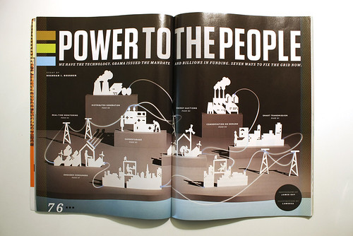
It’s not just the layouts, the attention to detail, the custom type by Hoefler & Frere-Jones, but at its heart it’s the magazine’s editorial ambitions that mark it out: for a story about a software designer lost at sea in dangerous currents, send a photographer back to the spot to record the moody waves. Want the new Transformers movie on the cover? Just get the guys at Industrial Light and Magic to donate $50,000 worth of graphics processing to create a digital celebrity for the cover. Just what FedEx-type logistics would Father Christmas need to deliver presents to all the Christian children in the world in one night? Research, write, illustrate and design a double-page spread explaining how it could be done. Wired’s content is a potent editorial mix of techno-geekery and business, true crime and scientific advance, much of it told through some of the most creative information graphics around.
Infographics by James Day/Lamosca from April 2009 US edition
The spirit of Lester Beall or Will Burtin’s work for Fortune magazine lives again, but reinterpreted for a different age where a certain amount of journalistic candy is needed to sugar the scientific pill.
Lamosca infographic detail
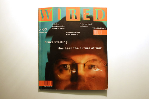
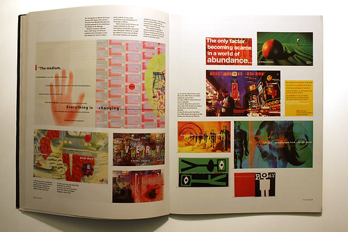
Of course, Wired has its own rich design history, beginning with its 1993 launch under art director John Plunkett [see ‘Reputations’ interview in Eye no. 28 vol. 7], and it is good to see Plunkett’s trademark special fluorescent and metallic inks still making their appearance in the magazine today.
Wired 1.1, 1993
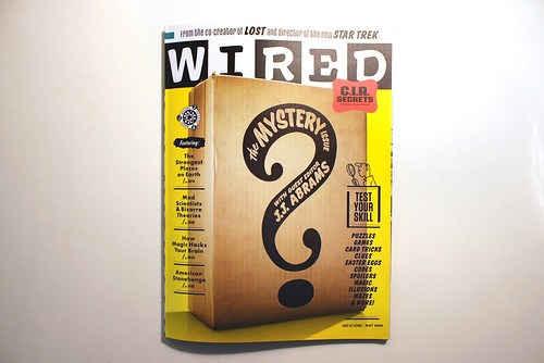
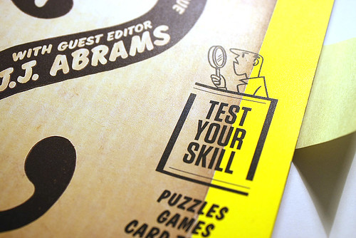
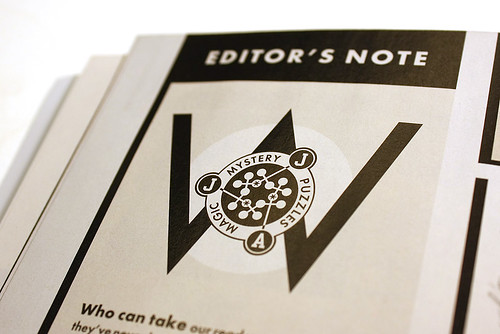
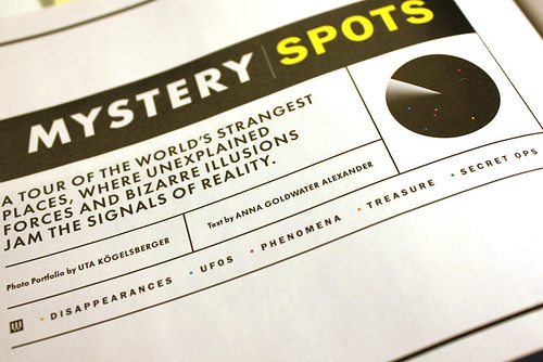
Then, just as I was picking myself up from the floor, Scott showed pages from the May American edition, guest-edited by Lost creator and new Star Trek movie director J. J. Abrams. Subtitled ‘the mystery issue’, it’s been art directed as if it were an issue of Wired crossed with a puzzle magazine and made in the 1950s: a knowing graphic pastiche of itself and a witty piece of typographic time travel complete with stock blocks and centred Futura.
Cover and details from May 2009 US edition guest-edited by J. J. Abrams
Part of Steven Heller’s 1998 ‘Reputations’ interview (pictured below) with John Plunkett has been published on the Eye website.
Eye is the world’s most beautiful and collectable graphic design journal, published quarterly for professional designers, students and anyone interested in critical, informed writing about graphic design and visual culture. It is available from all good design bookshops and online at the Eye shop, where you can buy subscriptions and single issues.

