Thursday, 11:18am
14 July 2011
Sea of information
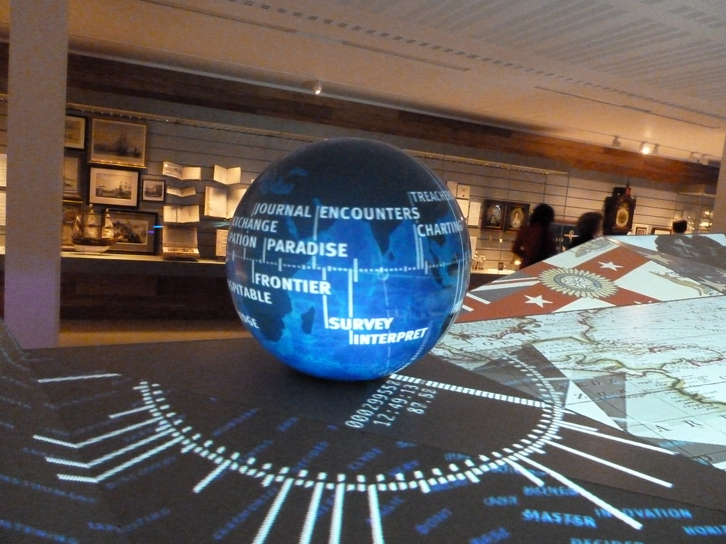
Digital design shines new light on the National Maritime Museum contents

The Sammy Ofer wing of the National Maritime Museum, which opens today, offers three different approaches to digital design: as spectacle, as archive and as immersive experience, writes John L. Walters.
You can see Voyagers: Britons and the Sea (Light Surgeons), the Compass Lounge (Kin) and the temporary installation High Arctic (UVA), which runs until 13 January 2012.
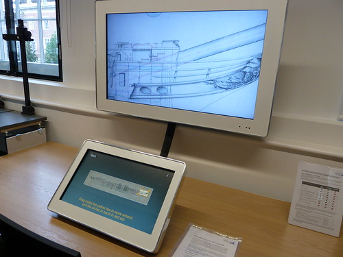
Yet the southeast London museum is ultimately concerned with content – and making that accessible in innovative ways. (Head of Digital Media Fiona Romeo spoke about this challenge at ‘The Design of Understanding’ conference last January – see review in Eye 79.) The Caird Library and archive in the new £35m wing has brought more of the museum’s enormous collections back to the main site: the upper floors contain more than 100,000 books, plus millions of maps, charts, etc., which can be accessed via the Reading Room on the first floor, where a large monitor gives visitors access to high-resolution scans of artefacts such as ships’ plans (below).
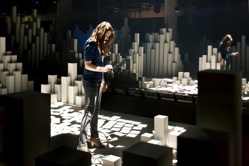
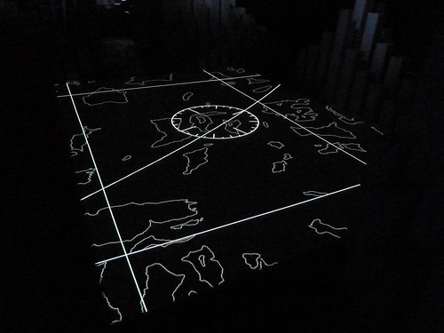
In their different ways, the three different digital projects are all gateways to learning and understanding as much as ends in themselves. It will be interesting to see what small children make of the spooky High Arctic experience, where you can play with UVA’s digital projections by shining ultraviolet torches directly on to the floor display.
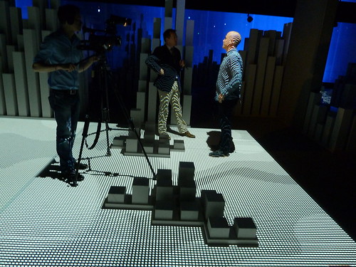
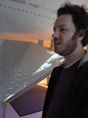
The same beams reveal the unpronounceable names of glaciers, while a collage of sound and spoken words (including work by poet Nick Drake) reverberates around the darkened cellar: it’s not for everyone. The generative soundscape was made by Henrik Ekeus and sound artist Max Eastley (currently part of the sound art exhibition ‘Gone With The Wind’ at Raven Row). UVA’s Matt Clark (below, being interviewed for the BBC describes it as ‘a monument to the Arctic past, set 100 years into the future’. (See also ‘Attacked by music, type and light’ in Eye 76.)
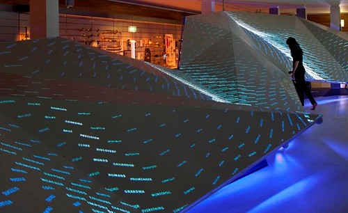
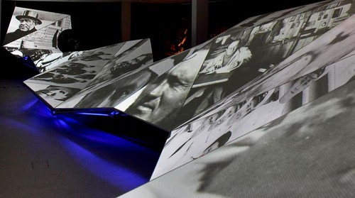
In the words of Light Surgeon Chris Allen (above, see ‘Beyond “VJ culture’ on the Eye blog) ‘Voyagers is like a title sequence for the museum.’ Sited opposite the entrance to the new wing, you enter to be confronted with a huge (25m) undulating screen (designed by Real Studio) that’s covered in a crashing waves made from words and letters.
These crossfade into fragments of images and movie clips associated with the NMM’s collection, grouped under six main themes: Anticipation, Love, Sadness, Aggression, Pride and Joy.
In between the different sequences (each is around 90 seconds) the screen darkens and our attention is focused on the globe at the far left (top), which displays the moon’s surface, the night sky, a map of the world and a further collection of words. The sound design is by regular collaborator Jude Greenaway.
Voyagers from THE LIGHT SURGEONS on Vimeo.
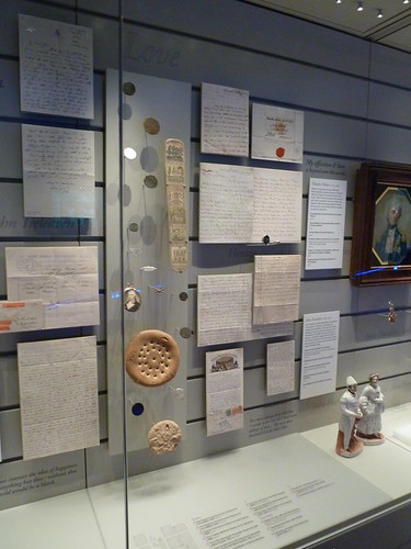
There are also small portrait-format screens set into pillars, that show video portraits – short interviews with members of the public who were asked questions such as ‘What does the sea mean to you?’ and ‘What’s your first memory of the sea?’ Allen says it was rather like being a therapist: ‘We went through all these questions and everything that people said ended was transcribed and all of these words end up in the ocean. It’s this sea of information!’ The back wall of Voyagers is mounted with a small selection of artefacts (below): paintings, uniforms, mugs, a ship’s biscuit, and it is possible to ‘collect’ certain items by pushing a barcoded card into a ‘ticket machine’, which embosses a little icon into the cardboard.
The artefacts lead natually to the third new digital installation, Compass Lounge, masterminded by Kin, in which you can use your personal ‘Compass Card’ to retrieve information from the NMM’s database: enter your email address on the touch screen and it will send you a link to the items you selected.
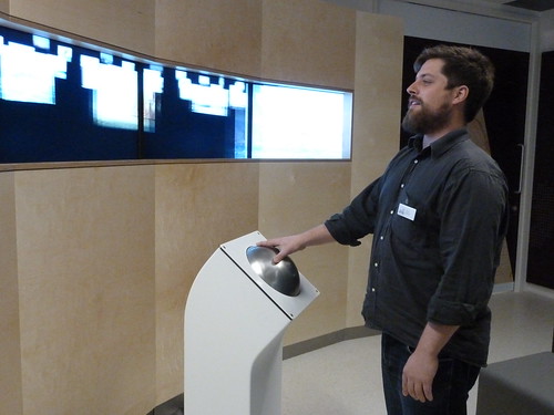
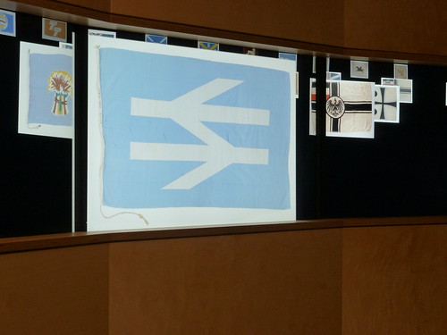
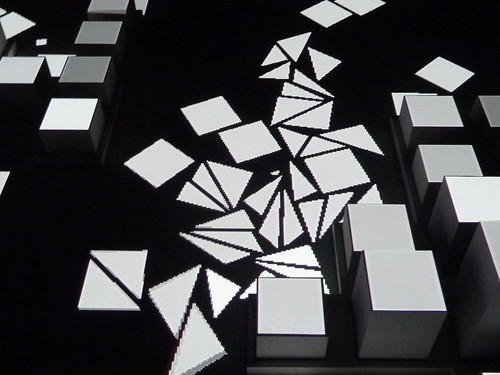
The lounge has comfy seats and wi-fi and a five-screen display called ‘the horizon’ (above), for which you use a big, touch-sensitive track-ball to browse and resize 4000 items from five of the collections: paintings, flags (below), etc.
This is all ambitious stuff, some of it quite groundbreaking, and it will be interesting to see how much the designs evolve as some very different sets of users – parents, students, tourists, children, teenagers, the retired, serious researchers, naval history buffs – visit the new wing.
Below: UVA’s Matt Clark explains the background to High Arctic.
Matt Clark introduces High Arctic from National Maritime Museum on Vimeo.
Eye is the world’s most beautiful and collectable graphic design journal, published quarterly for professional designers, students and anyone interested in critical, informed writing about graphic design and visual culture. It’s available from all good design bookshops and online at the Eye shop, where you can buy subscriptions, back issues and single copies of the latest issue. The last issue is Eye 79, a type special. Eye 80, the twentieth anniversary issue, is now being bound and will be ready for dispatch in the next few days.

