Thursday, 3:06pm
28 January 2010
Serious about design?

The challenges of designing for a declining market in classical music

Tomorrow’s ‘Design for music’ day at St Bride library includes a panel about design for classical music, writes Gareth Lofthouse. What is interesting about this right now is not so much attempting to provide a visual corollary for abstract music but the challenges presented by a declining market and the imminent redundancy of the CD format.
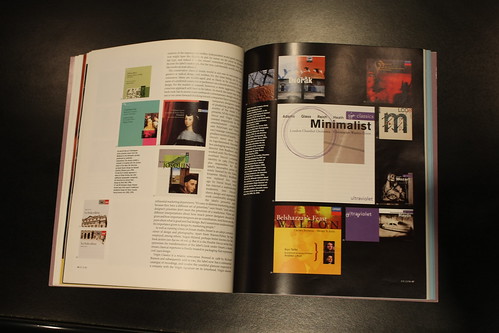
Above: spread from ‘Reinterpreting the classics’, Adrian Shaughnessy’s article in Eye 21.
The inherent conservatism of the industry has been exacerbated by the collapse of the market, as labels cling to ‘safer’ design. Design was more adventurous when the market was booming – and when record companies had their own in-house design departments. (Decca’s golden age was under David Smart in the early 1990s.)
Many feel that the great curse of classical music packaging is the company logo. Because of the duplication of repertoire with classical music, the brand (the label) has historically assumed importance. But is it still important? Can we finally discard the logo? Untitled’s covers for John Eliot Gardiner’s Soli Deo Gloria label (above and top) have no logo (though one might say that ‘Gardiner’ is the brand). The SDG Bach covers are similarly unusual in reproducing the same, minimal copy on each of twenty titles. The details – the names and numbers of the cantatas, the soloists etc – are on the back.
Another problem within classical music marketing is format – the persistent reliance on the jewel case when a CD needs, more than ever, to be something tactile and desirable.
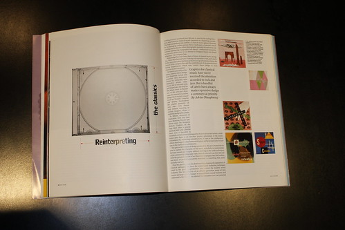
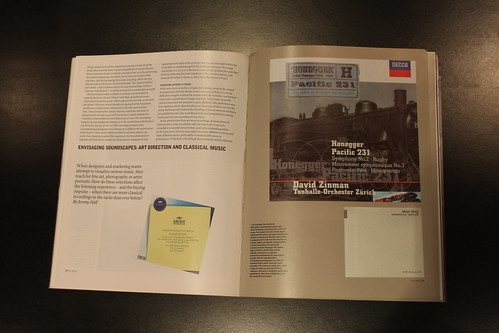
Above: opening spread from ‘Reinterpreting the classics’ in Eye 21.
But can a CD ever be desirable? Despite its apparent preciousness (the silver sheen, the jewel case to contain it) it is disposable, in a way that the LP never was. It is cheap to make, given away on magazine covers; one sees discarded CDs in the side of the road. It can be immediately and accurately copied, so has no intrinsic value. It does not need careful handling. How, therefore, does one give it importance?
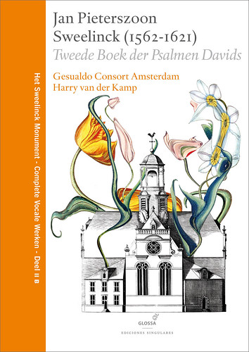
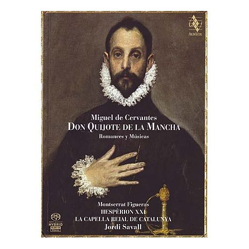
Some labels are responding by making case-bound books, such as the elaborate volumes from Glossa (above) and Alia Vox (below) that replicate some of the LP packaging of the late 1970s and early 80s, when documentation elevated the album format to a serious, academic publication.
But is that the right direction? Some would argue that classical music already takes itself too seriously!
The signs are that we may finally dispose of the CD as a sound carrier. If music is bought as a digital file, how do we approach the documentation? Do we reconsider what’s needed in place of the default liner notes? Should we replace the CD booklet with a properly designed PDF or a dedicated website?
And if so, who is going to pay for it? The publishers? The performers? The Arts Council? A micro-payment system might allow record companies to put real care into the production of PDFs, rather than (as at present) merely duplicating the existing CD booklet – if there are any classical record companies left!
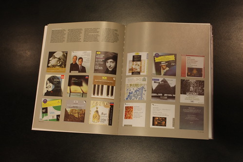
Below: spreads from Jeremy Hall’s ‘Envisaging soundscapes’ in Eye 39.
Design for music / Music and design is at St Bride Library, Bride Lane, Fleet Street
London EC4, 29 January 2010. For the full programme, click here.
Eye, the international review of graphic design, is a quarterly journal you can read like a magazine and collect like a book. It’s available from all good design bookshops and at the online Eye shop, where you can order subscriptions, single issues and (new!) classic collections (it’s that word again!) of themed back issues, including a music design collection.

