Wednesday, 10:03am
12 October 2011
Significant others
anne-marie conway
Book design
Design history
Graphic design
Illustration
Magazines
Music design
Reviews
Typography
Steven Heller invites designers to come clean about their graphic passions

Steven Heller loves design, but he’s quick to admit it’s ‘not a monogamous relationship’, writes Anne-Marie Conway.
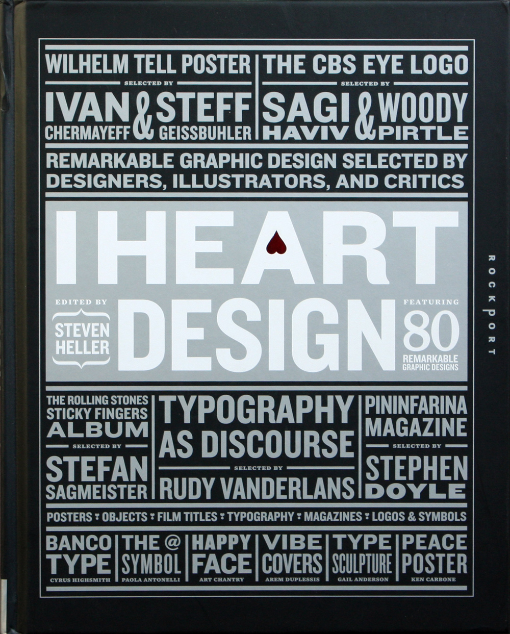
Which is why, like most designers, he dreads the common student question ‘What is your favourite piece of design?’. Yet this is the very question on which his latest book, I HEART Design (Rockport, $45, £30) is based.
Heller has had the temerity to invite a wide range of designers, typographers, critics, educators and scholars, to name ‘one significant designed object’ that has touched their heart.
The result is an eclectic collection of logos, posters (especially from Poland), books (mostly for kids), magazines (a heavy emphasis on fashion and typography, unsurprisingly), baseball cards, coins, film titles, a type sculpture, a mosque in Istanbul (chosen by Marian Bantjes), maps, even the Eberhard Faber Monglol 482 pencil (Liz Danzico).
Above: Ken Garland selects Stefan Lorant’s Lilliput magazine
And then there are the typefaces, of course: Albertus, as used in the 1960s cult TV show The Prisoner (Kerry William Purcell); Banco (Cyrus Highsmith); letters on the walls of Pompeii, in neon street signs, on motorways.
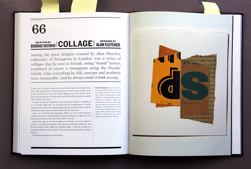
Deborah Sussman picked out the collaged monogram Pentagram’s Alan Fletcher made for her, (below). ‘My initials, DS, are made of lowercase d and a cap S so that, when turned upside down, it says SP. Which happens to be the initials of my firm, Sussman / Prejza. If he had used a cap D, the double entendre wouldn’t exist.’
A high concentration of album covers – for the Rolling Stones, Jimi Hendrix, Joni Mitchell, Lightnin’ Sam Hopkins, Iron Maiden – hints at more than one misspent youth. As does The Savoy Cocktail Book.
Milton Glaser clearly got around a bit, being cited by Jason Godfrey, Andrea Rauch and Beth Kleber. And Ivan Chermayeff and Steff Geissbuhler set a test for the book’s designer, Rick Lander, by both selecting Armin Hofmann’s monchrome Wilhem Tell poster (it appears first on a black background and then, somewhat reduced, on a white background on the following page).
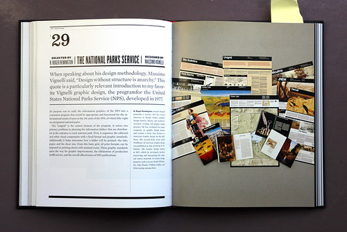
Above: R. Roger Remington selects Massimo Vignelli’s National Parks Service work.
Some designers cheated, by refusing to be tied down to a single object of affection. Warren Lehrer, for example, starts with the Apartheid Musuem in Johannesburg but also includes a couple of concrete poems (by the Apollinaire brothers) and the McCoys’ book Cranbrook Design.
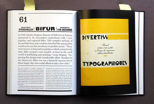
And there is a touch of droit d’editeur, in Heller allowing himself two bites of the cherry but keeping his amours (Erik Nitsche’s posters for General Dynamics and A. M. Cassandre’s Bifur typeface, below) well apart, at different ends of the book. But few who pick up this attractive selection of designs that have touched the contributor’s heart will begrudge him that.
Eye is the world’s most beautiful and collectable graphic design journal, published quarterly for professional designers, students and anyone interested in critical, informed writing about graphic design and visual culture. It’s available from all good design bookshops and online at the Eye shop. For a taste of the new issue, see Eye before you buy on Issuu. Eye 80, Summer 2011, is out now. Eye 81 will be on press any moment.


