Monday, 10:43am
8 December 2008
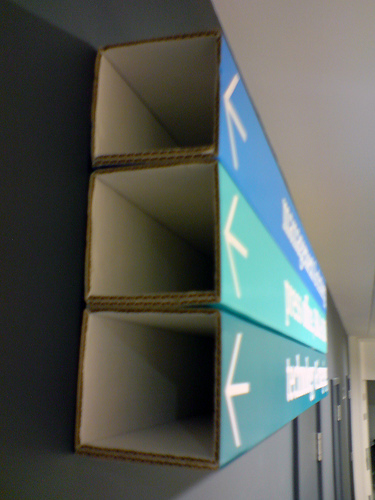
Signs for the digital age - in cardboard

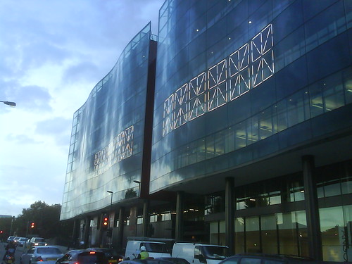
Cartlidge Levene show Guardian and Observer staff where to go

As The Guardian newspaper and websites move into their new offices in London’s Kings Place, Mark Porter, the paper’s creative director, has had the opportunity to commission new signage for the building from Cartlidge Levene, noted for their wayfinding design for the Barbican, Selfridges and the Oval.
Not surprisingly, the signs use the Guardian’s typeface family designed by Paul Barnes and Christian Schwartz, and ranges from signs silkscreened on folded cardboard (above and below) to large vinyls and digital displays. (Sibling Sunday newspaper The Observer is also moving to Kings Place, bottom.) Mark shows and tells more about the project on his site markporter.com.

Meanwhile the type department wonders what’s planned for Alan Kitching’s big typographic wall in the paper’s soon-to-be vacated old reception in Farringdon Road . . .
Eye is the world’s most beautiful and collectable graphic design journal, published quarterly for professional designers, students and anyone interested in critical, informed writing about graphic design and visual culture. It is available from all good design bookshops and online at the Eye shop, where you can buy subscriptions and single issues.

