
Tuesday, 9:00am
25 June 2024
Single track to a wide territory
various designers
Min-young Kim
Matt Vergotis
Reviews
Typography
Events and exhibitions
ATypI Brisbane 2024
Brisbane Convention & Exhibition Centre (BCEC), 133 Grey Street, South Bank, QLD 4101 16-20 April 2024
Interaction and communication were the order of the day at the second ATypI conference to be held in the Southern
hemisphere. John D. Berry reports
This year’s ATypI (Association Typographique Internationale) conference in Brisbane, Australia, was the second one to be held in the Southern Hemisphere (after São Paulo in 2015), writes John Berry. It was the smallest ATypI in several decades, with fewer than 200 attendees, and that made it easier than usual to meet everyone, or at least a large subset of everyone. Another factor that encouraged interaction was the way the main hall was set up: rather than an auditorium with the usual ranks of seats, it was arranged with chairs around round tables scattered throughout the room. The only disadvantage of this was that those in the far ends of the oblong room had a rather sharp viewing angle for the big screen.
Interaction and communication were the order of the day. With a single track of programming, everyone got to hear the same talks and presentations, and then talk about them outside the hall over copious Aussie snacks and the primary fuel of any conference: coffee. During the long lunch break, groups of people would fan out into the many restaurants, cafes and bars near the Brisbane Convention Centre in the lively South Brisbane neighbourhood, in search of Shiraz, dry Riesling, pizza and Moreton Bay Bugs. As one does.
Karin Kashima talks about Morisawa Type Design Competition.
Top. Kris Sowersby presents the Matarongo Project, a collaboration with Dr Johnson Witehira. All photographs by Eric Liu.
The conference programming covered a wide territory. As an indication of the scope of today’s ATypI conferences, there was only one presentation among the morning talks on the first day that concerned itself with the Latin alphabet. This has been a long-term trend, but it’s still a remarkable turn-around from the association’s origins as a European consortium of type-producing companies.
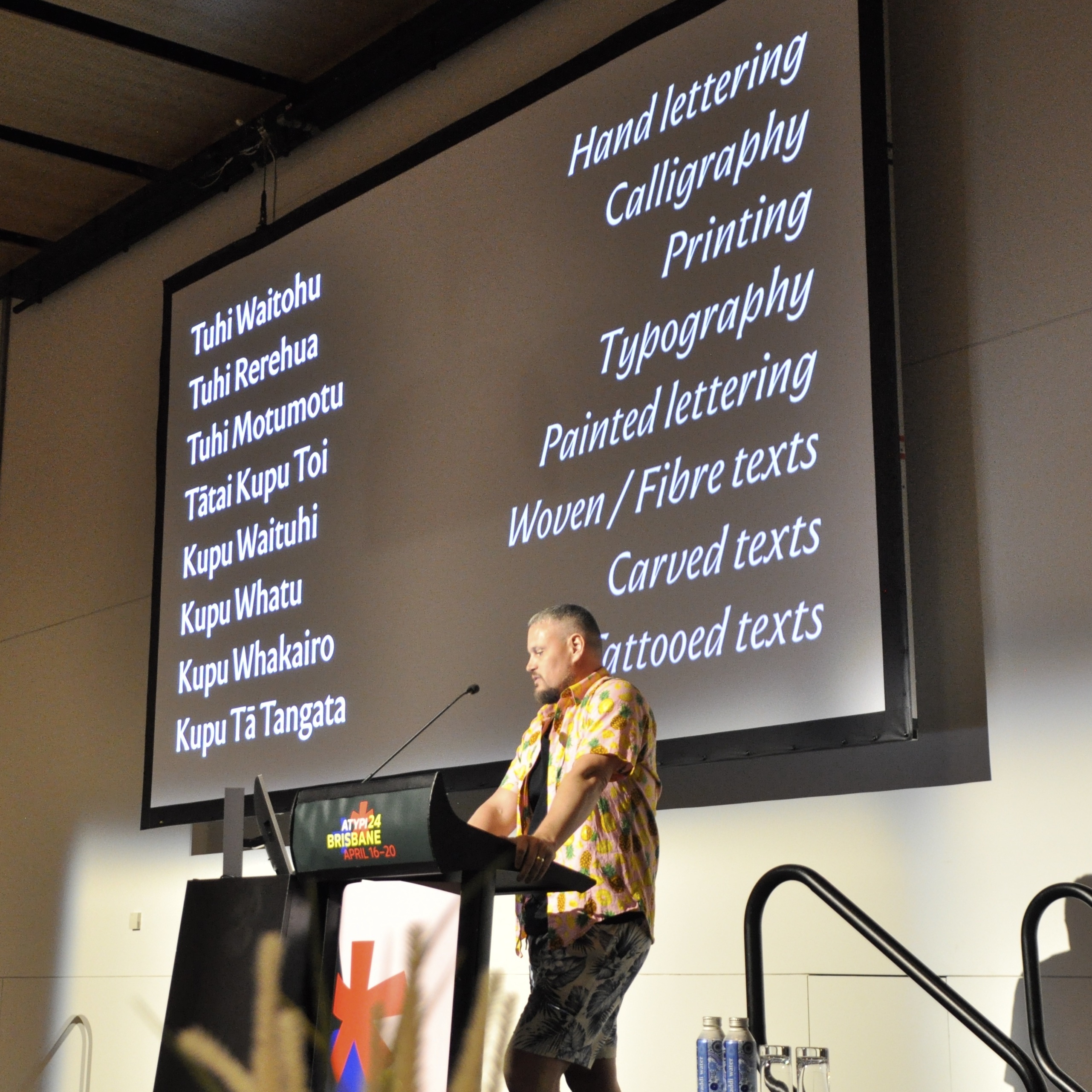
Even the Latin alphabet was not always dealt with in a traditional manner. Thy Ha’s talk about Vietnamese and its exuberant layers of diacritical marks, and Kris Sowersby’s talk about working with a Māori designer to create a Māori-inflected typeface for New Zealand (the Matarongo Project), made us very aware that we were not just in the world of antiquarian European book design. (Though my own talk on the typography of books did focus largely on typography in English.)
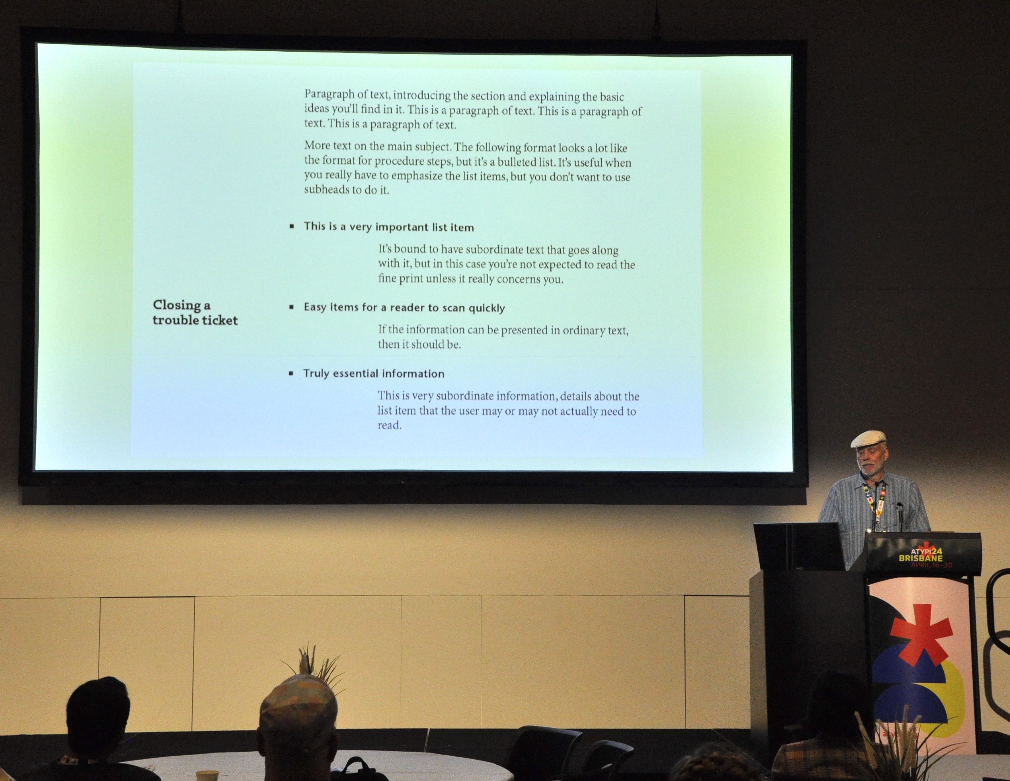
Presentation about book typography by John D. Berry (the author of this post).
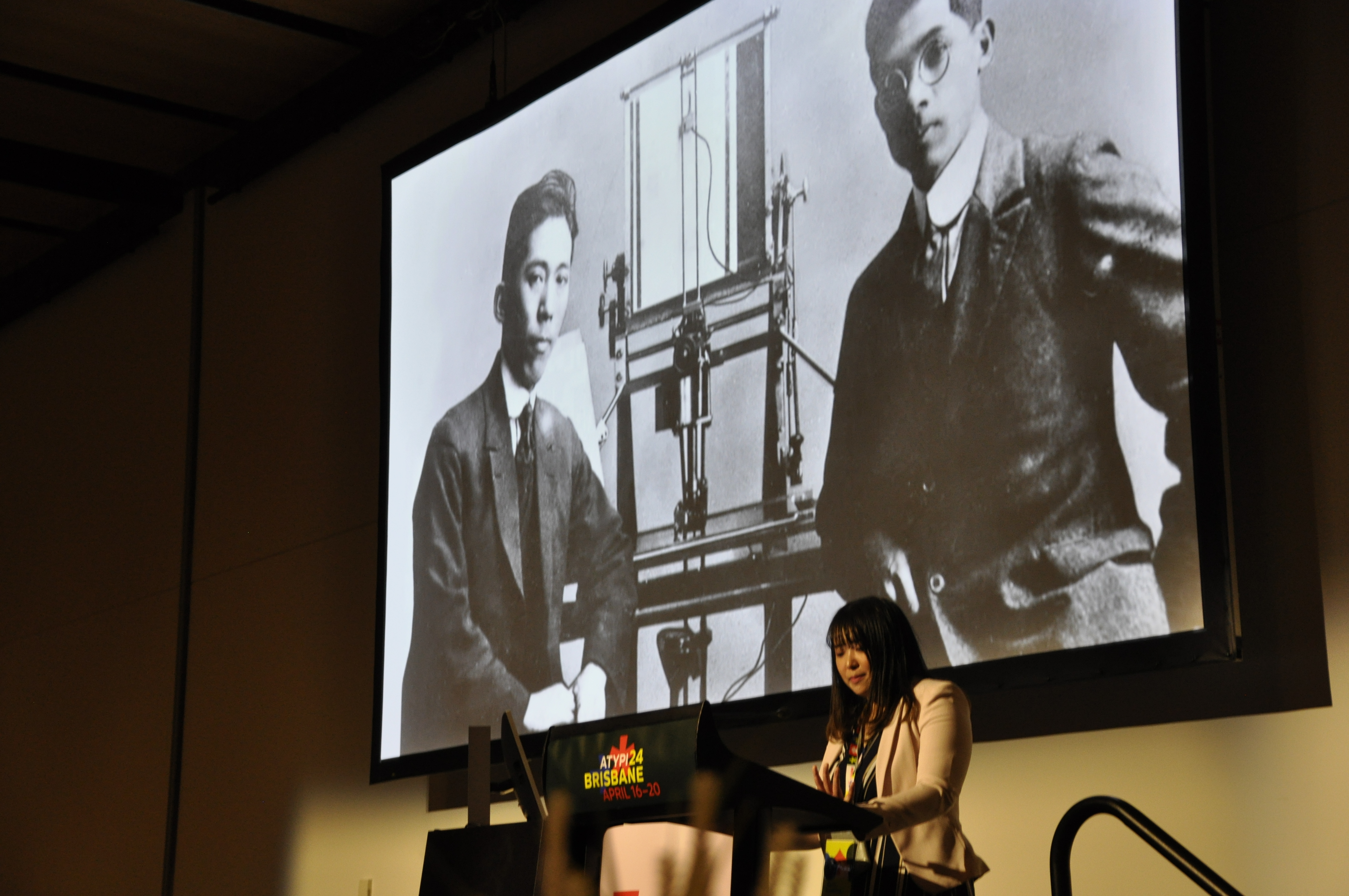
The kickoff talk on the first morning was by Min-young Kim, a Tokyo-based Korean type designer, in which she made it clear that even the Chinese-derived characters in the CJK (Chinese-Japanese-Korean) font world get different treatments in the typography of each country. Her talk was followed by Adobe’s Nat McCully on the text-layout challenges of CJK fonts whose shapes are not square. There were a number of later talks that touched on CJK typography, including Willie Liu on reviving a Chinese typewriter face and an intriguing dialog between Tao Di and Ryota Doi about recent trends in how type is being used in China and Japan.
Other scripts that got attention in one or more talks included Malayalam, Thai, Arabic, Persian and Chinese minority scripts.
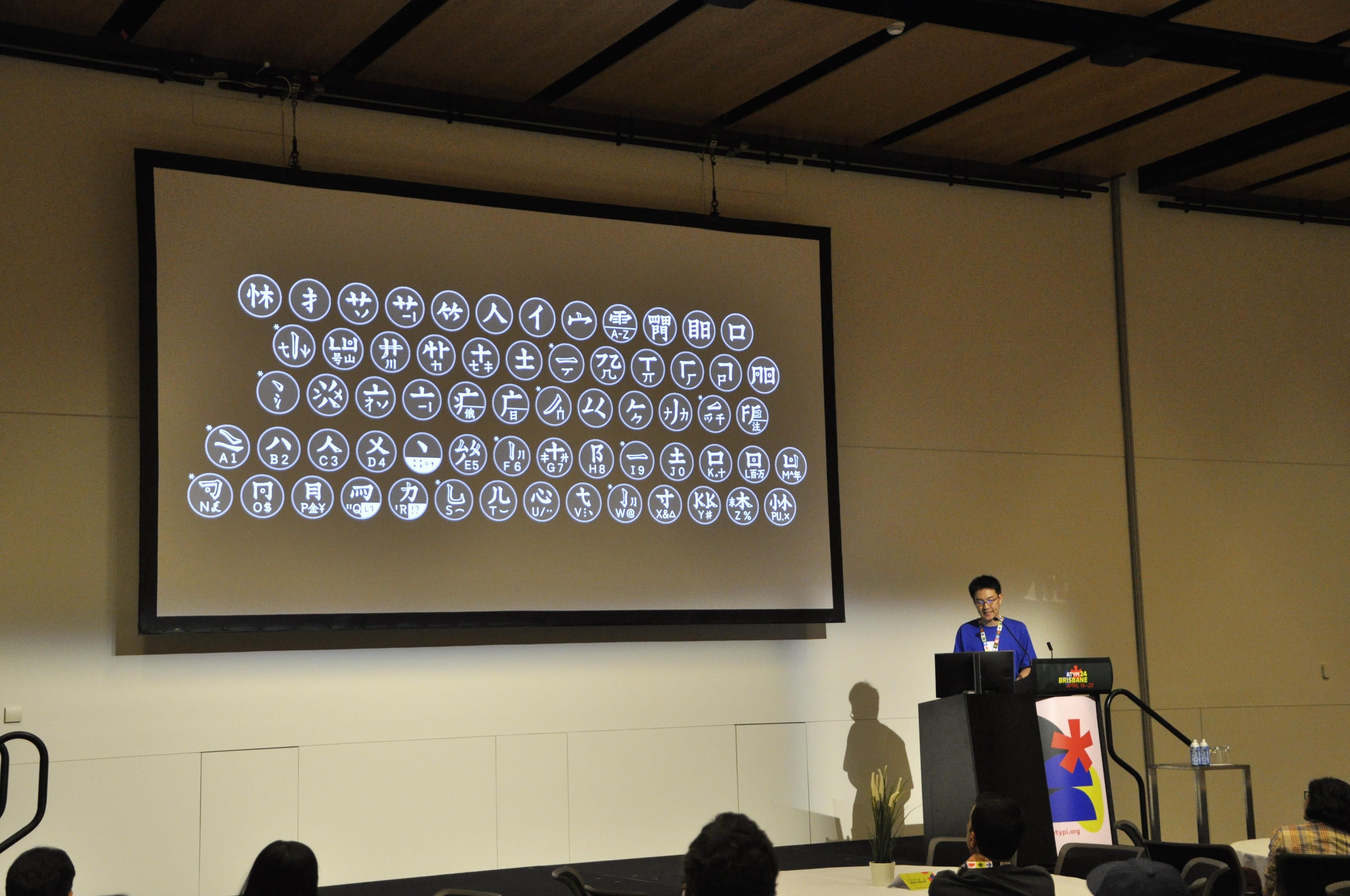
Willie Liu talked about reviving Ming Kwai, the Chinese typewriter font, invented by Chinese novelist Lin Yutang in the late 1940s.
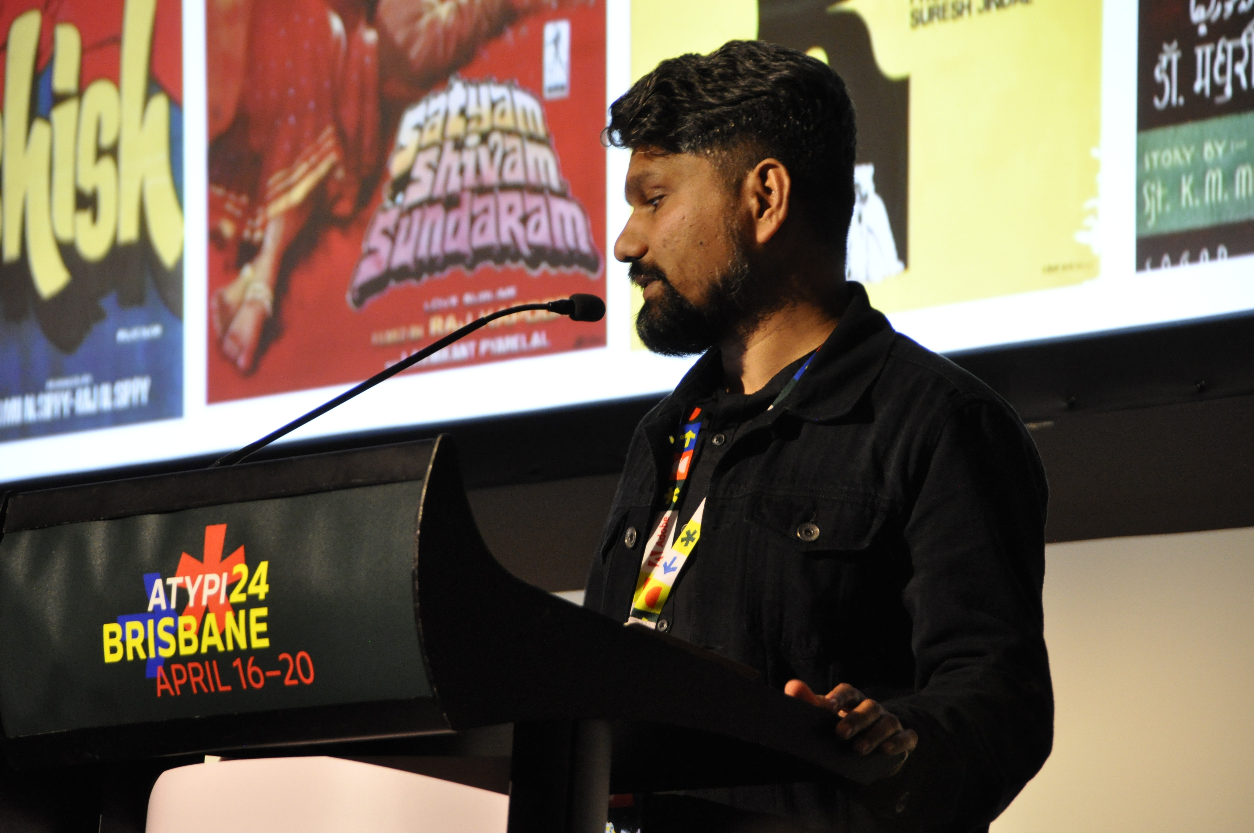
Nagesh Lakhan on ‘Typography’s Cinematic Journey in Bollywood’.
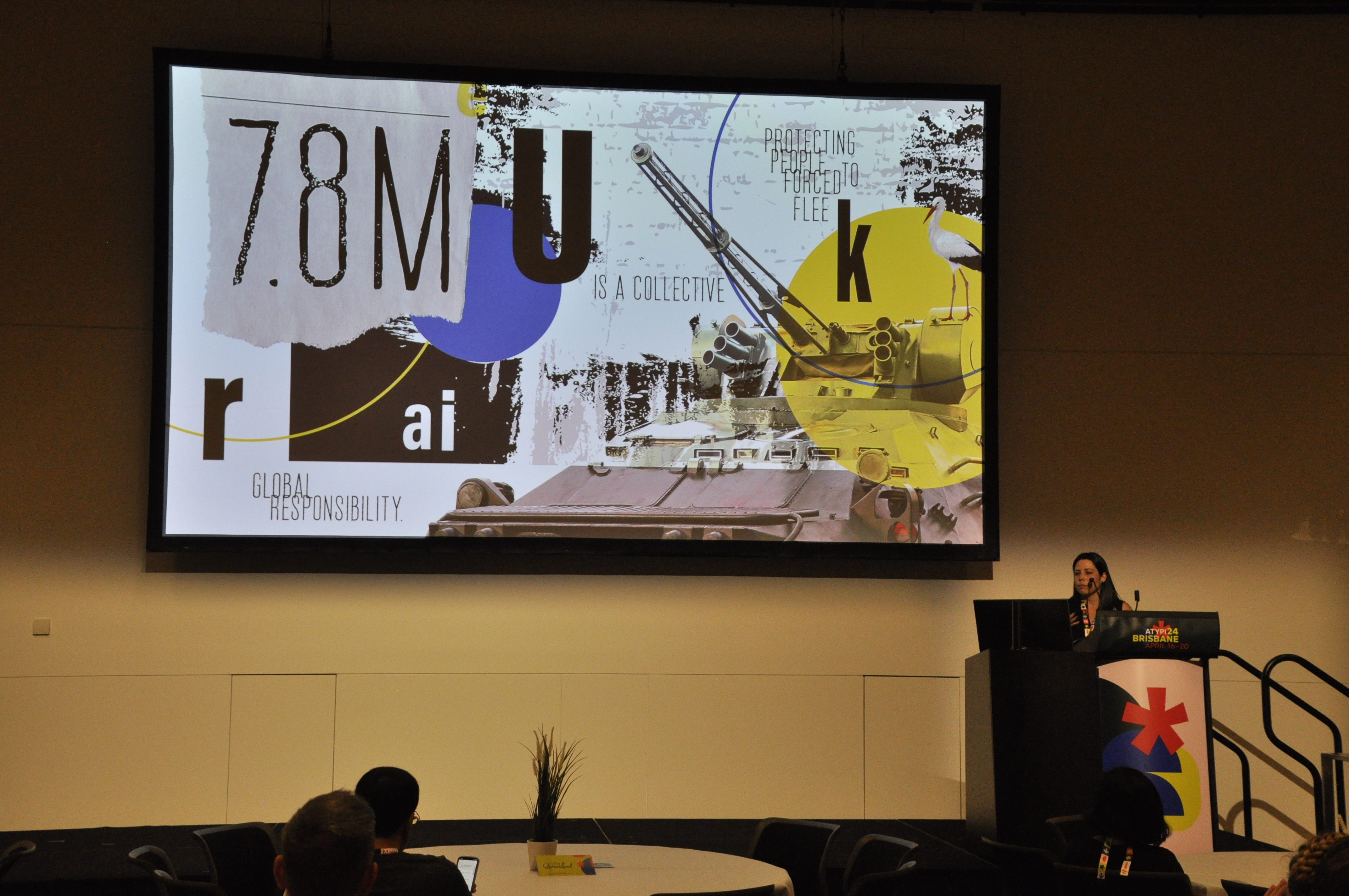
Melanie Uribe: ‘Augmented realities: Graphic Design’s Role in Amplifying the Struggles and Emotions of Displaced Populations.’
Melissa Silk (left) and Dzintra Menesis: ‘Bovine Pyroglyphics’.
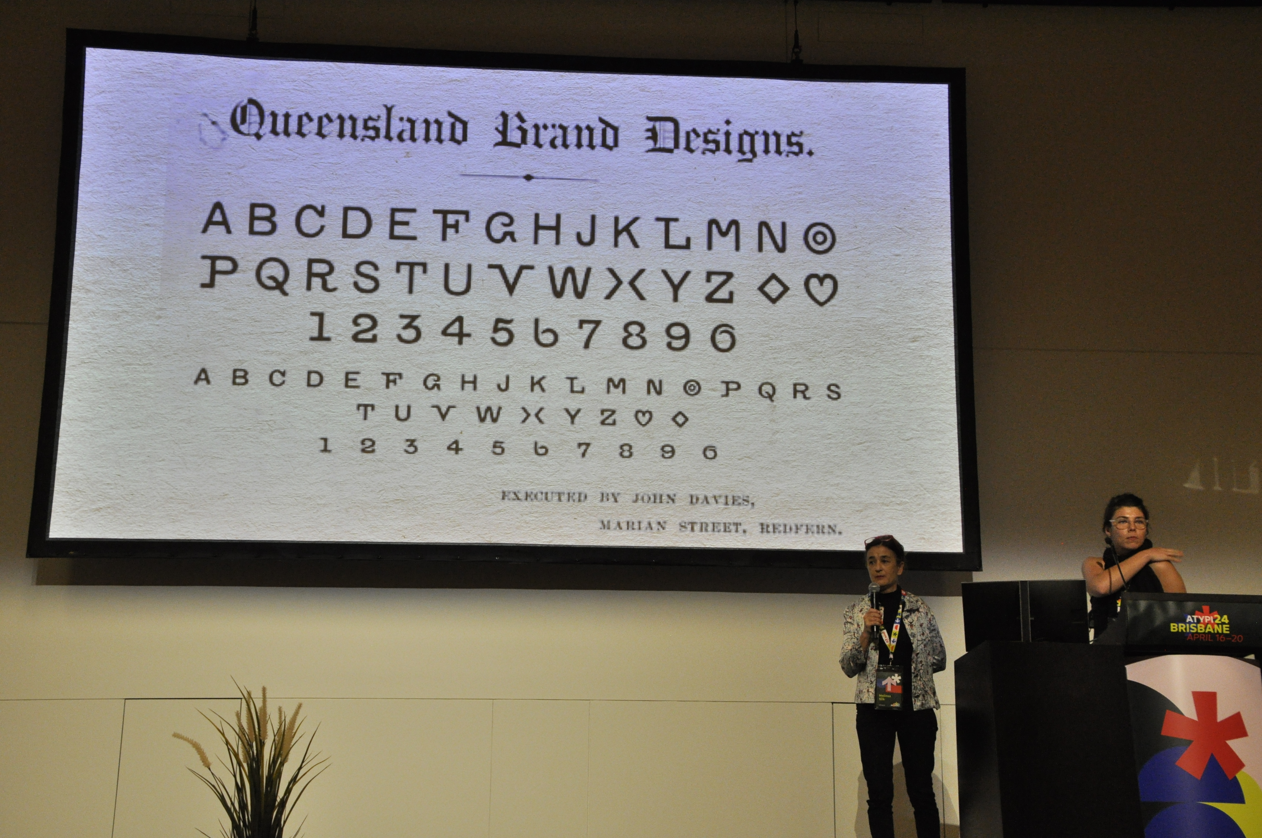
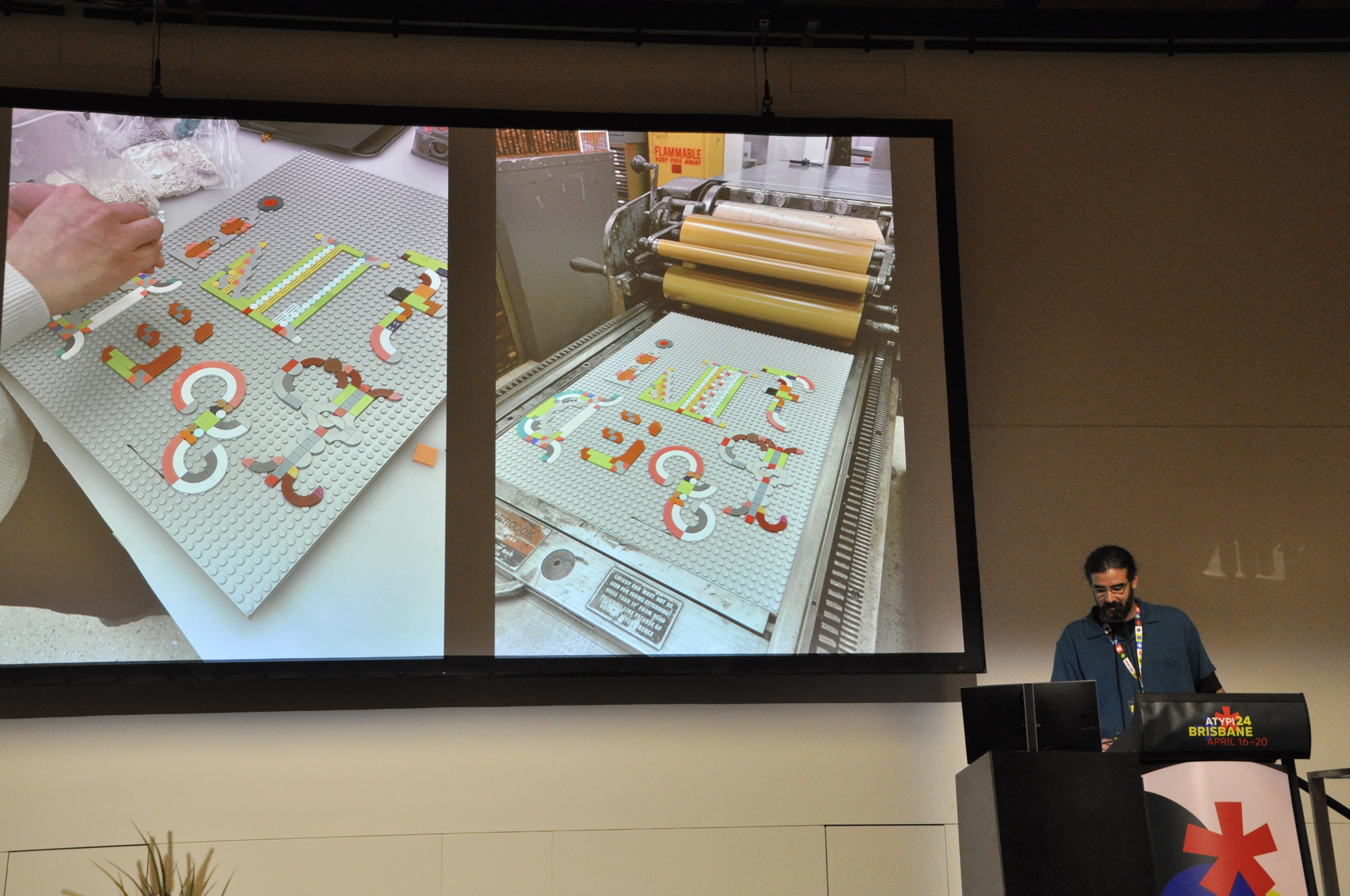
And then there was ‘Bovine Pyroglyphics’, the first talk on Thursday: a well illustrated presentation from Clint Harvey, Dzintra Menesis and Melissa Silk about the alphabets developed for, and from, cattle brands in northern Queensland. That was followed by Pedro Neves on letterpress LEGO fonts. Yes, really.
Pedro Neves talks about LEGO fonts for letterpress printing.
Other presentations focused on neon lettering, hand-painted murals in country towns, automated scaling of fonts, chromatic type for letterpress printing, Bollywood type, Lithuanian letters, a self-censoring font, typography for displaced populations, and a survey of Australian typography 1983-2023. Christine Bateup explicated the copyright implications of Generative AI for type designers. Eric Q. Liu gave us an entertaining and eye-opening look at grid systems for Chinese typesetting, and showed us the Chinese, Korean and Japanese editions of Josef Müller-Brockmann’s definitive Grid Systems in Graphic Design. Doug Wilson talked about how the Linotype machine was exported to Australia, followed by a showing of his 2012 documentary Linotype: The Film.
Wes Franklin on the role of typographic murals in rural communities.
A strong thread of lettering ran through the conference. Co-organiser Dominique Falla runs Typism, an annual conference on the Gold Coast just south of Brisbane; Typism was celebrating its tenth anniversary with an exhibition and a lively talk by Dominique. Despite its name, Typism seems to focus mainly on lettering, with occasional incursions into type design and calligraphy.
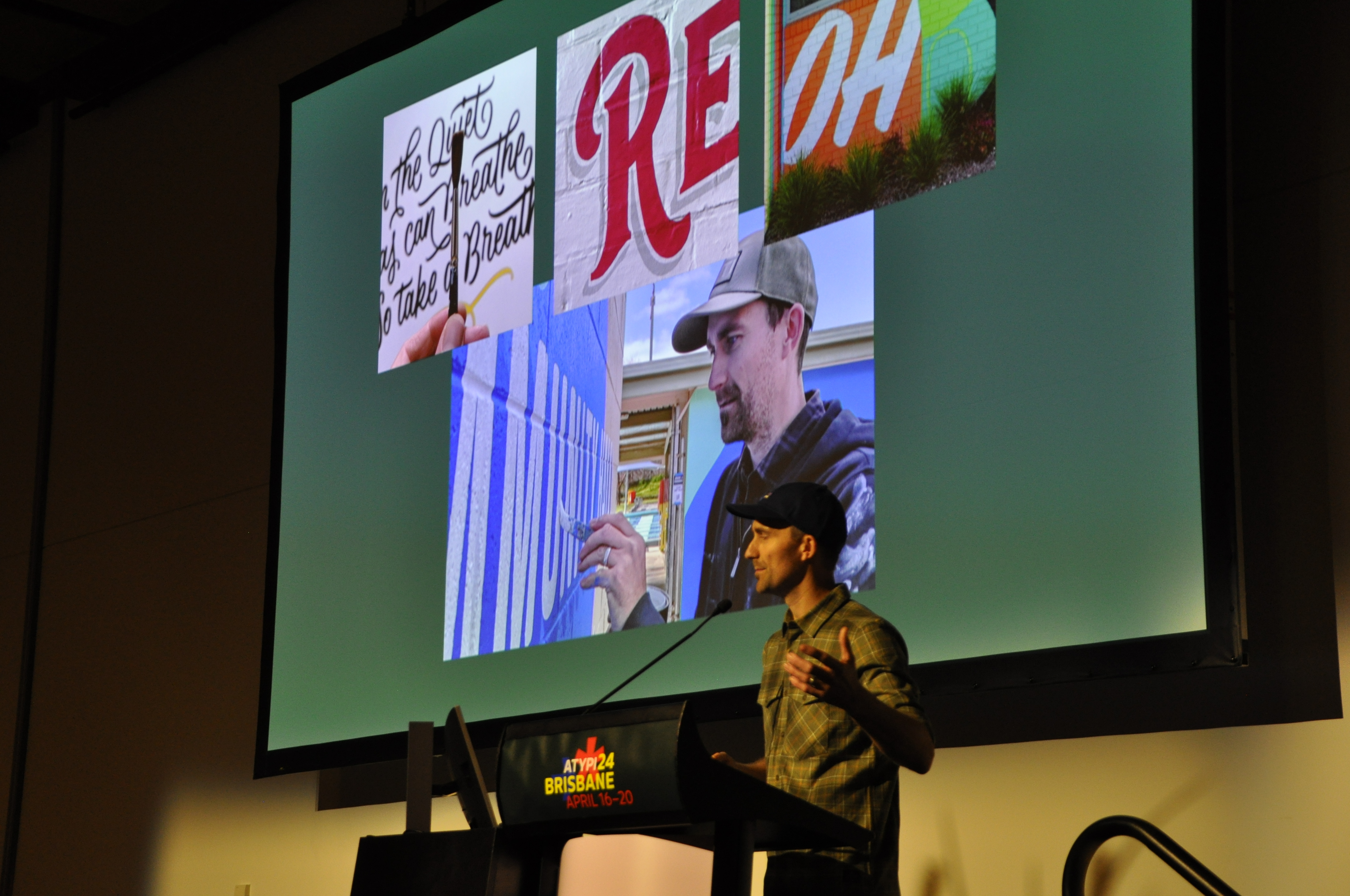
Lettering artist Matt Vergotis, also from the Gold Coast, spoke about how he works with craft beer breweries, many of them local, to express their brands through logos and related letterforms. By the end of the conference, no venue for next year had been decided on, though President Thomas Phinney told us that there were several possibilities under consideration. The one thing I think we can safely predict is that it will be somewhere in the Northern Hemisphere.
At the final-night party, in a noisy beachside restaurant, I was standing in front of the line of beer taps at the bar, wondering what to order, and mentioned to the bartender that I had just been listening to Vergotis, the guy who had designed two of the logos. Then I turned to my right: ‘And here he is!’
John D. Berry, editor and typographer, Seattle, United States
Special thanks to Eric Liu for the photographs.
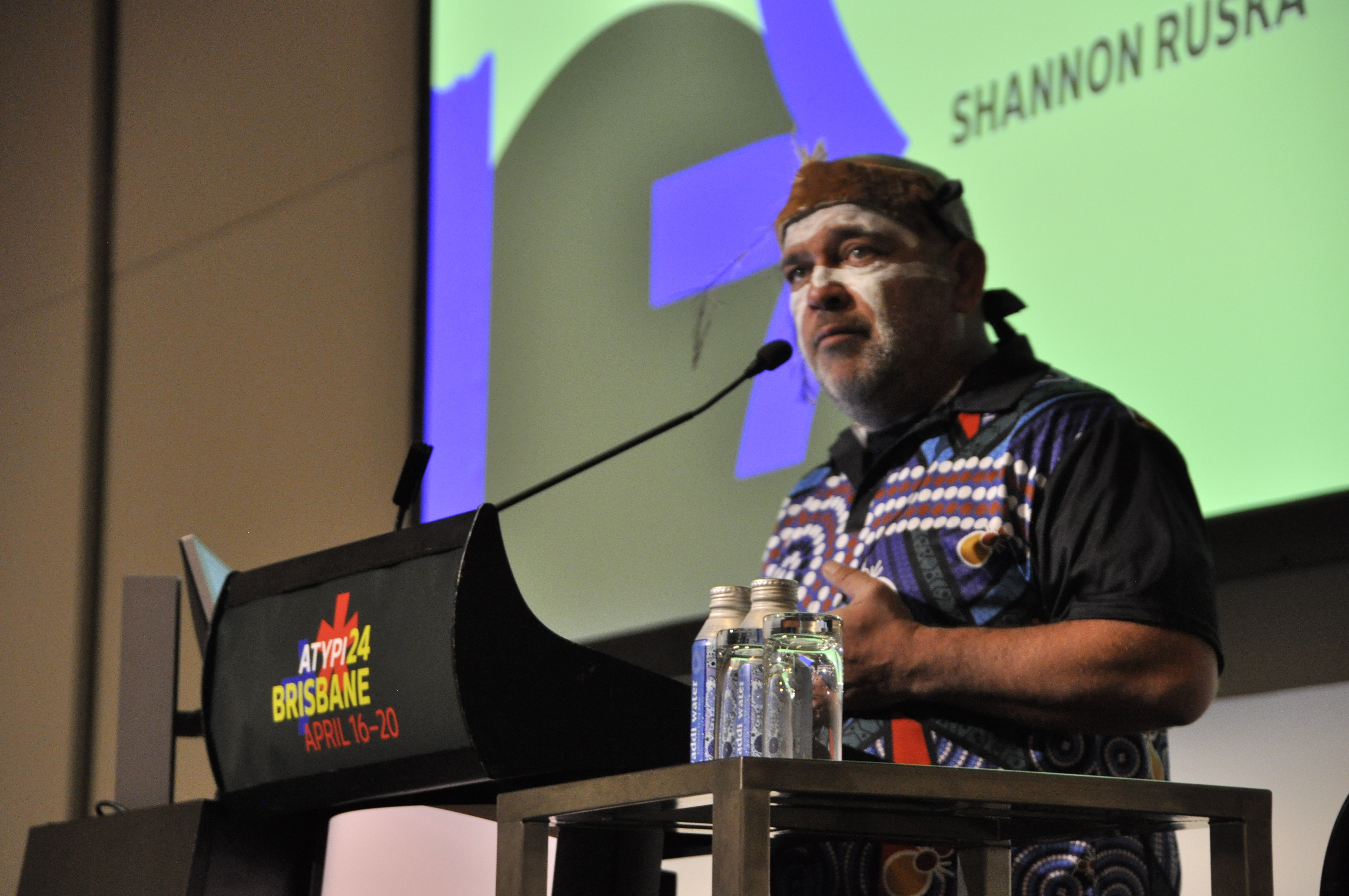
Shannon Ruska delivers ‘Welcome to Country’, a bridge between the Indigenous custodians of the land and visitors, which began the day on Wed 17 April 2024.
Eye is the world’s most beautiful and collectable graphic design journal, published for professional designers, students and anyone interested in critical, informed writing about graphic design and visual culture. It is available from all good design bookshops and online at the Eye shop, where you can buy subscriptions and single issues.