Tuesday, 9:00am
17 January 2017
Talented talent-spotter
Herb Lubalin
Tom Carnase
Seymour Chwast
Louise Fili
Carl Fischer
George Lois
Bert Stern
Andy Warhol
Bernie Zlotnick
Spin
Book design
Graphic design
Magazines
Posters
Typography
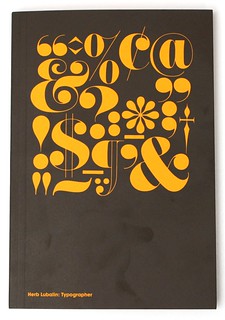
Herb Lubalin: Typographer
Edited by Tony Brook and Adrian Shaughnessy<br> Unit Editions, £29.50<br>Unit Editions’ second book about Herb Lubalin zeroes in on his ‘expressive typography’ and his gifted collaborators

Unit Editions’ Herb Lubalin: Typographer is a slimmer, more compact volume than the publisher’s popular blockbusters on Supergraphics, Henrion and Lubalin himself, writes John L. Walters.
This book focuses on Lubalin’s typographic work, with 144 pages of logos, editorial work and sketches printed monochrome on an egg-yolk-coloured uncoated stock (Neon Orange), and a further 64 on coated paper in full colour.
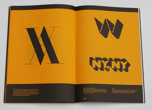
Logos for Ike Vern & Associates, date unknown (using lettering by Tom Carnase); Warner Paperback Library, 1970; and for the city of New York that was never used apart from as a short-lived masthead for New York magazine, 1960s. The paper used is Antalis Coloraction in Neon Orange – Acapulco.
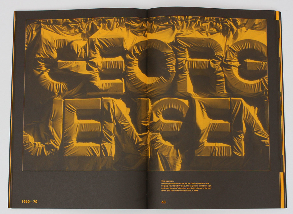
Top: Lettering installation for the Danish jeweller’s New York store.
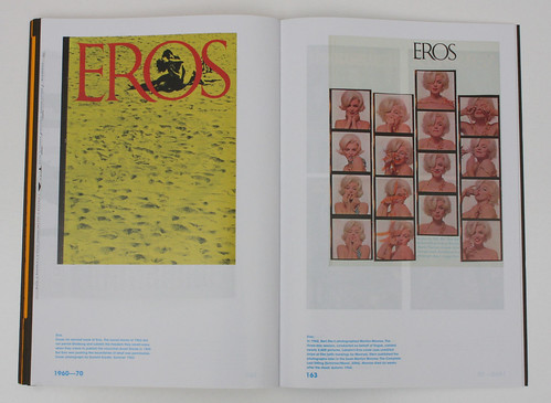
Eros Summer 1962 showing a photograph by Donald Snyder and Eros Autumn 1962 showing unedited film strips of Marilyn Monroe taken by Bert Stern for Vogue, just six weeks before Monroe’s death.
Lubalin (1918-81), who was colour blind, is recalled with affection by former colleagues in a short biographical text by Adrian Shaughnessy. Substantial captions add context, anecdotes and deal sensitively with the question of accurate credits of work from a studio packed with talented collaborators, including Tom Carnase, Tony Di Spigna and Ernie Smith.
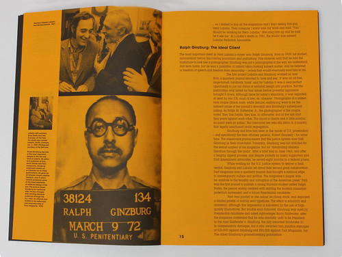
All the best known editorial work is here, including the publications he made with publisher / editor Ralph Ginzburg: Eros (see ‘Eros’ in Eye 25), Fact and Avant Garde. (Ginzburg was eventually jailed in 1972 for producing and distributing the short-lived Eros.)
Spread showing an image of Seymour Chwast, Lubalin and Bernie Zlotnick, 1967, Lubalin with Ernie Smith and Tom Carnase (thumbnail) and editor and publisher Ralph Ginzburg after being arrested for sending obscene materials through the US post, all of which were associated with his work on Eros.
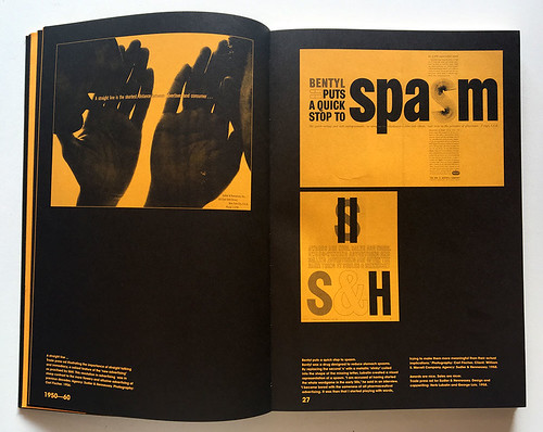
There are some striking early examples of Lubalin’s ‘big idea’ era ads while at Sudler & Hennessey, later SH&L (Sudler, Henessey & Lubalin), including work for William S. Merrell and Ciba Pharmaceuticals, and plenty of self-promotional work that employs what Lubalin called ‘expressive typography’.
Ads for Sudler & Hennessey with photography by Carl Fischer, 1956 (left); Bentyl, a drug to relieve stomach spasm, for client William S. Merrell Company, 1958; and a trade press ad for Sudler & Hennessey with design and copyrighting by Herb Lubalin and George Lois, 1958 (right).
Shaughnessy describes him as an ‘ace talent spotter’; Lubalin commissioned Warhol to do illustrations for pharmaceutical ads and he hired George Lois (see Reputations in Eye 29). Much later, he employed Louise Fili (see Reputations in Eye 87), who contributes a warm foreword to the book.
Lubalin, who left Sudler & Hennessey in 1964, was never particularly happy in the ad world. His wife Rhoda recalls him saying: ‘I’m not in advertising, I’m a graphic designer.’ His great talent was in designing with type through his practice of drawing ‘tissues’ – precisely specified roughs that colleagues would turn into finished artwork. There are ten pages of such sketches, including an unused proposal for MTV (which was launched in the year of his death), a sign of the changing times.
Read more in Adrian Shaughnessy’s Eye 83 article ‘Rethinking Lubalin’.
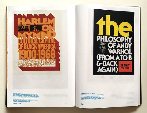
Book covers for Harlem on My Mind: Cultural Capital of Black America 1900-1968 and Andy Warhol’s The Philosophy of Andy Warhol (From A to B & Back Again). Shaughnessy wonders whether this book cover job was repaying the favour of Warhol illustrating an earlier book cover for Lubalin.
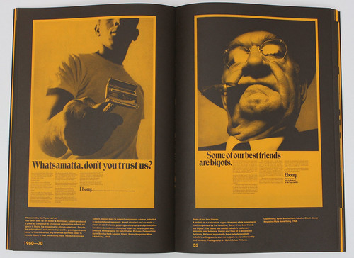
Lubalin art directed and co-wrote (with Irv Bahrt) a series of ads to encourage corporations to buy advertising in the African-American magazine Ebony, 1968. These ads use strong photography and language to challenge postwar ideas on race.
John L. Walters, Eye editor, London
Eye is the world’s most beautiful and collectable graphic design journal, published quarterly for professional designers, students and anyone interested in critical, informed writing about graphic design and visual culture. It is available from all good design bookshops and online at the Eye shop, where you can buy subscriptions and single issues.
