Monday, 3:00pm
13 May 2013
Talking about the A-Word
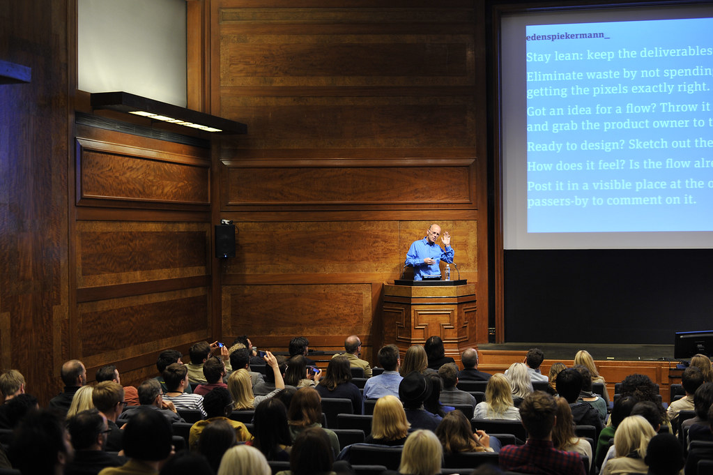
Erik Spiekermann
Oliver Reichenstein
Alan Fletcher
Milton Glaser
Gordon Young
Why Not Associates
John O’Reilly reports from day one of the inaugural Point Conference in London, where the designated theme was ‘authenticity’.

There was a little thought-bubble that imagined Erik Spiekermann carving out his lecture, live, on his body, Sagmeister-style, so that the first Point Conference’s attendees would swoon at his bloody authenticity, writes John O’Reilly. But I was glad he didn’t.
‘Authenticity’ wasn’t so much a theme as a kind of moodboard for the London conference, with speakers lightly alluding to it, reflecting how ‘authenticity’ has functioned in the world of marketing and branding. During a break I chatted to one of many attendees lapping up the array of stars and brands, and he remarked with relief the absence of brands explaining why they were ‘authentic’ or designers discussing the semiotics of authenticity – heartfelt and considered letterpress? Or don’t-care-authentically-default-Arial? Steampunk Victoriana?
The Point Conference’s own A-Team were conference organisers Henrietta Thompson (editor-at-large, Wallpaper), Patrick Burgoyne (editor Creative Review), Lynda Relph Knight (former editor of Design Week) and Patrick Baglee (writer). The venue was RIBA in London.
Day one speaker Phil Lewis, London Strategy Unit.
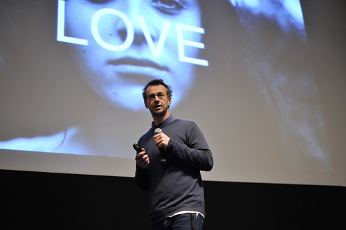
Top: Erik Spiekermann, EdenSpiekermann.
The morning began with Oliver Reichenstein from Information Architects, one of the few presenters to address the semiotics of Authenticity as he questioned the idea of ‘authenticity’ in a digital age. Reichenstein highlighted the oft-remarked on dilemma of this chase for the ‘authentic’. It’s hard to be authentic, ‘as soon as you try you become phony’. He discussed the thinking around the Metro design language for Windows 8 outlined by Pentagram who designed the new logo, ‘One guideline of Metro is that the graphic or interface must appear “authentically digital” – that is, it should not appear to be material or three-dimensional using gradients or effects.’
Reichenstein worried away at the issue of design and authenticity, pushing the idea of digitality to its limit – the alphabet is digital, data is digital – any information that is coded but stepping back from what you might call le digital abyss, ‘I don’t want to get carried away like the French philosophers – everything is digital, nothing is digital.’ Reichenstein argued, ‘digital authenticity is bullshit, because computers are simulation machines’. His closing gambit was a unique take on Plato’s Allegory of the Cave where prisoners mistake the shadows thrown up on a wall by a fire for the reality of light of the sun outside. It was early, and I was in the back row of the RIBA cave, so I may have misunderstand the parable but here goes, in Reichenstein’s jokey idiom … In the world of design it might be easy to see computer users as the dunderheads in the cave while designers, bask in the truth of pure design reality. Designers he argued need to focus on function and then on the ‘eye’. You can measure whether something works with Google analytics, and ultimately referring back to Plato’s Cave, ‘in order to have “authenticity”, you don’t go out in the sun to make products for designers – but for people.’ A wide-ranging argument that made Authenticity seem like a pallid sideshow of shadows, while Ambition and Argument got a bright A+.
Fenton 4GEE viral video for mobile company EE, by Poke London.
Poke’s Nicolas Roope explored storytelling in the digital age, arguing that ‘authenticity’ was about ‘depth’ which is why he reads stories to his children at night rather than feeding them chunks of data – ‘stories help joins things together’. They provide understanding. Looking back to previous eras he showed Kubrick film posters which were one of the rich but few ways of adding to the story of the movie for potential filmgoers. In our multi-platform age we have moved from a world of ‘complete experience to a world of granular stuff’. We consume feeds at a granular level which means story construction is different, showing how a scroll bar at the top of a page indicates to a reader there is more content to unfurl. Modern storytelling depends so much more on context, showing the version they made of the Fenton YouTube video for mobile brand EE. Brand or product stories are now told in bite-size chunks from packaging, to YouTube to tweets. In some ways, he argued, it goes against our cultural prejudice around the auteur, the idea of the single author in control.
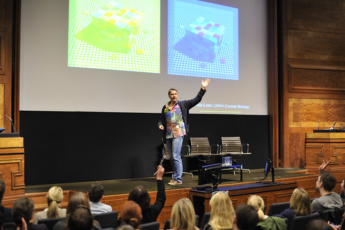
Beau Lotto, Beautiful Mind.
Neuro-scientist Beau Lotto founder of Lottolab, a hybrid of art and science played with the audience’s sense of perception, exploring how the brain makes meaning with a series of visual puzzles that echoed the project of Rudolf Arnheim. Lotto’s promise that he wanted the audience to know less at the end of the lecture than the beginning, was achieved in true Socratic fashion as he challenged the audience showing that we never see the world as it really is – ‘one of the hardest things to be is to be “authentic” when confronted by a problem is to know what your assumptions are’. So how do we see differently? ‘All new perceptions begin with a question.’ The issue as every philosopher or designer or businessperson knows, is how to invent the most productive question, the question that will generate new thinking.
David Hieatt from Hiut Denim talked about how the denim factory in his town closed down because it fought the wrong battle – price – and how his company has sewn in a unique kind of storytelling to his jeans. A bizarre and compelling story of how his company is changing jeans into something different, a multi-faceted object with a life of its own. So for example the solution to the expensive outsourced process of pre-washed jeans was to pay people to wear unwashed jeans for six months who don’t wash them, then give them back.
David Hieatt, Hiut Denim.
The afternoon session was clearly designed to focus on human ‘embodiments’ of creativity. Quentin Newark (Atelier Works) introduced a meditative documentary on his old boss Alan Fletcher shot not long before he died. The movie’s unhurried pace expressed the charismatic ease and lightness of Fletcher’s creative spirit as he moved through his studio, his creations such as the toys he made from garbage felt like living things. Fletcher’s work as expressed in this film embodied the idea of great design as creative generosity, his work offering new ways of perceiving and interacting the world. The kind of thing Beau Lotto was trying to explain in the language of neuroscience. Erik Spiekermann was part Woody Allen (‘Is there life before death?’) part Business Existentialist (‘I want to show you how I go looking for meaning’) and part outrageously Nutty Professor as this skilled performer – the modulated rhythms, the asides, the curses, the swell of outrage – talked us through the rituals and practices of his company, designed to make life and work sustainable in the human sense. And Magnum photographer Bruce Gilden, resembling one of the figures from his street photography, clicked us through his 1980s Coney Island images, his Yakuza images from Japan, and shooting the architectural and human debris from the recent Great Recession.
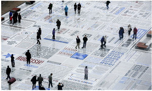
The evening session featured Andy Altmann from Why Not Associates and artist Gordon Young talking (in the words of Young) ‘authentic Northern bollocks’, about their comedy carpet (read ‘Gag pile’ on the Eye blog) for Blackpool pier. The scale of the project they took on, encompassing giant concrete typography, manufacturing and sculpture was a lesson on the necessity sometimes of taking on too much – and just making it happen. Young talked about how ‘authenticity’ was a feature of 1990s political and cultural discourse (the ‘real thing’) and jested how he was advised to steer clear of politics for this audience of designers.
Comedy Carpet, Why Not Associates.
But the highlight of the day for this viewer was Patrick Baglee’s visit to New York to bring back the wisdom of the gods – or in fact just one God, all others are fake – Milton Glaser. This was 30 minutes of supple, sophisticated thinking that came out of his practice that spanned: the triad relationship between designer, client and audience; the idea of a ‘hippocratic oath’ for designers; to his commitment as a designer ‘not to do anything with a mannerism that interferes with his promise to a client.’ I signed up to the Church of Glaser – I think it’s a broad church that includes writers and philosophers too.
It was fascinating to see how design would address context. And certainly on the first day there were mixed results, mainly in terms of format. The 30-minute show-and-tell is graphic design’s worst gift to the world, a blindspot in a discipline historically organised around the idea of communication. After nine hours (I missed the last hour) it occasionally felt like being accosted at a party by someone whose drugs / alcohol intake persuades them that their rapid conversation is endlessly interesting (probably how you are feeling about the length of this review). Most of all, this format underlined a wider, deeper history of graphic design culture, where critical journalism and reflective enquiry in the service of deeper understanding has not often been encouraged, and is at best tolerated.
Henrietta Thompson, Patrick Burgoyne, Lynda Relph-Knight and Patrick Baglee are among the most distinguished figures in design journalism and they needed to navigate the contributors and the audience through the topic. Their brief intros delivered short snappy context and the taster made me want more of their insight, their context – that said, I’m not a designer. In the age of ‘unmediation’, of unmediated expression such as blogs, Twitter and instant updates, the instrument of ‘thinking’ provided by the professional critic is likely to be seen as belonging to a previous era of technological production.
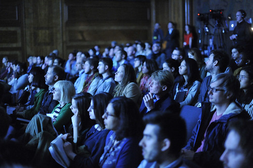
Point delegates.
As far as the authenticity theme was addressed in the conference, in a good way it felt like the long goodbye to bad philosophy, the endgame of a marketing meme, in an interesting book from James Gilmore and Joseph Pine, that got out of hand – without any dark Machiavellian plan, the idea really just tapped into the insecurity of clients / businesses, and branding consultants hungry for ideas. Companies just need to understand better what they do, why they are doing it, and why it matters to a consumer. The role of designers and illustrators is to use their mastery of artifice to connect with the intended audience. Thankfully, most presenters only nodded obliquely to the idea of ‘authenticity’. In the twentieth century any evolutions in design / culture / society were at the expense of rather simplistic and dangerous notions of ‘authenticity’ – which is another long-winded article.
‘Point’ took place 2-3 May 2013 at the Royal Institute of British Architects, 66 Portland Place, London.
John O'Reilly is a writer and editor of Varoom magazine – Illustration / Culture / Society.
Eye is the world’s most beautiful and collectable graphic design journal, published quarterly for professional designers, students and anyone interested in critical, informed writing about graphic design and visual culture. It is available from all good design bookshops and online at the Eye shop, where you can buy subscriptions, back issues and single copies of the latest issue. You can see what Eye 84 looks like at Eye before You Buy on Vimeo.


