Saturday, 12:15am
5 December 2009
The form of the book
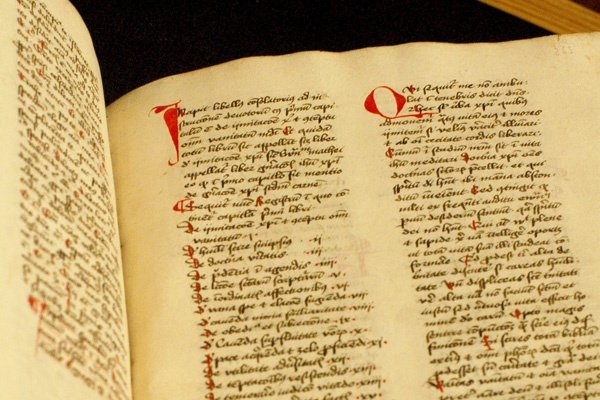
Fifteenth-century book-making – white space by design and default

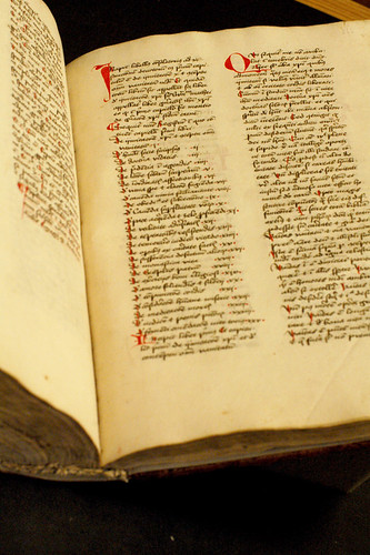
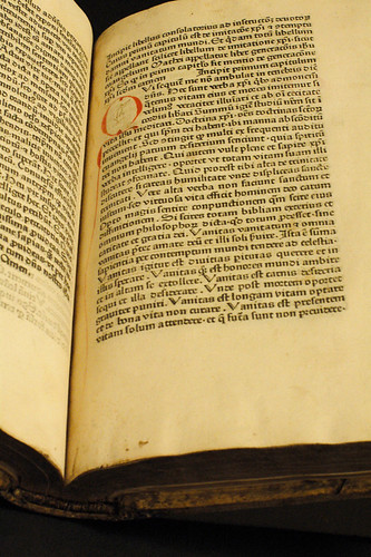
It is usually argued by incunabulists (specialists in works printed prior to 1501) that the first printed books were designed to look exactly like their manuscript predecessors, writes Jane Cheng. Looking at the two examples here, both fifteenth-century versions of the Imitatio Christi now in the Harvard Libraries, it is tempting to agree.
I think it was historian Henri-Jean Martin, however, who noted that the phenomenon of resemblance was probably not so much a matter of conscious ‘design’ as of default: how else could a printer have imagined a book to be, than what it was before?
If we look more closely, however, it is instructive to observe the differences between manuscript and printed book as well. These are more likely to be the aspects that were more consciously ‘designed’, precisely because they were departures. The case of the Imitatio Christi is particularly poignant, because identical idiosyncratic introductions in both books imply that they constitute a rare example of printer’s copy: that this very manuscript (MS Lat 246) was used by the printer, Gunther Zainer, to produce this first edition (WKR 1.2.13), in 1473. If this is true, we can see that Zainer has transformed the page such that it is now defined not by red, hand-painted rubrics, but by modern white space.
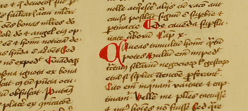
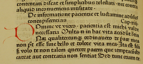
He has first of all merged two columns into one, a visible space-saving effort that took advantage of printed letters’ easy legibility and makes for a more regular surface, in which white space is more noticeable. In the manuscript, a hierarchy of red rubrics marks each chapter heading and opening, and even the beginning of every sentence. For printed books, on the other hand, rubrication would have been comparatively much more expensive, since printing was such an efficient economy of scale.
In Zainer’s edition, some rubrics have been deemed unnecessary, and others have already been replaced by a new use of white space. As we can see in the manuscript here, for instance, chapter headings often simply continue at the end of the previous chapter’s last sentence, and are marked by salient rubrics. In the edition, on the other hand, new chapters always begin on a new line, and there is almost always a long tab between the name of the chapter and its number, alleviating the need for red ink to differentiate components of the text. Sentence and paragraph marks have been left out altogether. Although large spaces were left for rubrics, it was left to the buyer to have them filled - and in most surviving copies, this space was left empty.
The book's colophon indicates that the printer was acutely aware of his new ‘design’. Zainer writes proudly, ‘By Gunther Zainer from Reutlingen, by the generation of a press with copper letters.’ Clearly, he wanted customers to know that the book came from him, and that it was printed.
Eye is available from all good design bookshops and online at the Eye shop. For a taste of the magazine, try Eye before you buy.

