Tuesday, 10:00am
24 June 2014
The last magazine czar
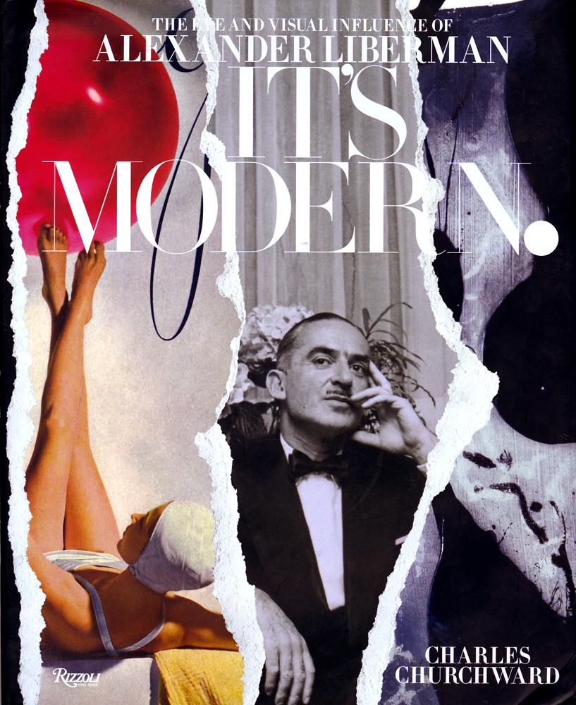
It’s Modern. The Eye and Visual Influence of Alexander Liberman
By Charles Churchward, Rizzoli, $65, £40Art director Alex Liberman remembered: ‘His only requirement was that the design make it easy to read the copy.’ Review by Steven Heller

Alexander Liberman (1912-1999) was the first and last twentieth-century magazine czar, writes Steven Heller.
No one else in the art director’s pantheon – not M. F. Agha (Vanity Fair, Vogue), Alexey Brodovitch (Harper’s Bazaar), Leo Lionni (Fortune) or Henry Wolf (Esquire) – wielded as much editorial and design power as Liberman while serving as editorial director of Condé Nast from the early 1960s until he stepped down in 1993. ‘He approved or designed every layout, every piece of text, for every issue of every magazine, and he chose much of each publication’s top staff,’ writes Charles Churchward in the introduction to this new career monograph.
Few creatives were more controversial within the design world for their designs either. While the above-listed art directors remained true to certain conceptual and aesthetic principles, Liberman (who preferred to be called Alex) literally tore up many of those tenets to which he once swore allegiance, challenging the dominance of fine typography and balanced layout. As he got older he was even more impatient with elegance for its own sake – and the design world in general.
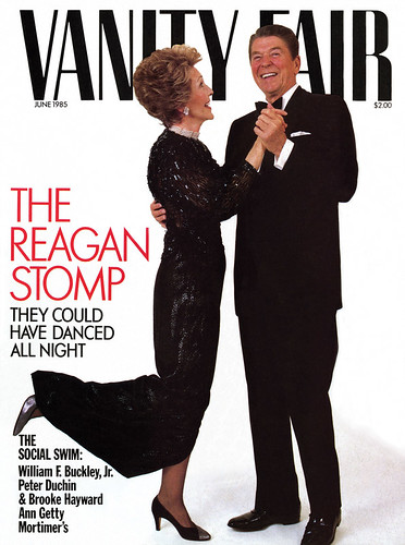
Vanity Fair cover, 1985. Photo by Harry Benson. © Condé Nast Publications.
Top: cover of Charles Churchward’s It’s Modern. The Eye and Visual Influence of Alexander Liberman.
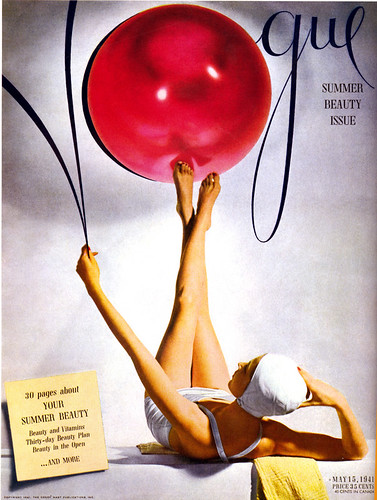
Cover of Vogue, 15 May 1941. Photo by Horst P. Horst. © Condé Nast Publications.
‘Alex believed the standard editorial format should be changed to communicate with a new, younger, and a wider audience,’ Churchward writes about the raucous layouts emerging from Condé Nast. ‘He believed spreads should be filled with layers of information, presaging the way we’d consume media through the windows of a computer screen decades later.’ Liberman introduced a proto-punk-retro-pulp aesthetic to magazines such as Mademoiselle, Self, Allure and Vanity Fair, for which he was both pilloried (‘Conde Nasty’, wrote one critic) for being anti-design and praised as flexible enough to break his own moulds. His anarchic rip and tear conceit, for better or worse, held sway for a while in the magazine market. Yet more important, this suave, urbane Russian-born painter, sculptor, photographer and layout man, who had started designing magazines at VU in Paris, espoused some progressively aggressive design ideas.
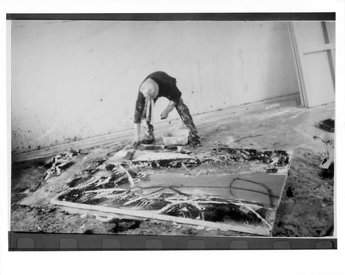
Alexander Liberman painting in studio. Photo by Dominique Nabokov.
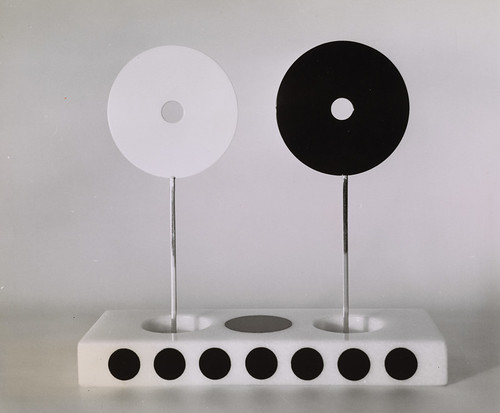
Alexander Liberman, Opposites, small sculpture, 1959. Archives of American Art, Smithsonian Institution.
‘It was fascinating to consider that the page was not sacred,’ Churchward recalls, ‘that margins and the gutter were not the limit, and the flow of text could run right off the edge of the pages. Old typewriters with broken keys and label guns were sometimes used in typesetting of headlines … He encouraged me to use odd typefaces and shapes, and I began my own collage-like layouts. His only requirement was that the design make it easy to read the copy. If ever his decisions were questioned, he would simply say, “My friend, it’s Modern,” and move on. No one could argue with that.’
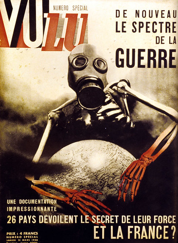
Cover of VU magazine, 21 March 1936.
It is not clear how much argument would be tolerated in any case. Despite encouraging the informal use of his name when speaking to him, Liberman’s authority was absolute. When showing layouts to him, it was common to stand aside while he ripped up pages and started from scratch. ‘Alex played with colored paper and photos copied in many sizes to create art collages that he used as layouts,’ Churchward notes about the ‘Modern’ method that Liberman encouraged his art director / designers to adopt.
Churchward, a Condé Nast art and design director, was a loyal member of Liberman’s court, and was ultimately given the keys to the archive. This works for and against him. His personal experiences and the biographical facts are useful for their insider knowledge, but for the pleasure of reading I prefer the more spritely Alex: The Life and Art of Alexander Liberman by Dodie Kazanjian (Knopf, 1993), which paints a more warts-and-all portrait.
My biggest disappointment, however, is endemic to Liberman’s own definition of himself as an artist whose true art was distinct from his day job. The mammoth red steel sculptures he produced are as far from the printed page as he could get. Having his sculptures and paintings woven through the book, sometimes juxtaposed with a reproduced magazine layout, may be enlightening in terms of Liberman’s attitude as a total artist, but means that a book that focuses exclusively on the way he designed, art-directed and ruled over the successes and failures of Condé Nast is still waiting to be made. Nonetheless, this is not a purely professional design monograph such as those on Alexey Brodovitch or Saul Bass. Churchward is true to a subject who might not have wanted to mix the arts but was czar over all of them.
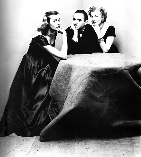
Alexander Liberman with his second wife, Tatiana Yacovleff du Plessix Liberman and his step daughter, Francine du Plessix Gray. Photograph by Irving Penn.
Steven Heller, design writer, New York
Eye is the world’s most beautiful and collectable graphic design journal, published for professional designers, students and anyone interested in critical, informed writing about graphic design and visual culture. It is available from all good design bookshops and online at the Eye shop, where you can buy subscriptions and single issues.
