Monday, 1:08pm
28 September 2009
The plight of Tibet – in typography
Interview with DAHRA’s Rishi Sodha about 3 Minutes

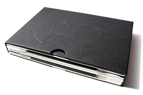
3 minutes is an elaborate graphic design project, a black slipcase containing eleven sixteen-page booklets (above). And it’s in aid of a good cause, the Tibet Relief Fund. The content – ten moving, often shocking interviews that shed light on ‘the issues faced by the people of Tibet’ – is intended to make us stop and think about the situation, and maybe do something about it.
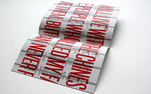
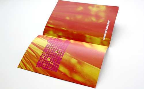
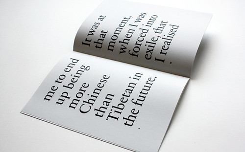
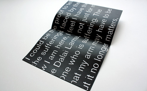
Each interview is given a different typographic treatment; the design groups involved include Brighten the Corners, Si Scott, Pentagram’s Abbott Miller and Research Studio’s Jeff Knowles, whose elegant, text-rich design adds extra layers of Wikipedia-derived information to the core text. In case you have trouble reading the more elaborate treatments, you can read all ten interviews in an eleventh booklet, which also includes a foreword by Rishi Sodha, founder of DAHRA (Designers Against Human Rights Abuse), and the person who put the whole thing together.
You can buy copies of this limited-edition work for £10 from DAHRA, and we'd like to hear what readers think of the designs, and the way the designers have interpreted the contents.
Below: An interview with Thamtse Dolma. Design by Nick Hard.
Above: An interview with Ngawang. Design by Abbot Miller.
We interviewed DAHRA’s Rishi Sohda about the project
Rishi Sodha: I was keen on challenging our designers by setting them a specific brief. Where our first book (Designers Against Tibetan Abuse, 2009) was more a collection of art, the typographic element in this book really means its foundations lie in design.
DAHRA was founded on the principle that all our projects should be enjoyable for our contributors and give them the freedom to express themselves away from client work. As such the challenge with this brief was to keep it open and yet being quite challenging. Hence we chose to translate the medium of sound into print and – to make this more challenging – we asked our contributors to primarily use typography.
From the feedback we got from the contributors they really enjoyed this brief, more so than the first one, as these parameters gave them something to work with and yet allowed them to flex their creative muscles. Especially as there was no client telling them whether something had to be bigger or smaller or if something needed to shift left or didn’t mean their brand guidelines etc.
In terms of choosing the designers I was keen to use our past contributors as well as introducing new members to DAHRA, to ensure that with each project we continue to grow. From previous projects we had Alex Haigh, Nick Hard, Si Scott return and they were joined by Bibliotheque, Brighten the Corners, Stefan Gandl, Jeff Knowles, Un.titled, Paul Skerm and Abbott Miller, all of whom are known for their typographic excellence. This was the only criteria when I was considering who to choose, as they have complete creative freedom we had to choose people whose talent we trusted.
DAHRA is extremely blessed in terms of the amount of members we have, all of whom are extremely talented, and with only ten spaces to fill we really were spoilt for choice. However I feel that the final outcome (the book) proves that we made the right choices and it really is an excellent collection of powerful and thoughtful responses and we couldn’t be happier with how they turned out.
Below: An interview with Tenzin Lose. Design by Brighten the Corners.
Above: An interview with Tsewang Dhondup. Design by Bibliothèque.
Eye: Was there much to-ing and fro-ing, or did they just send them to you as finished files for printing?
RS: The beauty of taking part in a DAHRA project is that our contributors have complete creative control within the parameters of a brief. As I had designed the slipcase and covers they had fourteen blank pages to work with and the final results you see is exactly how we received the artwork. The only amendments that were made were to the colour on two spreads after viewing the proofs and this was done with the original designers’ permission.
Eye: Which ones are your favourites (or which ones responded best to the brief)?
RS: I think each and every response was powerful and terrific in their own right and I really can’t choose between them. They really work as a collection and this is reflected in the covers of the booklets, which form together to make a large ‘3’ (below). And this is how the book should be viewed, as smaller stories combining to show the macrocosm, which in this case is the full extent of the plight faced by Tibetans.
Eye: Did you tell any of the designers that there would be a sixteen-page booklet with all the transcriptions alongside their interpretations (above)?
RS: We did tell some of the designers but we always stressed from the outset that they did not have to use the interview in its entirety.
At first I wasn’t sure we would need the ‘eleventh’ booklet, as it depended on how the contributors interpreted the brief. However to my delight there was an extreme contrast to the final outcomes and as such we were happy to include the extra booklet as the stories, in their own right, are extremely powerful.
Eye: What next?
RS: Our exhibition of the artwork from the first book culminated with an auction. That means that three projects have now been completed since January in aid of the Tibet Relief Fund. This is an exciting time in DAHRA’s short history as we are now introducing our second and third ‘themes’. The way DAHRA is structured is that we have three ‘themes’ that we run with for a period of two to three years, doing various projects for each. This way we ensure that over time we raise enough awareness and enough funds and make a real difference to each cause.
Our next project (the fourth) is in aid of Barnardo’s and is entitled Play.Create. We have invited ten graphic designers, ten product designers and ten children to customise Kidrobot’s Munny dolls on the theme of play and creativity and we will auction these off after an exhibition in London towards the end of November. All proceeds will go to Barnardo’s.
In terms of contributors for that, the graphic designers are: Michael Bierut (Pentagram), Paula Scher (Pentagram), Joe Shouldice (Sagmeister Inc), Michael C. Place (Build), Si Scott, Alex Trochut, Gary Fernandez, Alberto Cerriteño, Ollie Johns and 2 Creatives. The product designers so far are: Forpeople, Max Lamb, Rolf Sachs Studio, Anthony Dickens studio, Octo Design. The ten children will come from a local orphanage / hospice and we are in the middle of organising this currently.
Our fifth project, in aid of Cancer Research, will be out next summer and is entitled Memories. We are currently interviewing twelve people, six survivors and six families of people who lost their battles with cancer. These interviews will be used to brief our contributors, with twelve contributors being invited per interview. The theme for this is a year, so there will be twelve interviews, with twelve responses to the first ten interviews. The last two will be an open brief run in conjunction with Computer Arts. All proceeds once again go to charity. You can follow the progress of this project at memories.subism.co.uk, which gives people the utmost transparency on how we run projects and how much hard work goes into them.
We also have three short films coming out as the second part of the 3 Minutes project, using three separate interviews. These short films will be created by Rob Chiu (theRonin) and Ben Lukas Boysen (HECQ), the first of which will be released early next year. While no proceeds will be generated from them initially, the films will be used to raise awareness.
To order 3 Minutes (above), click here.
Eye is available from all good design bookshops and online at the Eye shop. For a taste of the magazine, try Eye before you buy.

