
Tuesday, 12:41pm
15 December 2009
The romance of chemicals
Max Schmid
hamish thompson
Design history
Graphic design
Illustration
Posters
Typography
A portrait of Swiss designer Max Schmid, father of ‘Geigy style’, by New Zealand typographer Hamish Thompson
Zurich is a long way from my home in Wellington, New Zealand, so I missed out on the Geigy exhibition, ‘Good Design, Good Business’ held in the Zurich Museum of Design earlier this year, writes Hamish Thompson.
However, as compensation, I quickly acquired the exhibition monograph, Corporate Diversity: Swiss Graphic Design and Advertising by Geigy 1940–1970, reviewed by Richard Hollis in Eye 72.
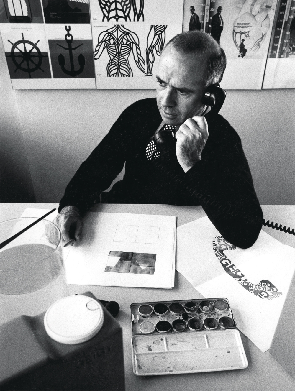
Turning the pages of Corporate Diversity, I was struck by the powerful, yet understated, legacy of Max Schmid – one of the important contributors to the Geigy style, and an exemplar of what we now regard as ‘classic’ Swiss Design. As the art director of the Geigy design studio for 23 years, Schmid influenced and shaped the corporate design identity of an international company which later became synonymous with ‘Swiss Design’ of the 1950s and 1960s, and yet, many readers may be surprised that his work features so prominently in this retrospective. Max Schmid is – if not overlooked – then taken as axiomatic: he is Swiss Design.
Max Schmid (1921–2000) was born in Rheinfelden near Basel. In 1941 he began an apprenticeship in graphic design in the studio of Fritz Bühler in Basel and remained Bühler’s closest collaborator for seven years. It was at Bühler’s studio that Schmid first worked together with Armin Hofmann, who would become his lifelong friend and colleague.
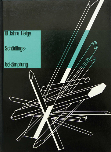
Book celebrating the tenth anniversary of DDT products:
10 years of Geigy pest control (1953).
Top: Max Schmid, ca. 1967.
In 1948 Schmid became art director at J. R. Geigy Pharmaceutical Corporation (now Novartis) in Basel, where he helped René Rudin to build up the graphic studio and to establish the famous ‘Geigy Propaganda’ department. The working environment for the designers was attractive for many reasons: while an array of new products required advertising, there were as yet no copywriters on staff who dictated headlines – often a solitary product name could be used as the largest typographic element interacting with the graphics. The designers understood every task as a new artistic challenge, and they were free to develop fresh solutions which looked different from all other publicity of the era; hence one soon spoke of the ‘Geigy style’.
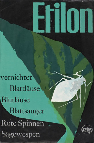
Poster for the insecticide Etilon (ca. 1955): ‘Etilon: exterminates aphids, apple aphids, psyllids, red spider mites, sawflies.’
Geigy’s chemical products lent themselves to a high degree of visual abstraction, and were ideal subjects for the reduced aesthetics of Swiss Design. It is worthwhile to remember, however, that for all that we recognize as classic in Schmid’s work, his designs and his directorship at Geigy represented a constant exploration of – rather than merely conformity to – this design idiom.
Schmid’s emphasis was always on the use of strong visual images. He made use of black and white photography and even X-rays to condense a subject to its most elemental; and used stylised depictions of pests or body parts in focused treatments. Colour related to the product: for example, colours for insecticide packaging were chosen for their toxic appearance, as well as to serve in a series. Schmid’s mastery of packaging design was displayed in Geigy’s uniform packaging for pharmaceuticals, and his innovative designs for industrial chemical containers.
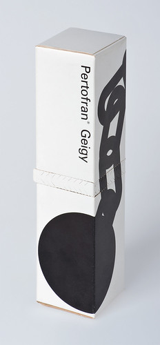
His work is formal and stylised but humanistic – Schmid rarely misses an opportunity to play in message or in form. On the package of ‘Petrofran: rapid resolution of depressive states’, a ball and chain runs around all four sides of the package – when the perforated strip in the middle of the box is torn open, the links in the chain are broken, symbolising liberation.
Package for the antidepressant Pertofran (1962).
Schmid was especially influential at Geigy, not only because of his own design expertise, but also in part due to his engagement with new talent. During his tenure, Schmid, with the aid of Armin Hofmann (Kunstgewerbeschule, Basel), engaged more than 30 talented graduates to work with him at Geigy AG. This collaboration, and Max Schmid’s association with Armin Hofmann and the Basel School of Design, helped to form the Geigy style.
Schmid viewed the design world as an international forum, and in 1962 he travelled to Japan to interview candidates to work at Geigy. His own studies and work led him to Italy (Olivetti, Milan, 1953), and the United States where he studied with Josef Albers, and spent several months working at the Geigy office in Manhattan (1957). In 1992 he was a Guest Professor at the Universidad de las Americas, Puebla/Mexico.
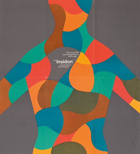
Brochure for Insidon (1965): ‘In the complex pattern of psychosomatic illness Insidon is consistently effective.’
Throughout his career, Max Schmid was committed to teaching and mentoring new designers. His tutelage and support of graduates working at Geigy had a significant influence on their careers. Many, such as Steff Geissbühler, went on to lead major design studios in the United States; while others went on to teach at the Kunstgewebeschule (Andreas His, Enzo Roesli, Igildo Biesele). Schmid also taught graphic design at the Basel School of Design (1964–1986), where I had the opportunity to study with him.
As a teacher, Schmid was particularly concerned with orientation and sign systems, and the aesthetics and technical problems of packaging design. An imposing but unobtrusive teacher, his students described Schmid as ‘always present, always interested, and always professional’. Bill Schorner remembers: ‘He never gave you the impression he knew something that you didn’t – he worked with you on projects as a support and co-worker and would just say, “I don’t know the answer. Keep trying in that direction”.’
Schmid approached his own work with the same open-minded attitude. In addition to his career at Geigy and as a teacher, he continued to work as a freelance graphic designer and specialised in posters, corporate identity, packaging, and book design.
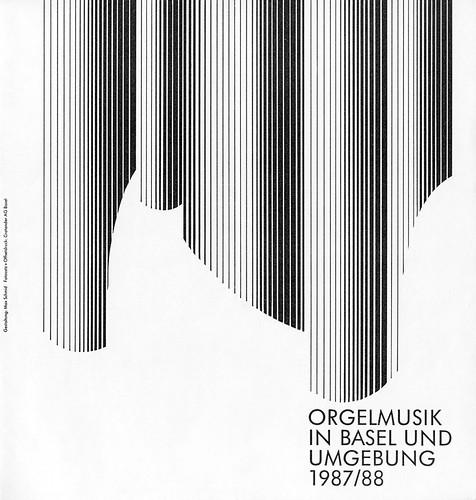
Programme cover: ‘Organ music in Basel and the surrounding area’ (1987).
Max Schmid was a family man, married with two children. His talents were not restricted to design and he was a lifelong passionate pianist and concert organist. He was also strongly interested in the arts, culture and politics. He is remembered as a kind, quiet gentleman, equipped with a rather sharp, dry wit. He was a man of great personal and professional generosity. As his student in Basel, I owe a great debt to his support and encouragement. Knowing the man, I am not surprised that his legacy, although crucial and exemplary, is typically understated.
Special thanks to Lisa Pomeroy at the Basel School of Design for assistance with research and translations.
Hamish Thompson, typographer, designer, teacher, Wellington, New Zealand
Eye is the world’s most beautiful and collectable graphic design journal, published quarterly for professional designers, students and anyone interested in critical, informed writing about graphic design and visual culture. It is available from all good design bookshops and online at the Eye shop, where you can buy subscriptions, back issues and single copies of the latest issue.