Tuesday, 1:25pm
20 January 2009
The Times: from paper 2 mag
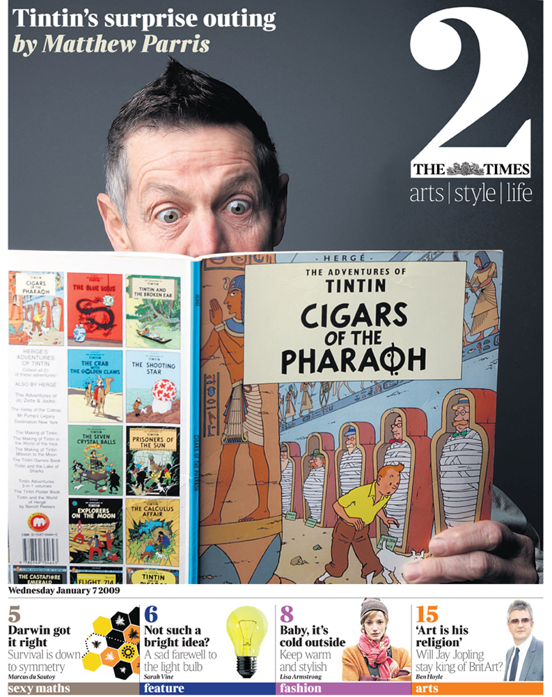
Thunderer prepares for a revamp by quietly reworking its second section

Life’s tough if you publish a paid-for daily newspaper, writes Simon Esterson. There are rising newsprint prices and advertisers moving their budgets online (or just cutting them altogether) while readers desert you for the internet and free papers.
In the UK, The Guardian, under editor Alan Rusbridger and creative director Mark Porter, has been the exceptional standard-bearer for the value of good design as a weapon in this battle: the change to the Berliner format; the introduction of full colour printing; commissioning its own complete font family; and unifying print and online design. The Guardian’s been there, done that and won a D&AD gold in the process.
But where’s everybody else?
As Rick Poynor pointed out recently (in his Web-only Critique), The Independent seems to have lost its way graphically. The Daily Mirror also worked with Barcelona’s Cases i Associats but couldn’t really escape its own tabloid legacy. (We haven’t seen a contemporary design for a mass-market tabloid in the UK, even though David Hillman’s telephone number is openly available). Meanwhile, the Daily Mail believes in its own particular brand of mid-market design: part sub-editorial lore, part big bag of typefaces.
In the 1960s and 70s it was The Times and The Sunday Times, with its visually minded editor Harold Evans, that made the typographic running. Now down at News International in London’s Wapping, things are stirring again. New full colour printing plants have given the Murdoch-owned titles the ability to produce a better product. Alfredo Triviño successfully climbed that Mount Everest of newspapers and, working with their design teams, redesigned the multi-sectioned Sunday Times, introducing a new serif font by Eduardo Manso along the route. At The Times, broadsheet pages turned to tabloid, and in 2006-07 Neville Brody’s Research Studios (who had previously worked on Times2) was employed to redesign the paper to make the best of its reduced format. Times Modern, a headline typeface drawn by Luke Prowse, was introduced, together with a lot of Hoefler & Frere-Jones’s Gotham. Dave Farey’s Times Classic remained as the text face (see ‘Face lift’, Eye no. 40 vol. 10).
Now under editor James Harding and design editor Jon Hill, the design of The Times is changing again: later this week (24 January) the Saturday edition of the paper will emerge with six redesigned sections, including some fonts new to Wapping. In a foretaste of the new design approach at the paper, its Times2 section was quietly redesigned by art editor Alex Breuer at the beginning of January. With more art-directed layouts, more white space, varied column widths and richer typography, it’s a move towards making powerful magazine-like feature pages in the daily paper. The section also previews two new weights of Times Modern (Ultra Light and Ultra Bold), now being supervised for the paper by Monotype, working with type designer Patrick Giasson.
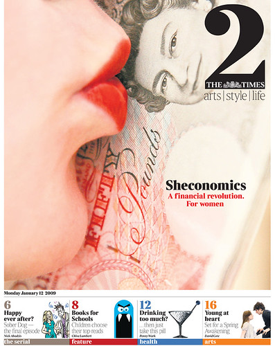

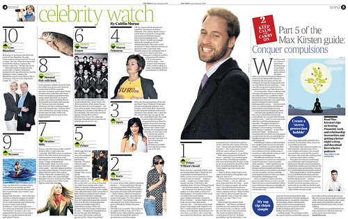
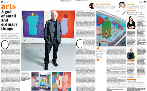
Above: The Times’s redesigned Times2 gets more ideas and energy into its tabloid format. A strong design, a controlled colour palette and detailed typography means the section looks more like a magazine, less like a deadline-driven daily paper.
Eye is the world’s most beautiful and collectable graphic design journal, published quarterly for professional designers, students and anyone interested in critical, informed writing about graphic design and visual culture. It is available from all good design bookshops and online at the Eye shop, where you can buy subscriptions and single issues.
