Saturday, 10:00am
27 August 2016
The ultimate Ultrabold
Simon Loxley
Rachel Gannon
various designers
Design history
Graphic design
Magazines
Typography
After ten eventful years, St Bride’s house magazine is on pause

The news that St Bride Foundation intends to cease publication of Ultrabold in its present form for the forseeable future is an opportunity to look back on a fruitful ten years, writes Ben Weiner.*
When Simon Loxley pitched the idea to the Friends of St Bride Committee back in 2005 I remember thinking it would be remarkable if we got a single issue into print. That seems pessimistic now, but the committee had earlier dismissed the idea of a journal on the grounds that the funds required would be too great and that human resources would not be forthcoming. Loxley solved both issues in fine style; he persuaded the suppliers (Principal Colour and Fenner Paper) to carry some of the costs of paper and print. He provided his own services as overall editor and designer, and solicited contributions from a host of writers, well known and otherwise. As far as possible, he kept up a schedule of two issues per year. Ultrabold quickly became an established facet of the Library and helped retain continuity through a decade of change at St Bride.
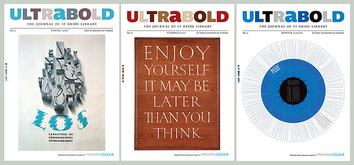
Covers of Ultrabold nos. 2, 8 and 9. Design: Simon Loxley.
An eclectic editorial approach meant there were surprises in each issue’s subject matter. The breathtaking scope of St Bride's collections found a worthy outlet in Ultrabold’s highly varied and stimulating material – its contributors had clearly profited from their visits to Bride Lane. In addition, a close eye on the Friends’ events programme ensured the pick of our speakers were offered a chance to put their contributions into print, meaning those who could not visit St Bride had a good sample of what could be found there. St Bride staff and volunteers past and present – including Nigel Roche, Holly Trant, Kim Vousden, Micha Dudley, Marisa Smith, Mick Clayton, Oliver Nesbitt, Heather Jardine, Teddy Loxley, Bob Richardson, James Mosley and me – contributed editorial advice, assistance and encouragement.
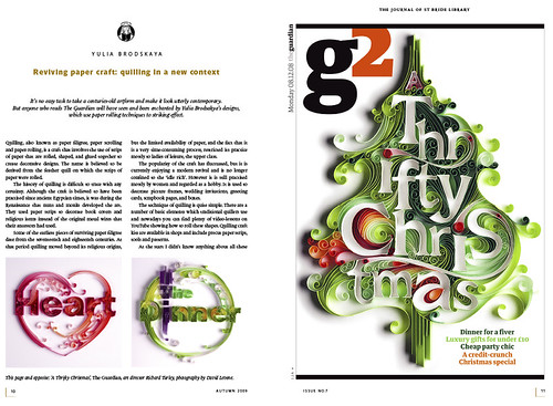
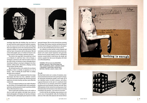
Spread from Yulia Brodskaya’s ‘Reviving par craft: quilling in a new context’ in Ultrabold no. 7, Autumn 2009. Typefaces: Le Monde Livre Classic and Parisine, designed by Jean François Porchez. Roundel by Alison Meechan.
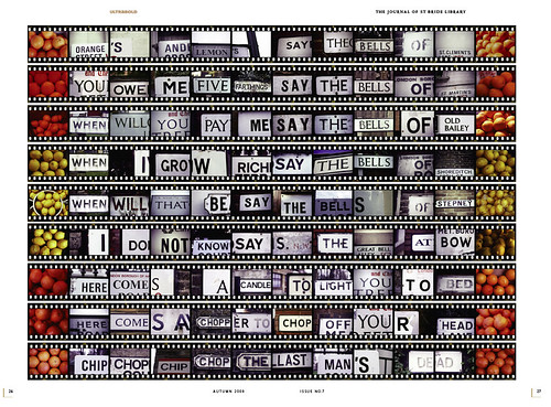
Spread from Martin Wilson’s ‘The hidden messages of the city’ in Ultrabold no. 7.
Cover of Ultrabold no. 7 including an illustration by Rachel Gannon.
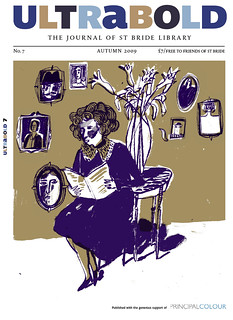
Ultrabold was the perfect title for the journal, with its full colour photography and self-confidence. Jean-François Porchez’s typefaces Le Monde and Parisine lent urbanity and refinement and Principal and Fenner continued their support through the life of the publication to date.
Spread from Sal Pittman’s ‘The Butcher of Common Sense’ Ultrabold no. 14.
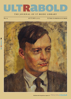
Cover of Ultrabold no. 14 featuring a portrait of Eric Ravilious.
So I would like to offer my thanks – especially since I was one of the sceptics in 2005 – to Simon Loxley and to all the contributors for their considerable achievement in steering Utrabold from its first issue (Autumn 2006) to the latest (No. 18, Spring 2016).
* A letter sent from the St Bride Foundation to members of the Friends of St Bride states that no. 18 ‘will be the last edition of Ultrabold until we have a clearer picture of what members want’.
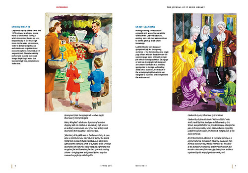
Spread from Lawrence Zeegen’s ‘A perfect world of style and content’ about the illustrators of Ladybird Books in Ultrabold no. 18.
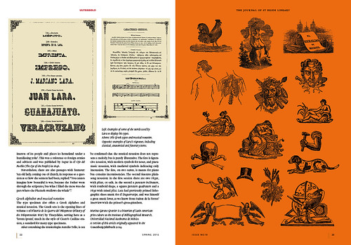
Spread from Marina Garone Gravier’s ‘The Mexican printer José M. Lara and his 1855 type specimen’ in Ultrabold no. 18.
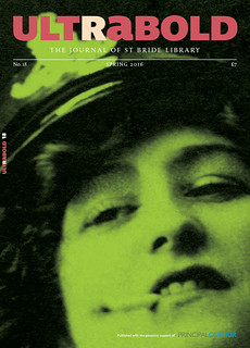
Cover of Ultrabold no. 18, Spring 2016.
Ben Weiner, designer, London
Eye is the world’s most beautiful and collectable graphic design journal, published quarterly for professional designers, students and anyone interested in critical, informed writing about graphic design and visual culture. It is available from all good design bookshops and online at the Eye shop, where you can buy subscriptions and single issues.
