Tuesday, 10:23am
25 May 2010
Thunderer comes out fighting

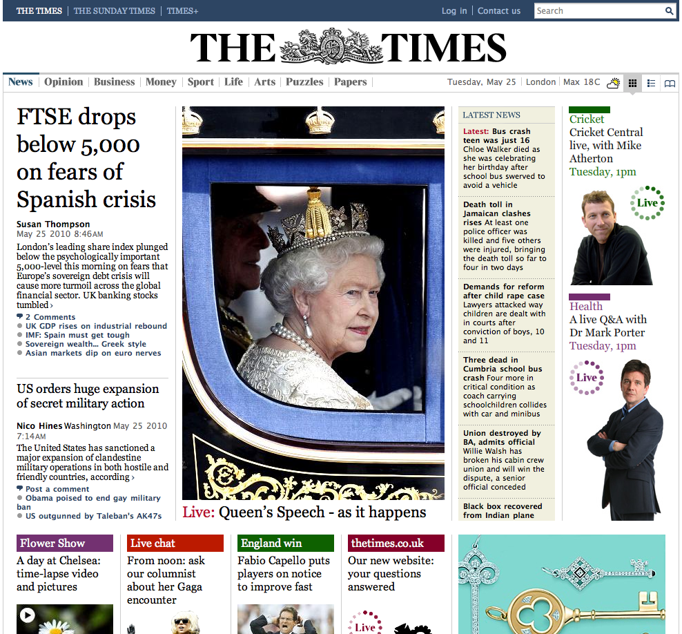
Will thetimes.co.uk change our view of what an online newspaper looks like?

The new Times website, thetimes.co.uk launched this morning, writes Simon Esterson. There’s a month to sample it on free trial before it goes behind a £2 per week paywall.
Editor James Harding says it ‘takes the architecture and the authority of the paper and harnesses it to the possibilities of digital media’ and it’s true that the design successfully breaks with the (much copied) Guardian online model in making something that looks much more like the printed paper: columns, modular layouts, lead stories. In that sense thetimes.co.uk is closer to the online approach of The New York Times.
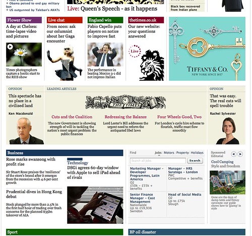
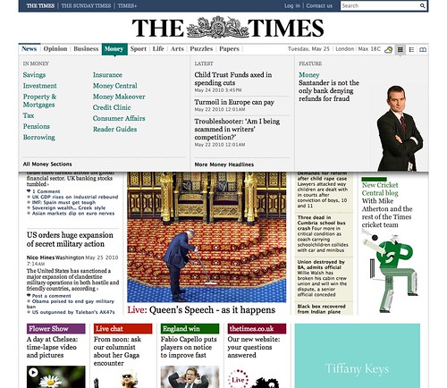
The design is strong and the typographic detailing good. There are some interesting touches: leader columns get a bit of space and a tint behind them (above). Contents panels for each section drop down from the top (below), graphics and illustrations are beginning to emerge and the News International marketing machine seems to be in check (for the moment). More thoughts as we explore the site over the next few days.
Design credits: Jon Hill and Simon Heys with Jamie Long, Nural Choudhury and Chris Clarke freelance. Tom Whitwell is sites editor.
Eye, the international review of graphic design, is a quarterly journal you can read like a magazine and collect like a book. It’s available from all good design bookshops and at the online Eye shop, where you can order subscriptions, single issues and classic collections of themed back issues.


