Sunday, 8:50pm
30 October 2016
Type on the campaign trail
various designers
Michael Bierut
Jennifer Kinon
Pentagram
Original Champions of Design
Lucas Sharp
Graphic design
Illustration
Posters
Typography
Visual culture
US designers contribute type, posters, badges and branding to the Hillary Clinton cause

From the outset, the Hillary Clinton campaign has enlisted the help of some of the United States’ best designers to portray and propagate her messages.
The Hillary Clinton campaign identity designed by Michael Bierut and his team at Pentagram.
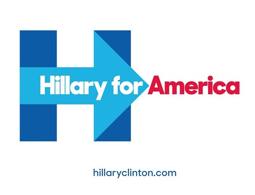
Pentagram’s Michael Bierut and his team designed the campaign identity in 2015 which used Sharp Type foundry’s typeface Sharp Sans Display No.1 as the foundation for their identity system. The foundry’s co-founder Lucas Sharp saw this application as an ‘opportunity to take the design further. We had drawn a tightly spaced, Lubalin-esque geometric sans that looked really good big. Now we wanted to draw a version with utility and versatility, that could work in any situation.’
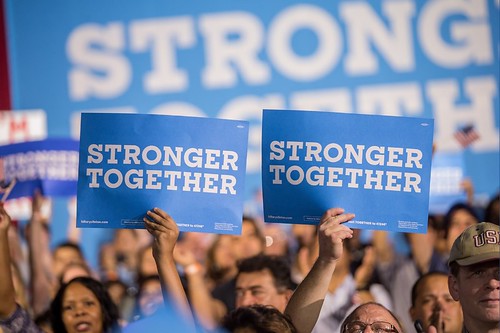
‘Stronger Together’ is set in Sharp Slab for Hillary.
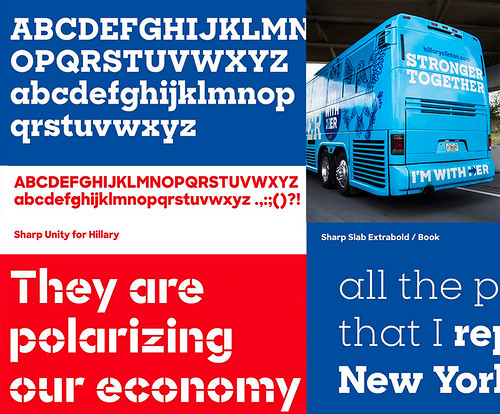
Bierut’s extensive identity system would be used by all manner of people on the campaign trail – from professionals to volunteer organisers – which meant that the detailed instructions laid out in the style guide for tracking a display face used for other applications were unlikely to be followed. Sharp writes, ‘It occurred to us that a serious presidential campaign needs a typeface that can work in any situation.’ As a result, Sharp Sans grew to include Sharp Unity for Hillary, Sharp Slab for Hillary, Sharp Slab Extrabold, Sharp Slab Book, Sharp Stencil for Hillary and Sharp Stencil.
Examples of Sharp Slab for Hillary, Sharp Unity for Hillary, Sharp Stencil for Hillary, Sharp Slab Extrabold, Sharp Slab Book and examples of several of the fonts in use on a campaign bus.
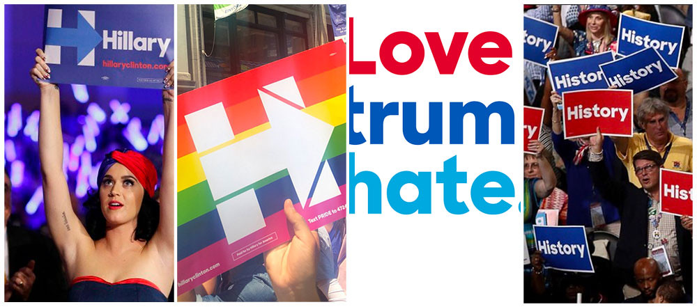
Jennifer Kinon of design and branding agency Original Champions of Design (OCD) stepped away from her agency role to become Hillary Clinton campaign’s design director. Kinon was tasked with rolling out and extending from the identity designed by Michael Bierut (Pentagram) that used the Sharp Sans family. Both Bierut and Sharp have praised Kinon’s work online and many of her designs have gone viral including the ‘Love Trumps Hope’ image.
A selection of Hillary merchandise.
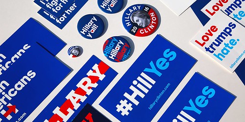
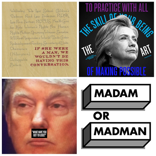
Other design led initiatives in support of Hillary Clinton include The Forty-Five Pin Project and 30 Reasons with work by designers such as Matt Dorfman, Elizabeth Resnick and Craig Frazier.
30 Reasons posters by Elizabeth Amorose, OCD, Bonnie Siegler and Larkin Werner.
Vote.
Hillary for America video showing Pentagram’s identity in action.
Eye is the world’s most beautiful and collectable graphic design journal, published quarterly for professional designers, students and anyone interested in critical, informed writing about graphic design and visual culture. It is available from all good design bookshops and online at the Eye shop, where you can buy subscriptions and single issues.
