Wednesday, 4:58pm
31 March 2010
Type technology

How new OpenType software is helping typography go retro

While a number of talented graphic designers have dabbled in type design, creating very charming and playful fonts, it takes a real type design professional to engage the full potential offered by font design software, writes Veer’s Joe Newton.
It’s the technology that has allowed a real surge in script type, as well as a resurgence in neo-Victorian and vintage letterpress aesthetics over the past few years.
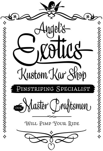
Top: Deliscript Complete by Michael Doret
Many of these retro-flavoured types depend heavily on new technology, especially when it is able to simulate the printing techniques of a bygone era. I’ve seen this in recent years in particular with designers using OpenType technology to recreate the look of weathered wood type or worn metal type.
When type is set with individual pieces of wood or metal type, each piece of that type wears a little differently – a little gouge here, a little worn edge there, which sets each letter apart. OpenType allows for the use of contextual alternates, which automatically places variant glyphs within a word simulating the effect of hand-set type and making it so that no two adjacent characters are alike.
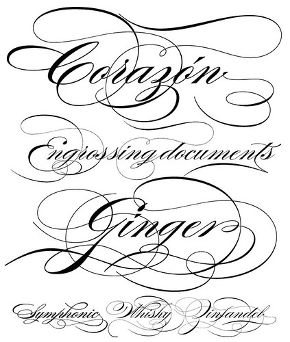
Above: Burgues Script by Alejandro Paul
It’s not just retro-flavoured types that are flourishing. The technology has been used to stunning effect for script fonts. OpenType technology will automatically substitute a letterform that properly joins to the next character, so that an ‘o’ may join correctly to a ‘t’ as well as to an ‘s’ – leading to settings that look custom-designed.
The ‘art of type’ is coupled closely to technology in other ways. OpenType allows for auto-substitution of true small caps and the inclusion of other ‘pro’ font features, such as ligatures and multiple sets of numerals.
Above: Liza Pro Complete.
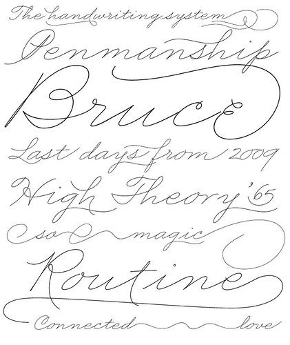
Below: Business Penmanship by Alejandro Paul.
These features convey a real attention to detail that creates fonts with a sophisticated level of performance. The ‘art of type’ is ultimately about creating typesets that work perfectly and are designed for specific uses. The best designers are creating type today that is as beautiful as any ever created, but uses technology to make the type more functional than ever.
Joe Newton is an artist, graphic designer and art director and is currently the head of the type collections for Veer.
More type articles in Eye 71, including Golden age?
And in Eye 75, including ‘Monitor: End of default’.
Eye 75 (out now!) is a typography special issue, featuring illustrative type and lettering, calligraphy, type on the Web, a profile of Anthony Burrill and Mark Thomson’s Reputations interview with Fedra designer Peter Biľak, who has just set up the Indian Type Foundry (first release, Fedra Hindi). It’s available from all good design bookshops and at the online Eye shop, where you can order subscriptions, single issues and classic collections of themed back issues.


