
Tuesday, 8:30am
15 May 2012
Type Tuesday: Between writing & type

Fred Smeijers
Maurice Göldner
Pierre Pané-Farré
eric kindel
type tuesday
Design history
Graphic design
Technology
Typography
Visual culture
Stencils, stencil letters, tools and new fonts on display in Antwerp
The exhibition ‘Between Writing & Type: The Stencil Letter’, which opened in Antwerp on 19 April 2012, combines two aims, reports co-curator Eric Kindel. The first is to display artefacts gathered over the past ten or so years that document some of the history of stencil letters. The second is to introduce a series of new stencil fonts.
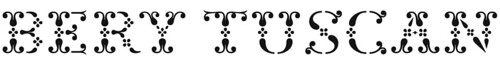
Top: Banner showing Couteau, Standing Type, Bery Tuscan.
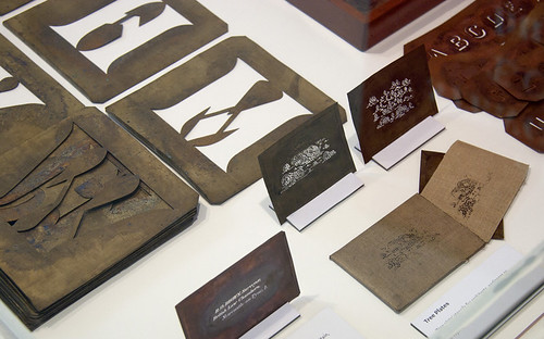
The artefacts are mostly stencils of many kinds and configurations, together with stencil-making tools, patented stencilling devices, printed ephemera and more. A small catalogue accompanies the exhibition (see text).
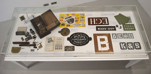
Above: Punched and routed letters.
Below: Patented stencilling devices.
One thing the artefacts reveal is what shapes stencil letters. Tools and techniques figure prominently. So, too, does decoration, and its adaptation as stencil form. The stencil letter’s association with writing, drawing, engraving and type is also important. Artefacts include early stencil letters that replaced written and drawn letters in manuscripts, and stencils technically enhanced to produce well composed words and text. These help demonstrate the exhibition’s title: while stencil letters are clearly neither writing nor type, their origins, configurations and uses are usually located somewhere in between, and may reach a considerable distance in either direction.
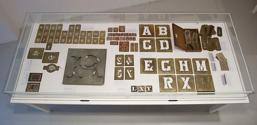
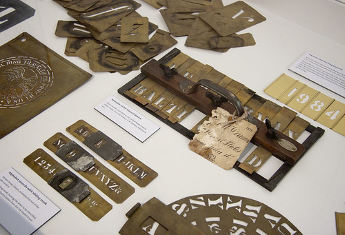
Above: Decorated letters.
Below: Decorated letters and surveyors’ stencils.
Below: Eighteenth-century numerals, nineteenth-century letters.

The new stencil fonts are the work of Fred Smeijers, Maurice Göldner and Pierre Pané-Farré, and they reveal several design strategies in operation.
One strategy is revival, as demonstrated by the Bery Roman and Bery Tuscan fonts. Both are based on stencil letters made by Jean Gabriel Bery in Paris in the 1780s.
Below: Bery Roman by Fred Smeijers.

Below: Bery Tuscan by Fred Smeijers, assisted by Pierre Pané-Farré.
Another is shaping with tools, thus Puncho, based on stencil punches, and Couteau, based on knife cuts (below).

Above: Puncho by Fred Smeijers.
Below: Couteau by Pierre Pané-Farré.

And a third is the construction of stencil letters from limited elements, common perhaps to all the fonts.
Below: Orly Stencil by Pierre Pané-Farré.


Above: Standing Type by Maurice Göldner.
By way of the last strategy, the exhibition draws attention to a handy pedagogic dimension of stencil letters. Although stencil letters are not always constructed from limited elements, it is relatively easy to create them in this way (the extreme example is Josef Albers’s Schablonenschrift). The notion can be extended to the Latin script in general, in which recurring elements are prevalent. By identifying and cutting these elements as stencils, students new to designing letters can build up sets of letterforms with ease and a good degree of coherence.
Although a number of type designers and teachers have exploited this technique over the years and recently, it is usually traced to W. A. Dwiggins and his Falcon stencils (see Dwiggins’s WAD to RR: A Letter About Designing Type, Harvard College Library, 1940). This is where Smeijers first encountered it in the 1980s and it has since played an important part in his work and teaching. Smeijers, in turn, introduced the technique to his former students Göldner and Pané-Farré, who have used it to good effect.

Above: Letterform experiments with limited elements by Fred Smeijers.
The exhibition takes place in the Kades-Kaden project space (below) fronting the design company Catapult.
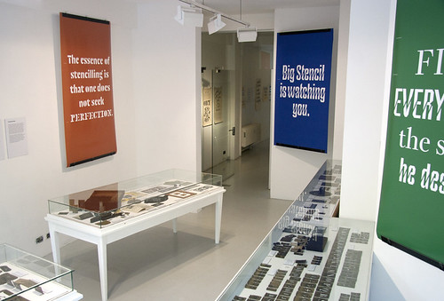
Since 2005, under the direction of Anton de Haan, Catapult has made this space available for a series of compact exhibitions, including those under the ‘Type an Sich’ moniker featuring well known type designers such as Unger, Porchez, Smeijers, Di Sciullo and most recently Matthew Carter.
In its assembly of artefacts, ‘Between Writing & Type’ presents episodes in the history of stencil letters, about which much is still to be discovered. The conjunction of artefacts and new stencil fonts illustrates the way historical material can inform present-day designing.
Below: Banner showing Greco Stencil.
‘Between Writing & Type: The Stencil Letter’ continues until 29 June 2012 at Catapult, Antwerp.
Curated by Eric Kindel & Fred Smeijers.
Fonts by OurType.
See also ‘Lettres à jour’, James Mosley’s enjoyable discussion of stencil lettering in France, and ‘Marked by time’, Eric Kindel’s article about stencil catalogues in Eye 40.
Eye is the world’s most beautiful and collectable graphic design journal, published quarterly for professional designers, students and anyone interested in critical, informed writing about graphic design and visual culture. It’s available from all good design bookshops and online at the Eye shop, where you can buy subscriptions and single issues. Eye 82 is out now – you can browse a visual sampler at Eye before you buy on Issuu.