Tuesday, 8:17am
19 June 2012
Type Tuesday: Forward to page 1

Fraser Muggeridge
Robin Kinross
Apfel
Experimental Jetset
Erik Spiekermann
Ellen Lupton
Phil Baines
Lucienne Roberts
Violetta Boxill
Tony Chambers
Tony Brook
Paul Finn
Morag Myerscough
caroline roberts
Book design
Design history
Graphic design
Typography
Managing (Great) expectations with a mix of ‘Pecha Kucha and speed dating’

A thought-provoking evening at the Design Museum marked the launch of Page 1: Great Expectations, the first publication by GraphicDesign&, writes Caroline Roberts.
GraphicDesign&, founded by Lucienne Roberts and Rebecca Wright, aims to explore the ways that graphic design connects with other things (see Eye blog), in this case design and literature.
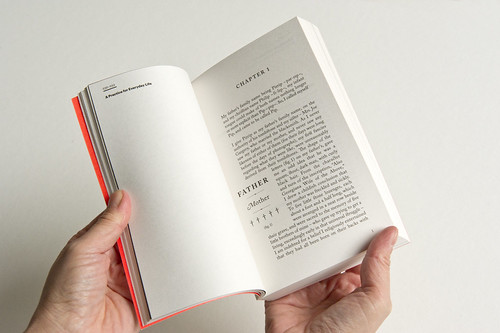
Top: Designer Neil Donnelly took Dickens’ text back to where it first appeared, on the pages of a popular newspaper.
Below: Page 1 designed by Apfel [A Practice for Everyday Life] .
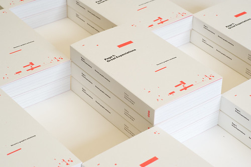
Page 1: Great Expectations, a 320-page two-colour paperback, is a book of first pages. At its heart are typographic interpretations of the opening page of Dickens’ popular novel by 70 different designers and design practices. These include: Erik Spiekermann, Robin Kinross, Jonathan Barnbrook, Apfel, Experimental Jetset and Ellen Lupton.
Below: The cover shows a series a fluorescent rectangles, each one positioned to show where the page 1 folio falls in the 70 contributors’ designs.
Roberts and Wright chose Great Expectations for their typographic experiment in part because its text makes direct reference to lettering. The book opens as Pip searches for clues about his family from the letterforms inscribed on their tombstone.
Individual treatments of the text vary widely. While some designers considered their page as a precursor to the whole book, playing with the ideas of emphasis and interpretation, others deconstructed the text. Some dispensed with legibility altogether. Many looked at the way we read, including explorations of new platforms such as QR codes and eReaders, while others took a more illustrative approach, using type as image.
For the first part of the evening, eighteen of the book’s contributors spoke for two minutes each about their interpretation of Page 1, while showing no more than seven images. (The numbers were taken from the date of Dickens’ birth: 07/02/1812.)
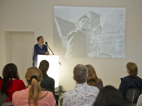
Above: Wallpaper*’s Tony Chambers questions the use of a sans-serif with a single-bowled ‘a’ in David Lean’s 1946 adaptation of Great Expectations.
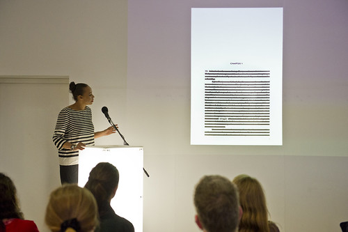
Above: Violetta Boxill’s approach was about reduction, taking inspiration from Nietzsche as she distilled the entire text to just two words: ‘my struggle’.
Two minutes raced by quickly, but many of the speakers (including Morag Myerscough, Tony Brook, Fraser Muggeridge, Violetta Boxill and Phil Baines) revelled in the challenges of the format.
Above: Tony Brook.
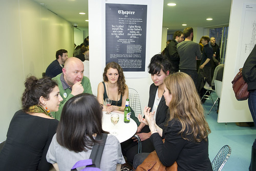
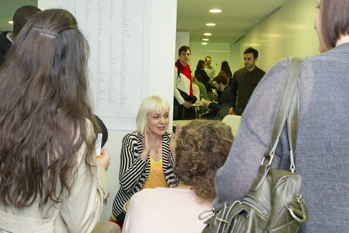
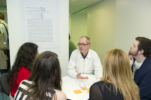
For the second (less adrenaline-fuelled) part of the evening, contributors presided over small discussion groups that rotated every twelve minutes, giving audience members a chance to chat with the speakers.
Below: Morag Myerscough.
Described by one audience member as ‘a sort of amalgamation of Pecha Kucha and speed dating’, the evening gave us a glimpse of some of the thinking behind Page 1: Great Expectations.
Photographs: Richard Hubert Smith.
More information at graphicdesignand.com.
Above: Phil Baines (once also known as Pip) explained his approach to typographic disruption, and why he started by designing a spread instead of a single page.
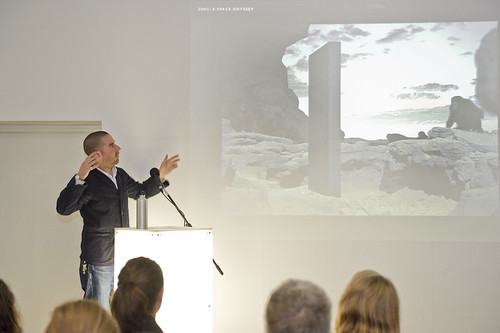
Above: Fitzroy & Finn’s Paul Finn organised the text into five columns, referencing the gravestones of Pip’s five siblings. His type is centred and reversed out of black, echoing lists of names found on monuments to the dead and the monolith from the film 2001.
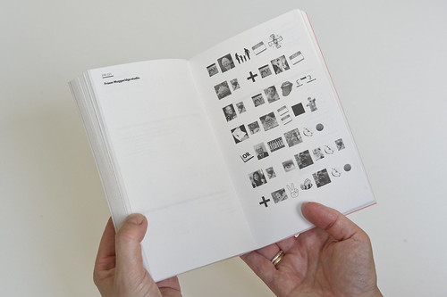
Above: Fraser Muggeridge studio’s page 1. In his accompanying notes Fraser proclaimed that ‘text is over’, having used nothing but clip art to (as he admits) rather unsuccessfully attempt to tell the story.
Eye is the world’s most beautiful and collectable graphic design journal, published quarterly for professional designers, students and anyone interested in critical, informed writing about graphic design and visual culture. It’s available from all good design bookshops and online at the Eye shop, where you can buy subscriptions and single issues. Eye 82 is out now, and you can browse a visual sampler at Eye before you buy on Issuu.

