Tuesday, 11:00am
28 February 2012
Type Tuesday: Iron curtain Vegas

robert hanks
type tuesday
Design history
Graphic design
Photography
Technology
Typography
Visual culture
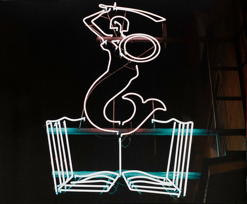
Ilona Karwińska shoots the lions and mermaids of Polish Cold War Neon

In the mind’s eye, the Eastern Europe of the cold war is painted with a grey wash, enlivened by occasional splashes of beige, writes Robert Hanks.
The reality was sometimes brighter: Poland, in particular, developed a proud national tradition of neon signage that could match Vegas for brashness and surpass it for originality and beauty.
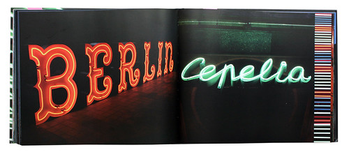
Top: spread from Cold War Neon showing signs from Wrocław.
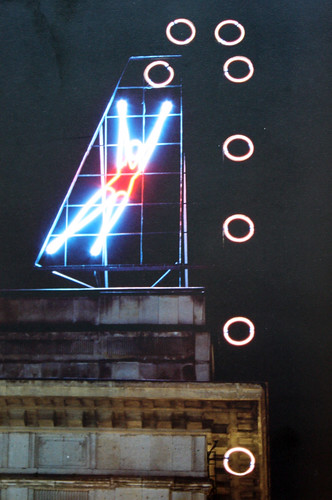
Above: sign from Warsaw.
Since 2005 the London-based photographer Ilona Karwińska has been photographing and collecting these signs to create the basis of Poland’s first neon museum (neonmuzeum.org). In Polish Cold War Neon she brings together many of the most striking items.
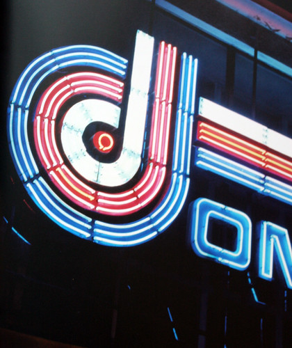
Above: spread showing signs from Warsaw.
Some are comparatively simple typographical compositions announcing a hotel, a club or a camera shop, though some rococo element of shape or luminescent colour almost always obtrudes. Others are complex diagrams or cartoons of birds, mermaids, burglars, lions. A few, such as a Julian Opie-ish volleyball player advertising a sports shop (below), seem improbably modern.
Karwińska places illuminated night-time signs next to their skeletal daylight incarnations, showing how neon conceals fragility and encroaching decay. Regarded with affection but expensive to maintain, the signs are vanishing.
The photographs are organised by city. The book (designed by David S. Hill of Storm Design) also includes interviews with employees of Reklama, the former state advertising agency, and some of the signs’ labyrinthine outline diagrams. It is an invaluable document of a yesterday that, for all its garishness, managed to slip by practically unnoticed.
Polish Cold War Neon
By Ilona Karwińska
Mark Batty Publisher, Price £35 / $55.
Foreword: David Crowley
Book design: David S. Hill of Storm Design
Review to be published in Eye 82.
See also ‘Neon lights’, Sebastian Schmidt-Tomczak’s review of ‘Cold War Neons’ at Glasgow’s Lighthouse in 2009.
Read more by Robert Hanks on his blog Zoo in the Head and in Eye 72.
Eye is the world’s most beautiful and collectable graphic design journal, published quarterly for professional designers, students and anyone interested in critical, informed writing about graphic design and visual culture. It’s available from all good design bookshops and online at the Eye shop, where you can buy subscriptions, back issues and single copies of the latest issue. Eye 81, has the theme of ‘Designers and clients’; Eye 82 is at repro today.


