
Tuesday, 2:04pm
3 July 2012
Type Tuesday: Reputations
Simon Esterson
Christian Schwartz
Paul Barnes
Graphic design
Magazines
Technology
Typography
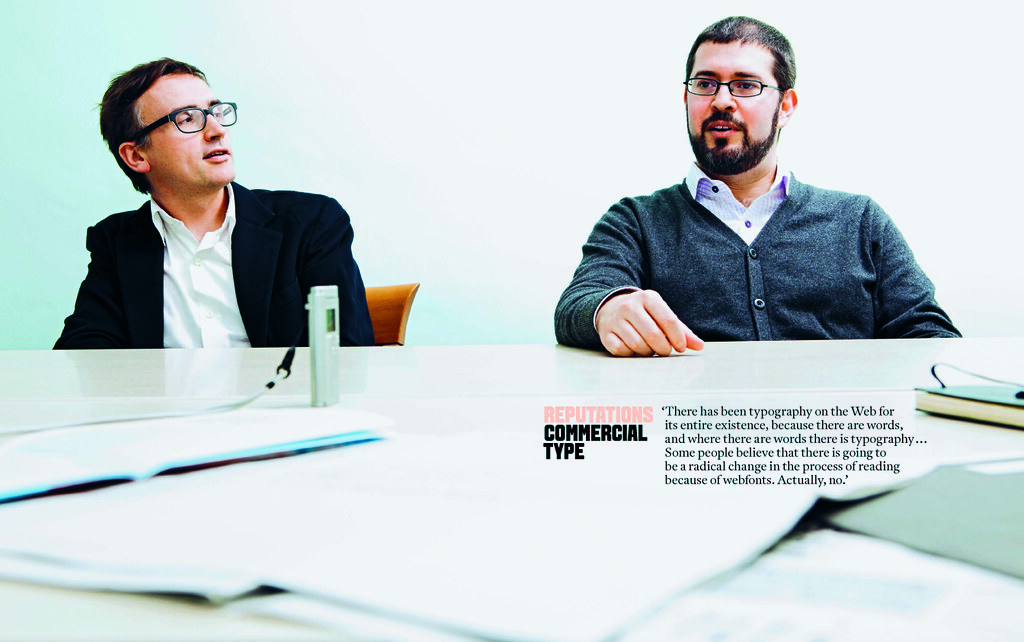
Commercial Type’s Christian Schwartz & Paul Barnes – interviewed in Eye 82
‘There has been typography on the Web for its entire existence, because there are words, and where there are words there is typography … Some people believe that there is going to be a radical change in the process of reading because of webfonts. Actually, no.’
You can now read the complete text of our Reputations interview with Paul Barnes and Christian Schwartz on the Eye website. Here are some images and captions and more choice quotes from the fourteen-page article.

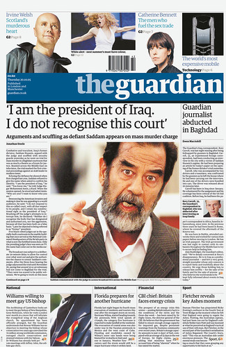
Above and below: Egyptian typeface family designed by Paul Barnes and Christian Schwartz in use for the Guardian, commissioned by the UK newspaper’s then design editor Mark Porter in 2005. Above: Guardian iPad edition, 2011. Design: Guardian News and Media in consultation with Mark Porter Associates. Below: printed daily.
‘Physically, we met at Heathrow, about six months into the Guardian project, but we first got to know each other via email about two years earlier … Paul tracked me down to ask me about the “g” of FF Bau.’ Christian Schwartz
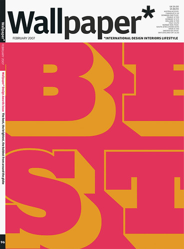
Above: Wallpaper*, October 2009, using a custom version of Schwartz’s Graphik (proprietary to the magazine) called Plakat Narrow. Design director: Meirion Pritchard. Below: Wallpaper*, February 2007. Logo and cover designed by Barnes. Lettering based on Two-Lines Bourgeois Antique Shaded, Caslon & Livermore, 1834. Titlepiece in Amplitude by Schwartz. Design director: Tony Chambers.
‘Editorial is a place where there’s a demand for typography and people care about it. With the Macintosh, typography has improved and you can do more … Maybe something in our DNA means we produce things that work well in editorial situations.’ Paul Barnes
Above and below: Chiswick in spreads from the September 2010 issue of O, The Oprah Magazine. Design directors: Priest + Grace.
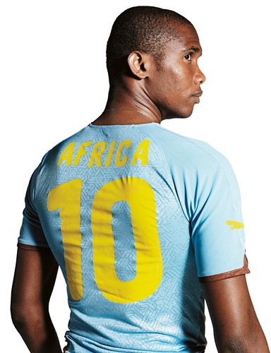
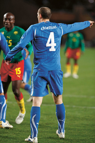
Above: letters and numbers for Puma’s African football teams for African Cup of Nations & World Cup, 2010. Puma Gmbh, 2010. Below: letters and numbers for Puma’s Rest of World football teams for World Cup, 2010. Puma Gmbh, 2010.
‘With every new client who wants us to draw something custom, the first part of our process is to try to talk them out of it … Because it’s a waste of somebody’s time and their money if we’re just recreating something for them that already exists.’ Christian Schwartz.

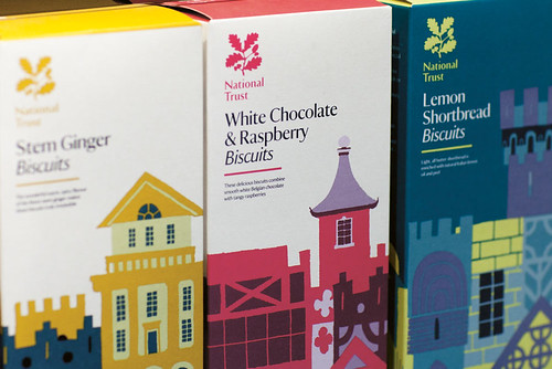
Above: Paul Barnes’s custom National Trust typeface in use at one of the UK organisation’s properties, 2009. Photo: National Trust Images / James Miller. Below: biscuits branded with National Trust typeface. Packaging design by Studio H, 2009. Photo: National Trust Images / James Dobson.
Read the full interview with Commercial Type’s Schwartz and Barnes in Eye 82. Portrait (top) by Mischa Haller (below, left).
Website: CommercialType.com.
Eye is the world’s most beautiful and collectable graphic design journal, published quarterly for professional designers, students and anyone interested in critical, informed writing about graphic design and visual culture. It is available from all good design bookshops and online at the Eye shop, where you can buy subscriptions and single issues. Eye 82 is out now, and you can browse a visual sampler at Eye before You Buy. Eye 83 is on press any moment.