Tuesday, 8:00am
22 May 2012
Type Tuesday – sticky Univers

Jonas Etter’s transient sculptures leave a bittersweet aftertaste

In the 1960s and 70s, making art with words was a way to avoid having a ‘thing’: words made it possible to replace the trace of the artist with the presence of the viewer. Artist Jonas Etter’s work both continues and inverts this tradition, turning the word itself into a ‘thing’ and a trace, writes Jane Cheng.
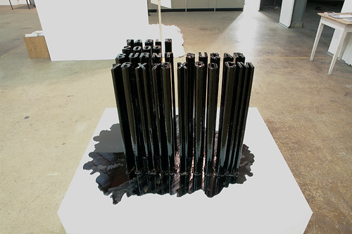
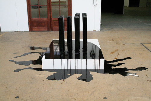
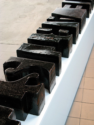
Top, above and below: Jonas Etter, Table (2007)
In 2006 Etter began pouring burnt sugar into moulds to make sculptures, which then melt slowly into sticky puddles.
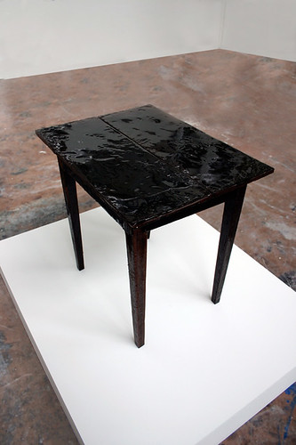
The first sugar sculpture was a simple, traditional table (below): a transformation of the cheapest of ingredients into the most ordinary of objects. Such simplicity is, however, deceptive. For just as the sugar precedes the table, sugar cane, with its legacy of colonial exploitation and importation, precedes sugar. In each case the change of form is the result of an intervention (cultivating, harvesting, processing, boiling, pouring) that we rarely see.
Below: Jonas Etter, Tisch (table), 2006.
The final melting of the gallery object calls the viewer’s attention both to the very real consequences of these transformations and to their paradoxical invisibility.
Then, in 2007, a second iteration of the sugar project appeared. This time Etter revived the table as its own caption, burnt sugar words spelling ‘Table / 2006 / burnt sugar / 76 x 79 x 60 cm’ (top). In the manner of Joseph Kosuth in the 1950s, Etter points out the the difference between word and object – but this time it is not the gulf between them that is the point, but their proximity (in medium) and contingency (in form). Etter uses the typeface Univers – as straightforward as a kitchen table – as a paradigmatic ideal that emphasises the materiality of the sculpture.
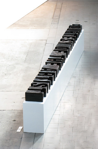
A third iteration, in 2008, saw the words ‘courtesy of the artist’ spelled out in the negative (below).
Above and below: Jonas Etter, Courtesy (2008).
This time the even the letters have lost their substance. Reading negative space brings the viewer’s attention beyond the concrete – beyond the table, beyond the word ‘table’, and even beyond its maker – to the process of decipherment itself. As in minimalist art the presence of viewer a once again becomes central: but this time they find themselves at the end of a less innocent series of processes involving artist, time, history and coincidence.
Jonas Etter website, jonasetter.ch.
Eye is the world’s most beautiful and collectable graphic design journal, published quarterly for professional designers, students and anyone interested in critical, informed writing about graphic design and visual culture. It’s available from all good design bookshops and online at the Eye shop, where you can buy subscriptions and single issues. Eye 82 is out now – you can browse a visual sampler at Eye before you buy on Issuu.

