
Tuesday, 1:01am
18 October 2011
Type Tuesday: Private Eye
Tony Rushton
Matthew Carter
john l. walters
type tuesday
Design history
Graphic design
Magazines
Technology
Typography
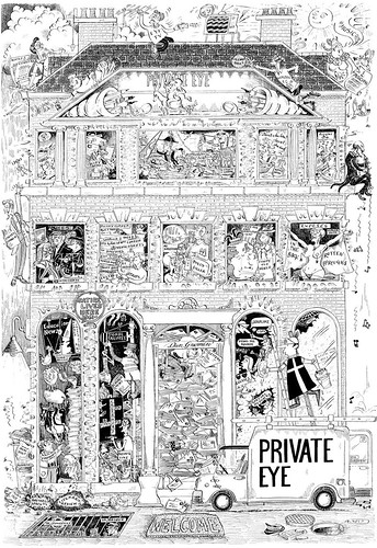
Matthew Carter’s timeless typographic masthead for Private Eye magazine
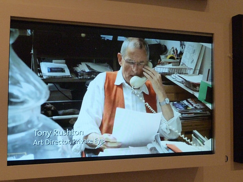
Tony Rushton has been art director of satirical magazine Private Eye for 49 of its 50 years. The fortnightly is celebrating its half-century with a small, free exhibition in two rooms at the Victoria & Albert museum.
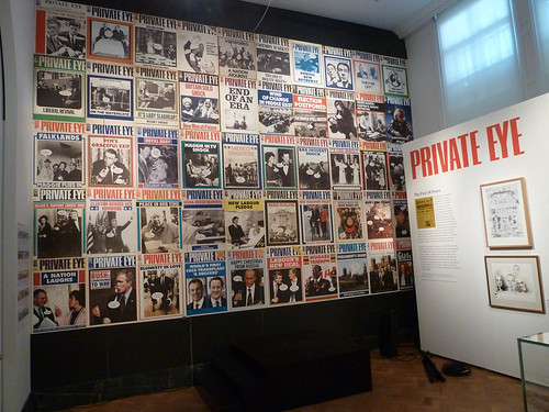
I interviewed Rushton prior to the opening of the show, close by a wall covered with 50 of its distinctive covers (below), writes John L. Walters.
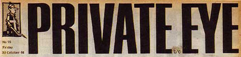
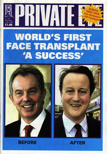
‘I can lay claim to all of those,’ said Rushton (below), pointing out that most of them had been designed in a few hours. (Which possibly a luxury, compared to the deadlines given to the Eye’s cartoonists.) And 49 of the covers have that unmistakable masthead (top), designed in 1962 by Matthew Carter.
Eye: ‘Has there ever been an attempt to change it?
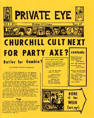
Rushton: ‘No. Matthew Carter, he who must be obeyed, great God of typographical design, designed our logo for us and we’ve used it since 1962. Not quite the first issue. If you look in Adam’s book [Private Eye: The First 50 Years by Adam Macqueen] you will see that there are a few different logos in the early days.’
Eye: ‘How did the relationship with Matthew Carter come about?’
Rushton: ‘Matthew was a friend of Nicholas Luard who owned the Establishment club. And in the early days we were producing the magazine in the waiters’ changing room there. So we would use the office during the day, and then the waiters would come in and change and we would have to leave.
‘Matthew Carter did the alphabet and produced the logo. It’s such a strong one.’
‘It goes through ups and downs. When it first came out it was very of the moment.
Now, because there’s so much nostalgia for the 1960s, it’s very fashionable again.
‘We’ve had Private Spy, Private Di, we played with it … different colours and ways of presenting it … Matthew presented us with a very nice bromide, a sharp, clean bromide … It’s now in the system digitally of course.’
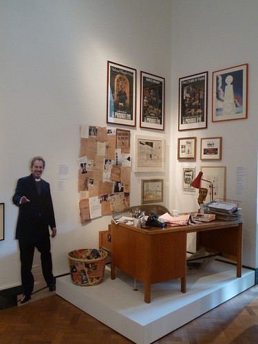
The show includes an ‘installation’ (above): the editor’s office, complete with phone and a wastebin full of copies of Sir James Goldsmiths’ magazine Now!
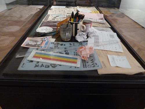
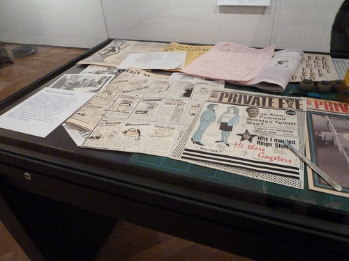
Private Eye’s early design methods are represented by a glass display cabinet (above and below) littered with the arcane tools of 1960s and 70s magazine production: scalpel, sheets of Letraset, golfball typewriter heads, type rule, etc.
More about Tony Rushton and Private Eye later this year.
A very happy 50th anniversary to the (other) Eye.
18 October 2011 > 8 January 2012
Private Eye: The First 50 Years
V&A Museum
Cromwell Road
London SW7 2RL
www.vam.ac.uk
Eye is the world’s most beautiful and collectable graphic design journal, published quarterly for professional designers, students and anyone interested in critical, informed writing about graphic design and visual culture. It’s available from all good design bookshops and online at the Eye shop, where you can buy subscriptions, back issues and single copies of the latest issue. Eye 81 is on press.