Tuesday, 10:00am
8 November 2011
Type Tuesday: play on words
Monotype opens up three typefaces to artists

Creative social enterprise space Mill Co. has collaborated with Monotype for their second annual exhibition, writes John Ridpath.
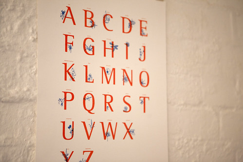
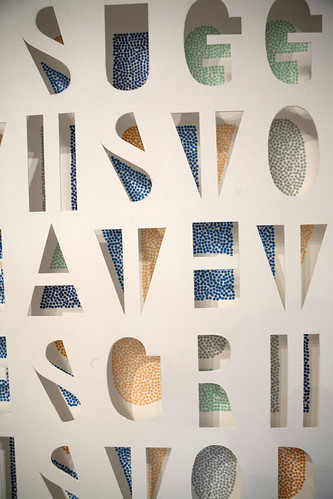
Artists from the Mill Co. community were invited to use three of the foundry’s fonts – Akko, Neue Haas Grotesk and Rotis II – to create original works in any genre. The results range from prints and paper sculptures, to short films. I caught up with James Fooks-Bale from Monotype to hear more about the project – and the typefaces used.
Top: By Kelly Angood.
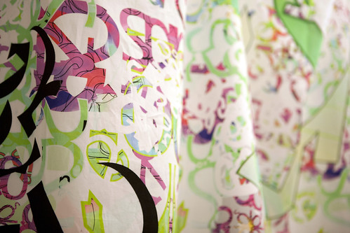
Below: Textile print by Lisa Stannard.
John Ridpath: How did the project come about?
James Fooks-Bale: Mill Co. initially approached Monotype Imaging to create a typographic exhibition and we gladly agreed. Typography is one of those things that is all around, something we see hundreds of times a day, but maybe never really appreciate enough and we thought that London needed more opportunities to view and experience typography. Monotype Imaging has been producing typefaces since the nineteenth Century but we wanted to challenge people’s perceptions of type and we knew that working with Mill Co. would bring diversity, would create some different interpretations of typography and would result in something really special.
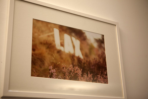
Above: Photograph by Karina Lax.
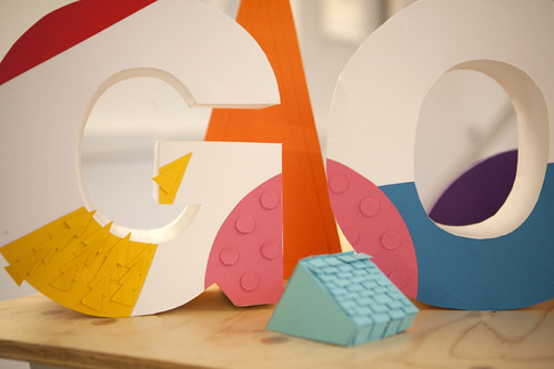
Below: Paper art by Rebecca Manley.
JR: Can you give some wider context about the fonts chosen for the project?
JF-B: We provided three of our newest and arguably more exclusive typeface families, Akko, Neue Haas Grotesk and Rotis II Sans.* We then briefed designers working in varying artistic genres, from traditional print to illustrators and product designers. The brief was to break the normal perception of type as a message carrying device and create some really different interpretations and installations. We rarely select an exhibition format to release a font but the three selected warranted the Mill Co. treatment. Traditionally, when a font is released, the designer doesn’t know how their design will be used – some designers may work toward a particular angle or definition but in reality once something is released, the public decide how it’s used.
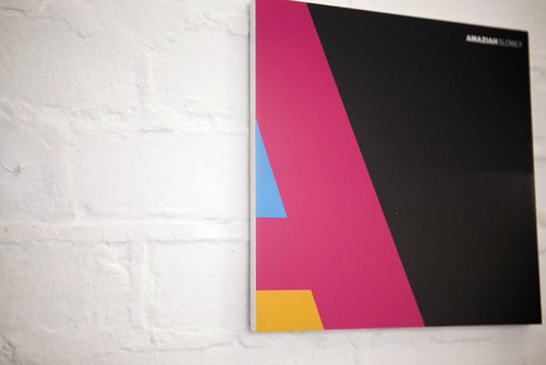
Above: Graphic design by record label Claremont 56.
Below: Print by graphic designer Thanyaporn Jarukittikun.
JR: Your brief allowed for quite a broad scope of work. Can you comment on the different ways in which the artists responded?
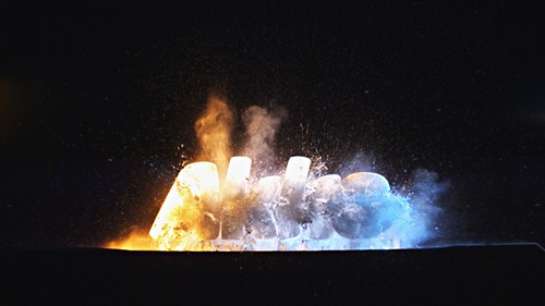
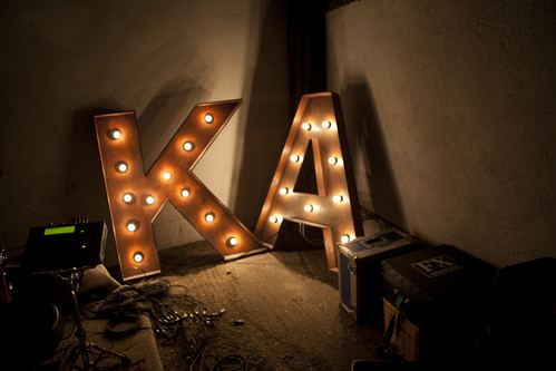
JF-B: There was an incredible range of work presented, from an exploding Akko font ice sculpture to giant neon letters and font etchings. It was fantastic to see so many different interpretations, as it proves how malleable typography can be.
Above: image from film directed by Mark Jewitt.
Below: By visual artist Ann-Kathrin Schubert.
* More about the three typefaces used from Monotype:
Akko: Designed by Akira Kobayashi, who comments: ‘I wanted to create a sans serif typeface with rounded corners, then I began to see a more industrial design, with the straightforward feel of DIN Next but also with curved strokes and soft proportions, Akko is robust and structured, while Akko Rounded is softer and friendly. Synthesizer, fluffy soft, clouds float by, summer, quartz, electric city car, speed.’
Neue Haas Grotesk: Designed by Christian Schwartz. ‘The original design, under its original name, has been reborn for a new generation of graphic communicators and type lovers. Original Swiss craftsmanship, back to its roots, warmth and verve, from an elegant thin to a commanding black.’
Rotis II Sans: Designed by Alice Savoie and Robin Nicholas; the original Rotis was designed by Otl Aicher. ‘This updated and improved Rotis II Sans, crafted by Alice Savoie and Robin Nicholas, should prove even more popular and useful than ever. It is perfectly suited to numerous contemporary applications, from text, advertising, signage, corporate identity, packaging and much, much more. Highly rationalised yet intriguing type.’
Eye is the world’s most beautiful and collectable graphic design journal, published quarterly for professional designers, students and anyone interested in critical, informed writing about graphic design and visual culture. It is available from all good design bookshops and online at the Eye shopThe new issue,Eye 81 is on its way to subscribers and bookstores worldwide – seeEye Before You Buy for a visual sample.

