
Tuesday, 11:16am
15 November 2011
Type Tuesday
Monotype Grotesque, guest typeface in the new issue of Eye
Every new issue of Eye (since the redesign of Summer 2009) features different ‘guest’ typefaces. Eye 81, the latest edition, employs a twentieth-century classic – Monotype Grotesque.
Designed by Frank Pierpont in 1926 (as a refinement of Berthold’s earlier Ideal), Monotype Grotesque is among the earliest sans-serifs cut for hot-metal machine typesetting, which was gaining widespread use in England in the 1960s.
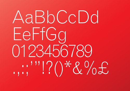
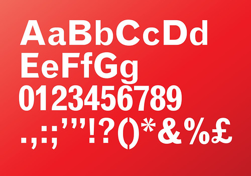
Above and below: Monotype Grotesque in Light and Bold weights.
The typeface became popular in the 1950s and 60s owing to its availability on Monotype machines. While the explosion of Modernism saw designers across Europe making good use of typefaces such as Univers and Akzidenz Grotesk, Univers didn’t become available on Monotype machines until later, and typefaces such as Helvetica were never available. So for British designers wanting to work with Modernist, asymmetric type, MT Grotesque 215 was the typeface du jour.
Above and below: Herbert Spencer’s Typographica.
Its best-known application is probably in Herbert Spencer’s experimental journal Typographica (see Eye 31). After several layout revisions, beginning with more old-fashioned justified Walbaum and Bembo before moving on to MT Grotesque for titles, Spencer finally set the whole journal in the unjustified grot, saying ‘[only by the third issue of Typographica’s new series was I] in a strong enough position and I had a sufficiently large following [to introduce unjustified setting]’.
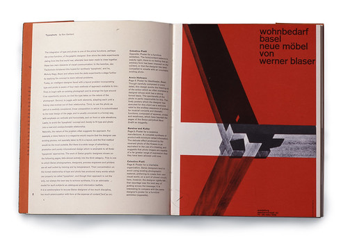
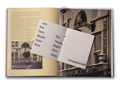
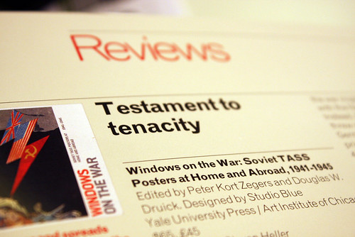
MT Grotesque is a large family, with a range of weights and condensed styles. Despite its design being intended to ‘tone down’ some of the fruitier idiosyncrasies of Ideal, it has enough character to hold its own as a headline font, and enough legibility for use as body copy, which is why, in Eye 81, we were happy to use it for both (below).
Type Tuesday is the Eye blog’s weekly column on typography and type design, featuring a mixture of new articles and material from the extensive Eye archive. For more Type Tuesday articles, click here.
Eye is the world’s most beautiful and collectable graphic design journal, published quarterly for professional designers, students and anyone interested in critical, informed writing about graphic design and visual culture. It’s available from all good design bookshops and online at the Eye shop. For a taste of the new issue, see Eye before you buy on Issuu. Eye 81, Autumn 2011, is out now.