Tuesday, 1:00pm
20 December 2011
Type Tuesday
Type Tuesday
andrew haslam
type tuesday
Graphic design
Technology
Typography
Visual culture
How lettering is made for public display: hand-routing

Andrew Haslam looks at the production of display lettering, and, in this instalment, hand-routing a lightbox for Specsavers by Active Signs.
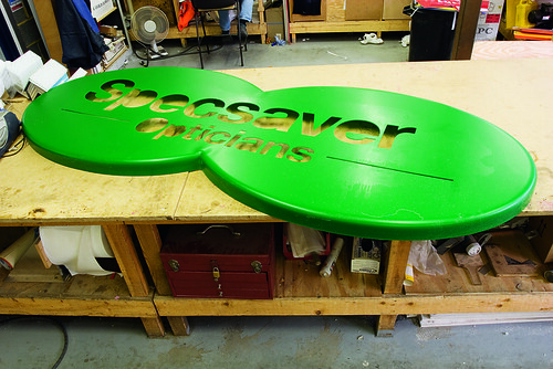
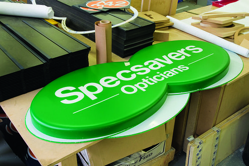
Some signs are best routed by hand, in which case a skilled operator guides the bit around the letter outlines. The routed letters can be surface-mounted as a sheet or built into a three-dimensional form that stands proud of a wall or the floor, and can be internally illuminated. This hot-moulded sign for a high-street retailer uses Perspex letters fitted into an acrylic box with internal illumination.
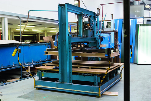
1. Acrylic has a relatively low melting point and, like many other plastics, becomes pliable when heated. Here a large moulding press sits alongside the oven.
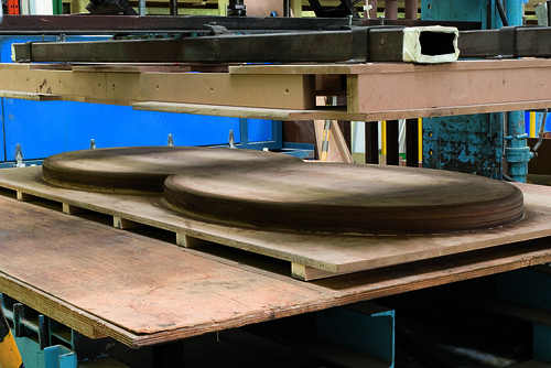
2. Two MDF forms – one ‘male’ and one ‘female’ – are fitted to the press, which can apply a pneumatic pressure of several tonnes to mould the heated sheet into shape.
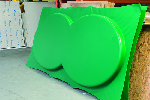
3. The moulded acrylic sheet.
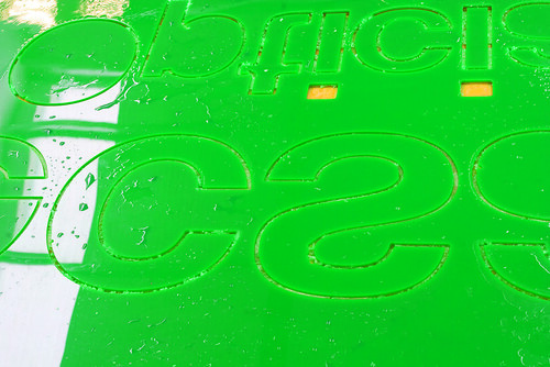
4. Once the moulded sheet has been trimmed with a band saw, the lettering can be machine-routed from the reverse. The cut does not pass completely through the sheet, leaving the precision work to the hand-cutter.
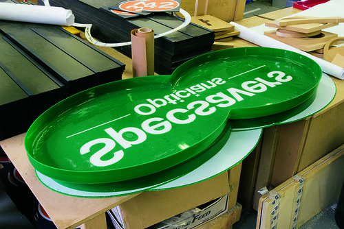
5. Detail of the letters on the reverse of the sign awaiting hand cutting.
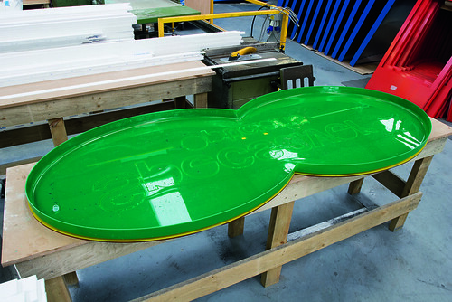
6. The moulded sign with all the routed letters removed.
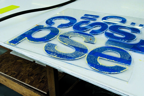
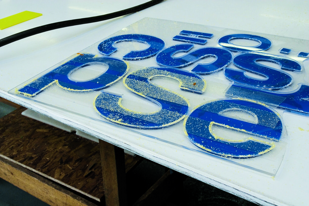
7. The Perspex letters used for the lightbox must fit the letter-shapes routed in the acrylic sign. This is achieved by cutting a second set of guide letters on the hand-router. These are then glued to a sheet of acrylic to make a guide for hand routing.
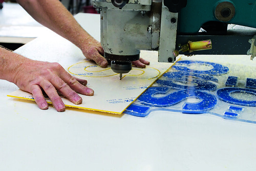
8. The letter inserts for the sign are cut on the hand-router. The operator moves the yellow acrylic sheet along the router’s cutting edge, which is controlled by a pin that follows the edge of the blue guide letter below.
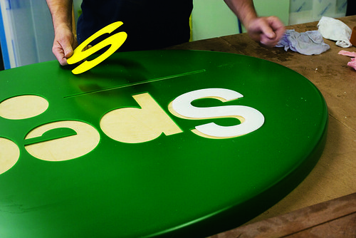
9. The operator checks the fit of the letters. In this instance, yellow letters are being applied to a different sign.
10. The letters are fitted into the form, and glued from the back with an ethylene-based resin that seeps down between the two plastic surfaces, creating a watertight chemical weld.
11. The letters sit flush with the surface.
Type Tuesday is our weekly column on typography and type design, featuring a mixture of brand new articles and material from the extensive Eye archive. For more Type Tuesday articles, click here.
Physical Display by Andrew Haslam was originally published in Eye 67, Spring 2008.
Eye is the world’s most beautiful and collectable graphic design journal, published quarterly for professional designers, students and anyone interested in critical, informed writing about graphic design and visual culture. It’s available from all good design bookshops and online at the Eye shop, where you can buy subscriptions, back issues and single copies of the latest issue. The latest issue is Eye 81, a type special.

