Tuesday, 8:00am
24 May 2011
Type Tuesday

Faith in asymmetry. John D. Berry on Jan Tschichold and Active Literature

What makes Jan Tschichold so interesting is not his theories but his practice. None of his dogmatic theories would matter much, writes John D. Berry , if he hadn’t been a superb typographer.
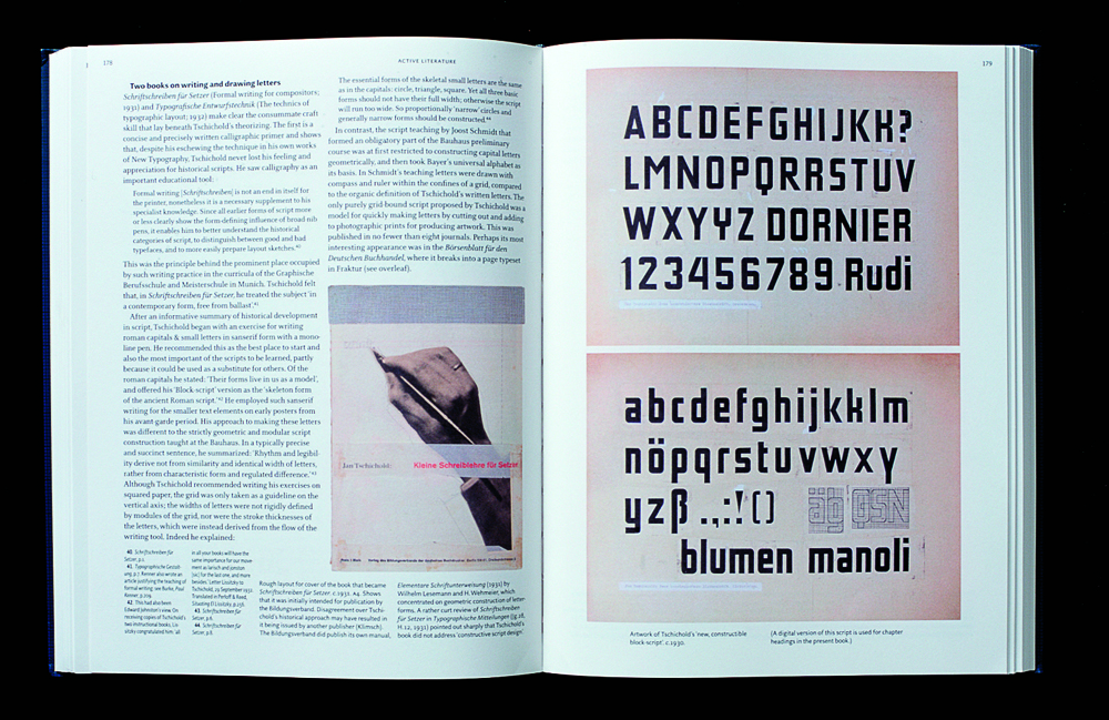
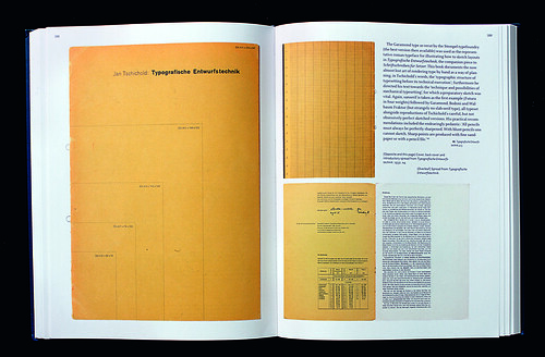
Tschichold’s unending search for perfection in typography led him from youthful revolutionary enthusiasm to mature reflection. His circumstances as a young typographical radical in 1920s Germany also led him from an exhilarating artistic milieu to persecution and arrest in the early days of the Nazis, and eventually to exile in conservative Switzerland. Although he is best known in the English-speaking world for his reform of Penguin Books in 1947-49, the other pole of his fame is as chief evangelist for the New Typography, given concrete form in his 1928 book Die Neue Typographie.
These arguments (his and his opponents’) can sound quaint today; for many decades, symmetric and asymmetric typography have simply been alternative tools in the graphic designer’s toolbox, not articles of near-religious faith. And in fact the later Tschichold recognised that asymmetric typography, which he was embarrassed to have trumpeted in his youth as the one true solution to every problem, was still an extremely useful way of dealing with industrial and promotional graphic design. After emigration to Switzerland in 1933, he found himself concentrating more and more on book typography, which he had barely practised before; and for that traditional purpose, he found that traditional methods, clarified and simplified, worked best.
‘The real role of the New Typography,’ wrote Tschichold in 1937, ‘consists in its efforts towards purification and towards simplicity and clarity of means.’ That was no less true of the way he later applied himself to symmetric typography in books. His firebrand youth was a response to the times – the creative ferment of Weimar Germany and revolutionary Modernism, and the sad state of the everyday printed matter he saw around him. As Burke says, ‘What he was mainly aiming for was a clearing away, in visual terms, of the gratuitous decoration endemic in the majority of German commercial printing.’
Unlike other artistic avant-gardists, Tschichold approached this task pragmatically: his books were directed not at an artistic elite but at practitioners in the printing trades.
This is an extract from John D. Berry’s Faith in asymmetry review of Christopher Burke’s Active Literature in Eye 65. You can read the full review here.
Type Tuesday is our new weekly column on typography and type design, featuring a mixture of brand new articles and material from the extensive Eye archive. For more Type Tuesday articles, click here.
Eye is the world’s most beautiful and collectable graphic design journal, published quarterly for professional designers, students and anyone interested in critical, informed writing about graphic design and visual culture. It’s available from all good design bookshops and online at the Eye shop, where you can buy subscriptions, back issues and single copies of the latest issue. For a visual sample, see Eye before you buy on Issuu.


