Tuesday, 1:00pm
25 March 2014
Typographic freak-out
Content Aware typography makes Adobe’s software ‘fail’ in the most interesting way

Content Aware Fill first appeared in Adobe Photoshop CS5, released in 2010, writes Tom Harrad.
It’s a neat piece of intelligent software that can be used to edit out figures and elements from images and photographs, generating a composite material using information pulled from the surrounding image. It can automatically create complex textures, for example if you had a photo of a landscape and wanted to remove an unsightly telephone mast – simply by highlighting the mast and selecting Content Aware Fill, Photoshop can conjure up a ‘new’, dynamic background, collated from other textures in the photo, masking it over the object you want to remove.
Oh, the Places You Go!
Top: the Coca-Cola logo subjected to Content Aware Fill in Photoshop. Both from Content Aware Typography Tumblr.

Type from the Doom video game, called ‘the ultimate Doom poster’ on the Content Aware Typography Tumblr.

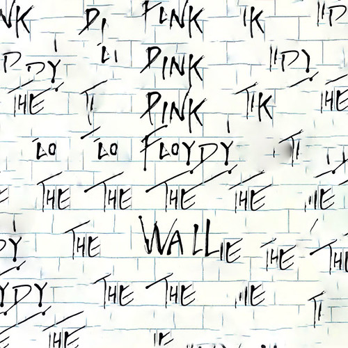
It’s all very clever and impressing, and with photography, particularly landscape photography, it works very well. When it comes to type however, it has a total freak-out. Contentawaretypography.tumblr.com is a Tumblr dedicated to showcasing what happens when this technology is applied to logos and typography, what one might call Content Aware Fail. The software struggles to grasp the logic behind text and logos, and so produces dizzying, confused extrapolations of original designs, stretching and distorting them, or maniacally repeating them, Adobe chasing its tail.
Pink Floyd’s The Wall. Content Aware Typography Tumblr.

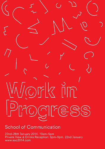
The success of the Tumblr (which invites visitors to submit their own experiments) is perhaps now having an effect on contemporary designers.
Work in Progress poster, 2014. Design: Jonas Berthod and Andrew Brash.
Logo for Lisa Frank Inc. Content Aware Typography Tumblr.

Jonas explains, ‘the main thing about tools is that they’re just that—tools. While some of them may come with a manual, you certainly shouldn’t only use them the way people designed them to be used. Tools are defined by how you use them. And in that sense Content Aware Typography is a nice way of disrupting the tool itself.’ While the Works in Progress poster wasn’t made using the technique, it occupies a similar, ‘post-internet’ aesthetic to the Content Aware images. Jonas recognises that typography, like any visual medium, is susceptible to shifting trends and fashions. ‘The output is just an elongated version of the existing design. It couldn’t have been created without the existence of the image the designer feeds into the machine. While sometimes it produces interesting results, aesthetically all the examples are curiously similar’.
He goes on, ‘While the name of the blog refers specifically to the Adobe Photoshop tool, it’d be fun to foresee it as an almost utopian idea of typography reacting to content. Imagine a typography that is not just aware of its surroundings, but aware of the very message it contains. It would be like the voice of a parent reading a tale to a child, adapting the tone of their voice to the content of the story. Now that would truly disrupt and randomise typography itself, a design future.’
The Starbucks logo. Content Aware Typography Tumblr.
Tom Harrad, writer, London
Eye is the world’s most beautiful and collectable graphic design journal, published quarterly for professional designers, students and anyone interested in critical, informed writing about graphic design and visual culture. It is available from all good design bookshops and online at the Eye shop, where you can buy subscriptions and single issues.


